The History Of Christmas Colors Is Simply Fascinating
Today, it might seem like decking the halls for the holiday season is all about tinsel with a generous splash of red and green, but long before their commercialized presence, the color combo possessed a more spiritual significance. The evergreen holly plant, with its sharp spined edges and ruby red berries, was a symbol of the season. To commemorate the winter solstice, the ancient Celtics filled their homes with the plant and considered it to be a sign of prosperity. It was a vibrant accent amidst the gloomy, gray and white surroundings.
History of Christmas Colors

History of Christmas Colors
Throughout history, the color palette remained a constant, evolving into the form of ornamental trees, garlands, and so on. The 1930s brought on a modern revival spearheaded by Coca-Cola who enlisted artist Haddon Sundblom to illustrate a jovial Santa Claus. A first of its kind, the advertisement featured St. Nick in his iconic red and white suit, which further propelled the popular hues to stardom.
How Christmas Colors Have Evolved
How Christmas Colors Have Evolved
Today, Christmas colors have gone far beyond the classics. Winter whites sprinkled with a dose of warm or cool metallics, and even purple, have become mainstays. In fact, both gold and blue hold a religious connotation, signifying a gift from the biblical Magi and the color of Mother Mary's robe, respectively.
And while some of us may be eager to adopt these hues into our interiors as soon as December rolls around, there's something to be said about a contemporary twist on the tradition. We're talking about Christmas-inspired interiors that channel the best of the season in the most effortless way. Read on to see how Christmas colors have evolved.
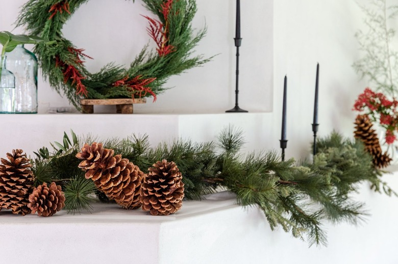
Green, Red, and White
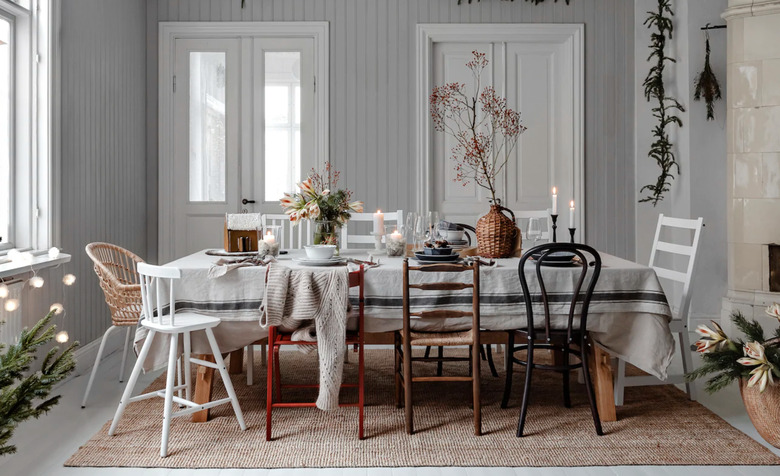
Green, Red, and White
When it comes to sourcing color ideas for the dining room, striving for a certain level of festiveness never hurts. But before you dress it up to the nines with tinsel and the works, allow this Scandi-chic scene from IKEA to inspire a different approach. Let neutrals like beige and white set the scene and then sprinkle in touches of the classic red and green combo for interest. Greenery hung high on the walls, vases of holly stems, and even bright red chairs will complete the look.
Blue and Silver
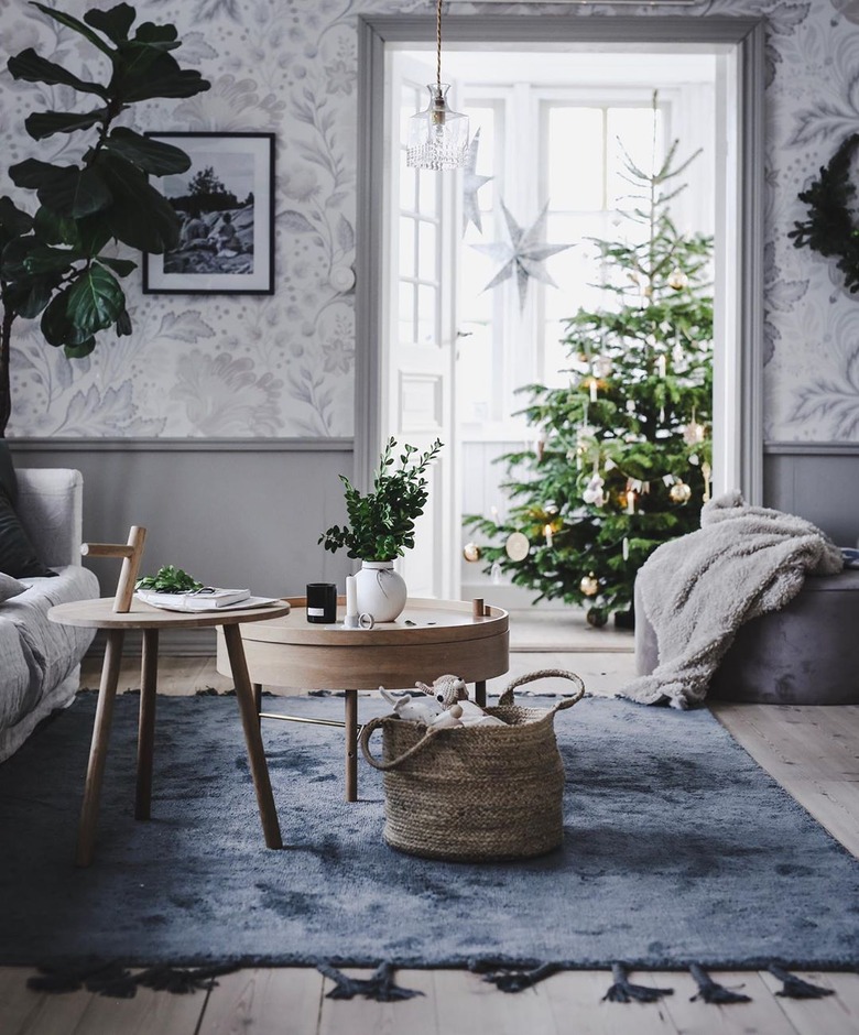
Blue and Silver
These days, the standard spectrum of Christmas colors has expanded to encompass hues found in nature. Picture a winter wonderland of ice blues, stark whites, and hints of silver. Translating that to our interiors looks a lot like this dreamy living room by photographer and stylist Jasmina Bylund. While the soft blue area rug and patterned gray walls set the tone, traces of green plus white and silver ornaments tie it all together.
Purple and Warm Metallics
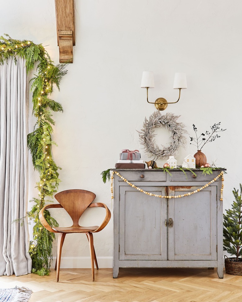
Purple and Warm Metallics
We're loving Emily Henderson's glam twist on classic Christmas colors, where warm metallics and dark burgundies replace the standard red and green. The designer decked her halls with frosted wreaths, brass and gold ornaments, and splashes of deep purple (we're talking pillows, presents, and more), then layered in blush accents to balance it all out. Beaded garlands and house-shaped votives nod to Scandinavian style with a modern touch.
Red and Green
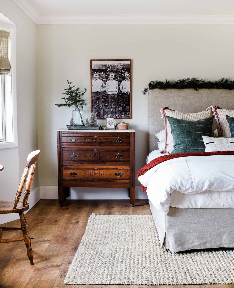
Red and Green
Tackling an interior with quintessential Christmas colors need not feel like an overwhelming buildup of tartan and plaid. Chloe of Boxwood Avenue proves just how versatile (and subtle!) the two can feel when thoughtfully layered within a neutral scheme. The creative used a scarlet knit throw, deep sage pillows, and a modest string of garland to transform her guest room with seasonal flair.
Green and White
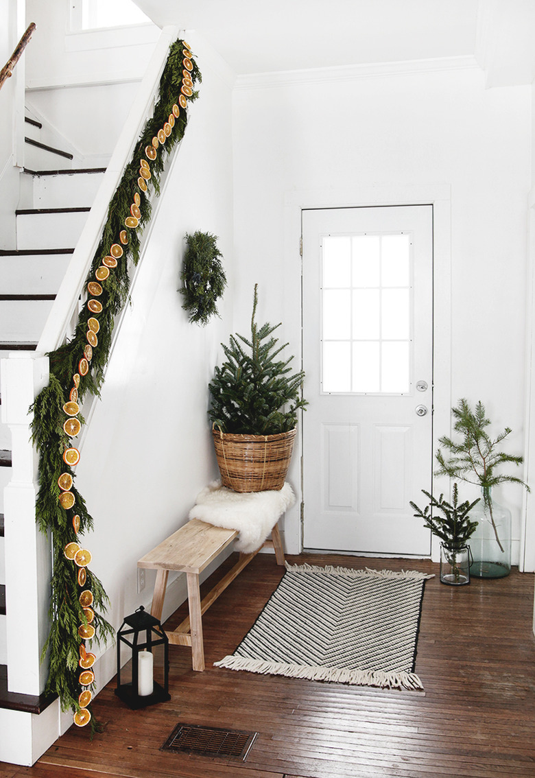
Green and White
A Nordic holiday scheme may be all about simplicity, but don't confuse that with a compromise on style. This festive entry from The Merrythought is an example of how impactful a pared-down palette of high-contrast Christmas colors can be. The key to making it work is integrating a rich array of textures — be it a variety of mini trees, evergreen branches, or a cozy sheepskin — to invite a dynamic note. Of course, an unexpected pop of color, such as the dried orange garland, never hurt.