These Color Combinations Seem So Wrong Yet Look So Right
Chicken and waffles, Swedish meatballs and jam, avocado and chocolate (Are you hungry now?) — The world is filled with weird combinations that seemingly don't work, but surprisingly, when done correctly, they actually do. Not only limited to food, these unique pairings also relate to home decor, as well. When it comes to your home's color palette think beyond neutrals and basics and consider adding a little colorful spice to your life. The options are almost endless. It's all about creating a balance between base colors and accent colors. And to help you navigate these tricky waters, here are 8 unexpected color combos that you might not think work together, but totally do.
Blue and Yellow
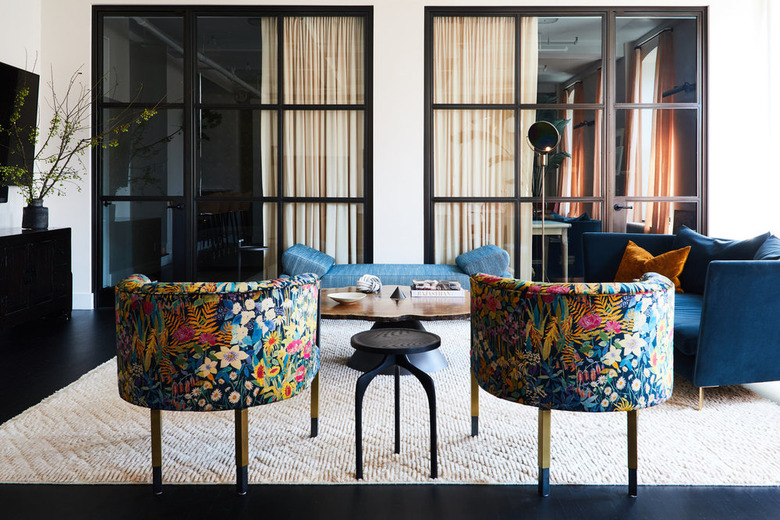
Blue and Yellow
Blue and yellow are complementary colors — meaning they are opposite one another on the color wheel. While more traditional color pairings aim to create a cohesive color palette, when it comes to this color duo, it's their stark differences that make one pop against the other. When incorporating this color mash-up into your home, pick one hue as the base color and add striking accents in the other, like these eye-catching blue club chairs with yellow accents.
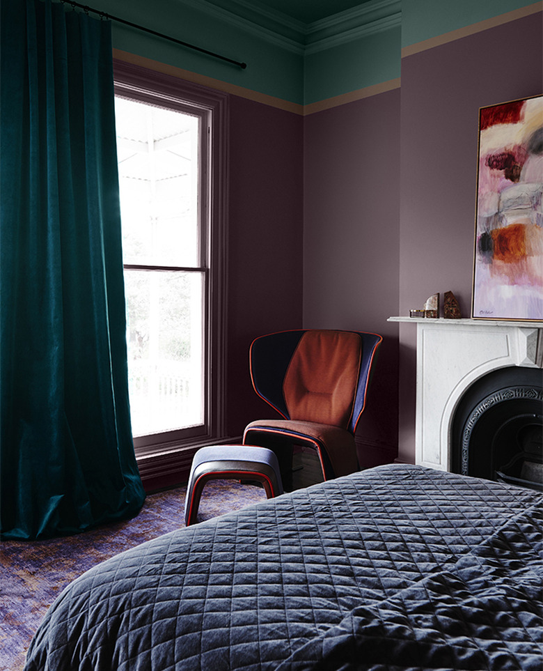
Orange and Pink

Orange and Pink
When it comes to picking a color scheme for your space, choosing colors that are near one another on the color wheel — also known as analogous colors — is always a safe bet. But to spice things up and take your decor to the next level, opt for a strong hue of one color and a softer hue of the other. That's why this orange and pastel pink color combo in Kate's bedroom (from the blog Kate La Vie) works so well. The velvet orange pillows boldly stand out against the soft pink backdrop, without feeling too overpowering.
Pink and Aqua

Pink and Aqua
While pink and aqua sound like they should clash, they actually make a surprisingly dramatic statement when paired together. The warmth of pink creates a strong accent color that wakes up this deep dramatic aqua hue. When decorating with this unique color combo in your home, be sure to use pink accents sparingly and strategically — either spreading a few accents around the room or highlighting one single item, like a velvet sofa or this pretty in pink framed vanity mirror.
Green and Gray
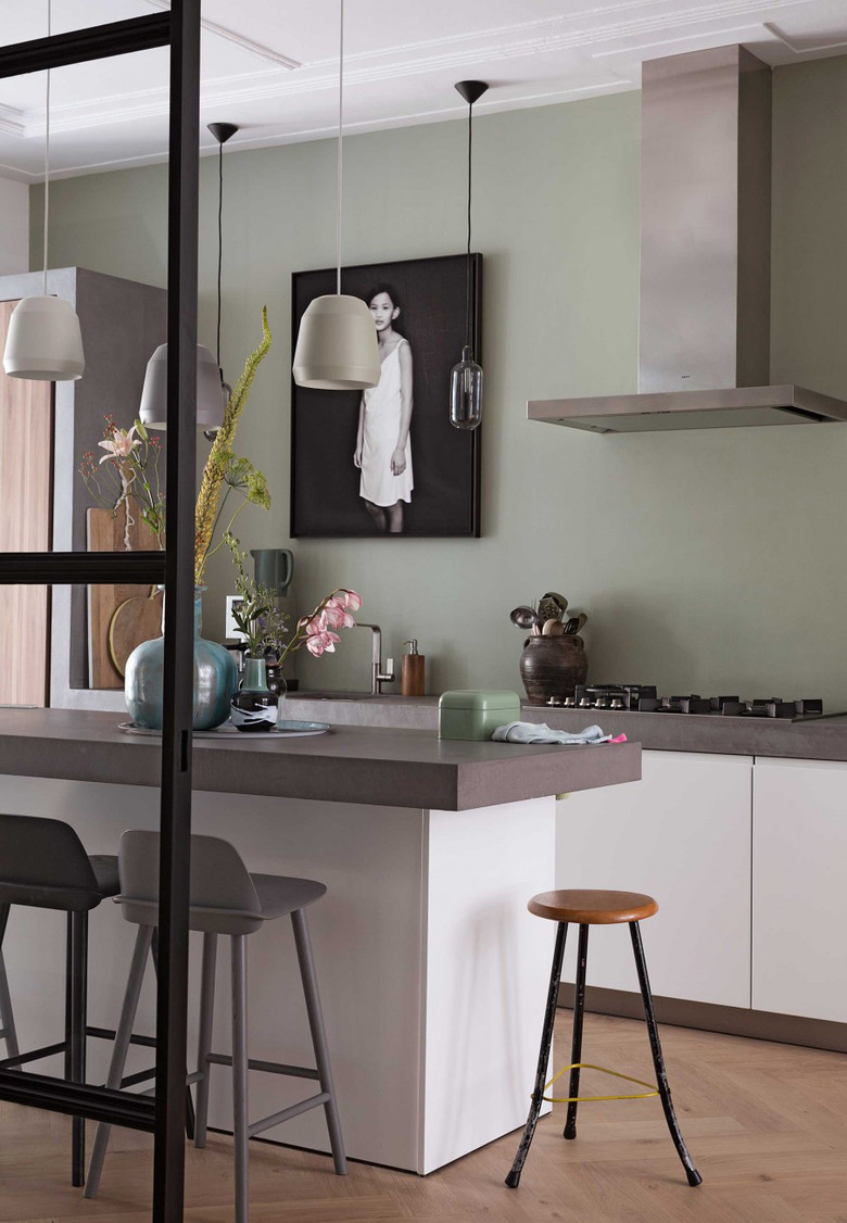
Green and Gray
Since green and gray are both cool colors, their hues balance each other out nicely and create an artistic, fashion-forward look. Just make sure to pick a strong, bold gray so it's able to stand up to green's strong olive undertones. Since both colors are somewhat subdued, use it in a stately living room, serene master bedroom, or even a relaxing and modern kitchen.
Red and Yellow
Red and Yellow
Go bold with red and yellow. Both of these primary colors are clear and bright, which is why they balance each other out — essentially competing for your eye's attention. When decorating with this color palette, be sure to pick shades that are parallel in their vibrancy, so one doesn't outshine the other. Since these colors are especially energizing, they'll work well in a kitchen or play room.
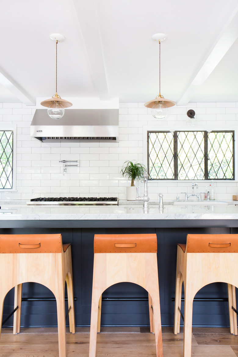
Navy and Persimmon
For stately, sophisticated spaces, give navy and persimmon a try. Interior designer Amber Lewis paired these bright leather counter stools with this navy kitchen island adding an elegant pop of color to an otherwise neutral space. The pops of persimmon really wake up the base color, keeping it from looking too dark and drab.
Teal and Red
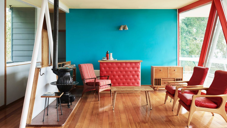
Teal and Red
Teal spaces with fiery red accents give off a cheerful, retro vibe. Red is often too strong of a color to take center stage in your pad, which is why an uplifting teal base helps cool off red's hot impact. This color combo can work well in just about any room, where teal is the base color and pops of red are scattered throughout the space in the form of playful accents.
Lilac and Green
Lilac and Green
Lilac and green look great together for the same reason blue and yellow work — they're complementary colors directly across from one another on the color wheel. Think of them as the yin and yang of colors, perfectly balancing one another out. The key to pulling off this look is to balance the darkness or lightness of your hues; if you go with light purple, then pick a complementary light green and vice versa. Add further interest to your look by featuring these flattering hues in fun fabrics, like velvet, linen, or chunky knits.