These 10 Paint Colors Are Always Trending Because Design Experts Repeatedly Use Them
Choosing paint is deceptively hard — even for professionals. That's why, when they find a color they love (like these faves for the kitchen), they stick with it. Here are 10 no-fail paints that designers choose again and again.
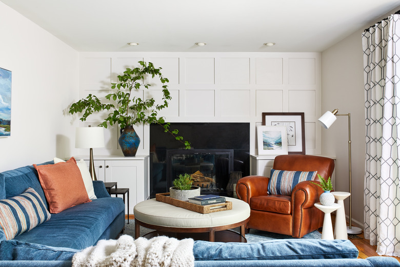
1. Thundercloud Gray, Benjamin Moore
1. Thundercloud Gray, Benjamin Moore
Devi Dutta of Devi Dutta Architecture in Berkeley, California, finds Thundercloud Gray by Benjamin Moore to be a great modern neutral. "It's a dramatic name for a calming color," she says. "Gray is often used to cool down a space, but this gray is quite warm and enveloping, making it cozy, too. Pair with white trim for this classic modern look."
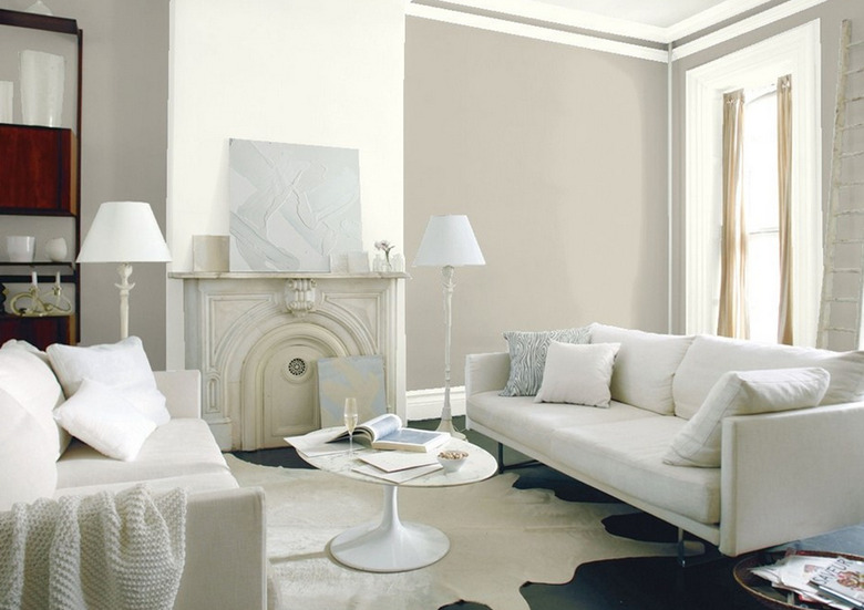
2. Silver Satin, Benjamin Moore
2. Silver Satin, Benjamin Moore
Meghan Hackett-Cassidy and Erin Hackett, the two sisters behind Hackett Interiors in Bronxville, New York, like Benjamin Moore's Silver Satin. "It can go anywhere and everywhere," they say. "It looks great with warm and cool tones, which lends itself a lot of versatility whether you're updating a room or starting from scratch. It's a great base — you really can't go wrong."
3. China White, Benjamin Moore
3. China White, Benjamin Moore
Kristin Gunnette, senior designer at Atelier k in Los Angeles, California, likes Benjamin Moore's China White for a variety of projects. "This delicate shade of off-white adds enough body and weight in a room to create warmth in any space. We have used China White in modern, Spanish, and classical architectural settings to create warmth and subtle depth," she says.
4. Pure White, Sherwin-Williams
4. Pure White, Sherwin-Williams
The go-to white for Maureen Stevens, of Maureen Stevens Design, is Sherwin-Williams' Pure White. "You can use this pretty much anywhere but it is probably best used for the kitchen or bathroom since you can pair it with a bolder backsplash, floor, or cabinet color."
5. Light French Gray, Sherwin-Williams
5. Light French Gray, Sherwin-Williams
For living rooms, though, Stevens leans toward Light French Gray by Sherwin-Williams. "It's very hard to find a true light gray," she says. "This is it!"
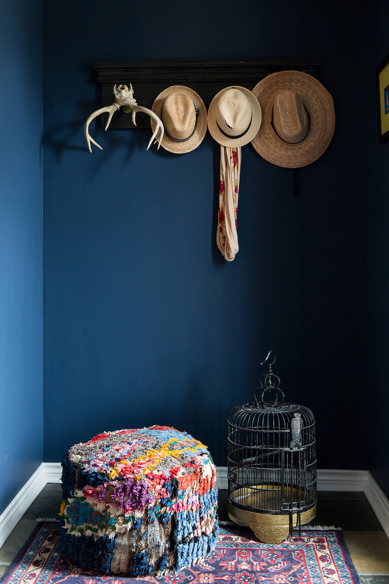
6. Naval, Sherwin-Williams
If depth is your goal, try Sherwin-Williams' Naval. "It's so great to have a dark color background when curating a wall with art," says Stevens. "Navy is a classic and so versatile. It can be used anywhere."
7. Calamine, Farrow & Ball
7. Calamine, Farrow & Ball
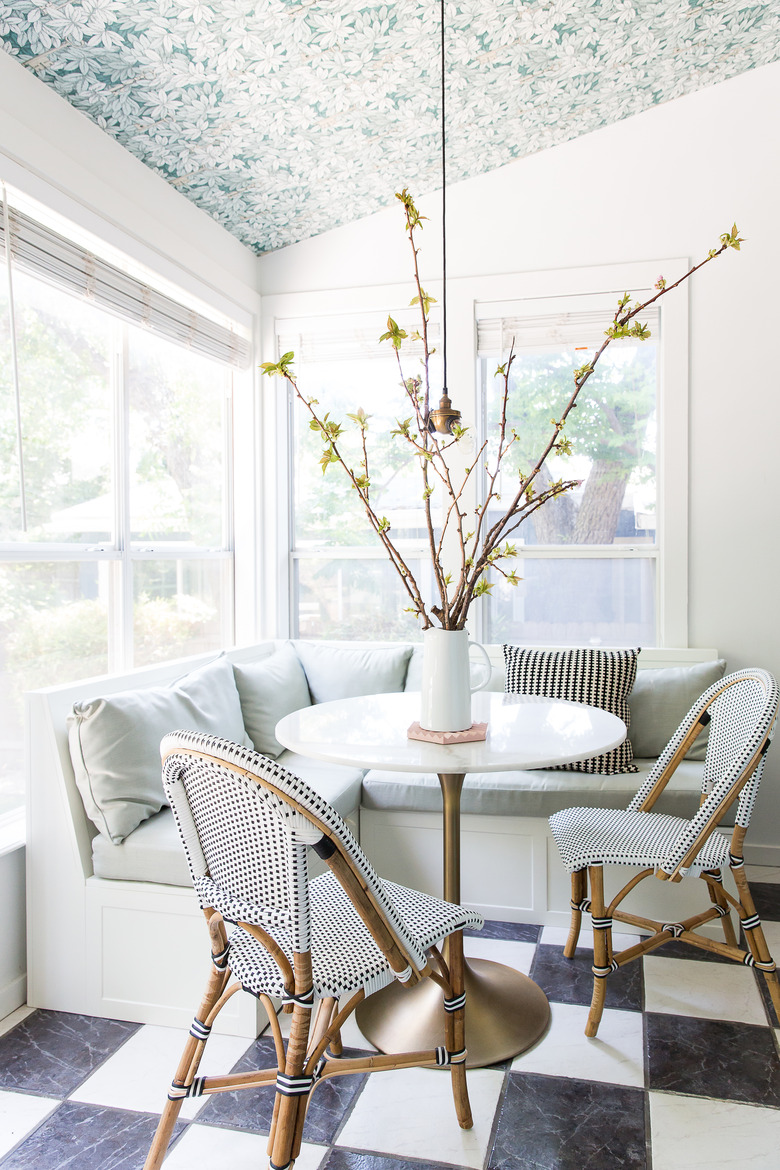
And then, of course, the unexpected neutral: pink. "I am also so into pink right now and I think it is extremely versatile and adds such a lightness to a space," says Stevens. Her go-to pink is Calamine by Farrow & Ball.
8. Cool December, Dunn-Edwards
8. Cool December, Dunn-Edwards
Courtney Thomas of Courtney Thomas Design in La Canada, California, just outside of Los Angeles, finds Dunn-Edwards' Cool December to be a great complement to marble, which makes it ideal for kitchens and bathrooms. "We also go back to it for living rooms and entries where blue is an accent," she says. "It's a crisp pairing for blue and gray but can easily work with a warmer, taupe palette."
9. Toque White, Sherwin-Williams
9. Toque White, Sherwin-Williams
Christie Leu of Christie Leu Interiors, in Chevy Chase, Maryland, loves to work with Toque White — a warm gray masquerading as white. "It adds a bit of warmth to a room but remains neutral so that the colors of the furnishings, rug, and things that are important to you stand out," she says. "It is also great for trim and 'white' painted kitchen cabinets. Many people are using a lot of white in design as we explore minimalist Scandinavian home decor. But I like to avoid stark whites and cool grays in favor of cozy Toque White."
10. Revere Pewter, Benjamin Moore
10. Revere Pewter, Benjamin Moore
Lauren Maggio of Lauren Maggio Design in Boulder, Colorado, loves Revere Pewter, especially for kitchen walls and cabinetry. "I actually had the paint store add more of the formula for the cabinetry to darken the neutral. I often employ this technique — for example, 150 percent of Revere Pewter HC-172. In this way, the walls and the cabinetry are related and the overall vision is of a neutral palette with some depth." All that said, she offers this word to the wise: "Always, always order samples and assess on site — light and other elements in the space can change paint colors so try before you buy!"