12 Warm Color Ideas That Are Almost Too Hot To Handle
Originating from the yellow, red, and orange side of the color wheel, warm colors are hues that easily remind people of the sun and fire. Unlike cool colors, which include shades of green, blue, or violet, these colors really do "warm" up interiors and impart brightness, joy, and comfort.
Specifically, color theory tells us that when the color wheel is divided in half, one part is considered "warm"— red, orange, yellow — and the other is thought of as "cool" — green, blue, violet. When woven into a palette, these shades can visually warm up or cool down any room. If you mix a warm color with a cool color, and you'll have a scheme that's an instant conversation starter.
Whether your happy place is a desert scene punctuated by pink hues or a red-and-orange sunset cresting over the ocean, warm colors can help you hang onto that summer feeling, all year long. And you can continue the theme throughout your home. Want to create a jubilant atmosphere for parties? Paint your dining room a sunny shade of yellow. Is it time to freshen up an old fireplace in the living room? It'll look amazing in a punched-up shade of orange. Or perhaps the guest room could use a makeover? Add terra cotta linens to the bed. Warm colors are also perfect in children's rooms and family rooms to encourage an atmosphere of fun.
Still not convinced that warm colors have a place in your home? We're betting these 12 gorgeous ideas will do the trick.
12 Warm Paint Colors
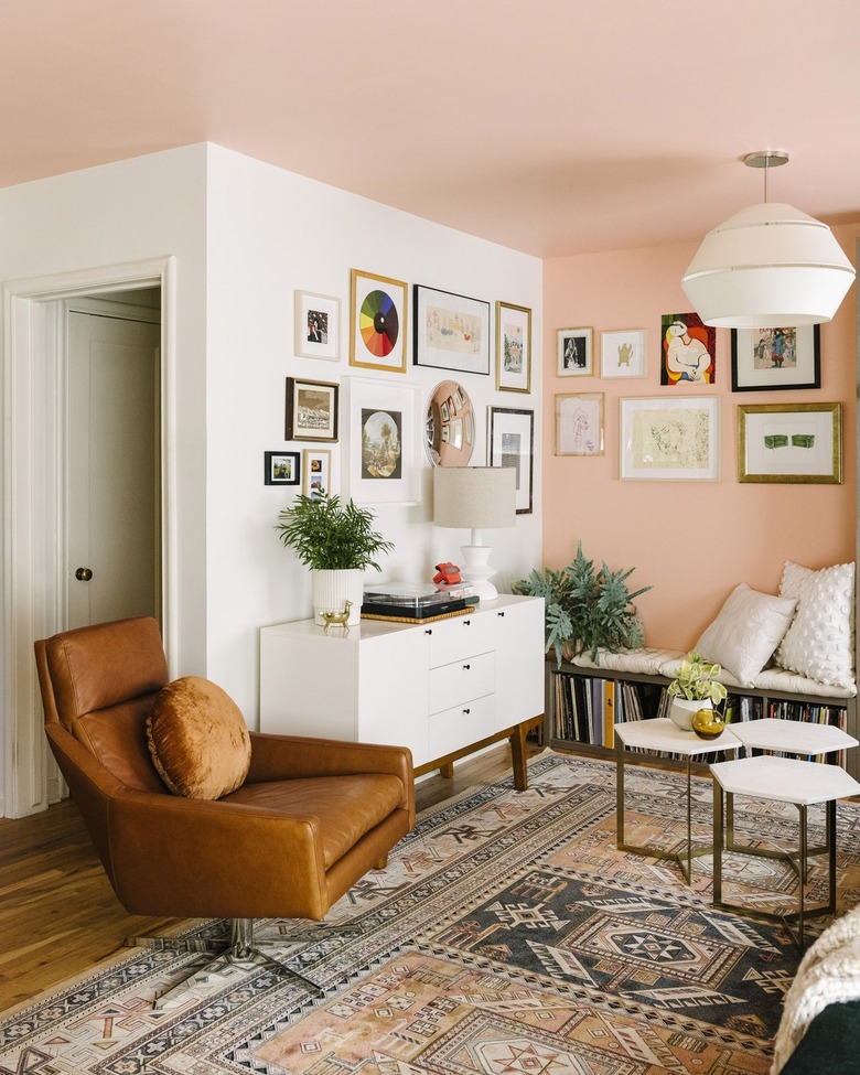
1.
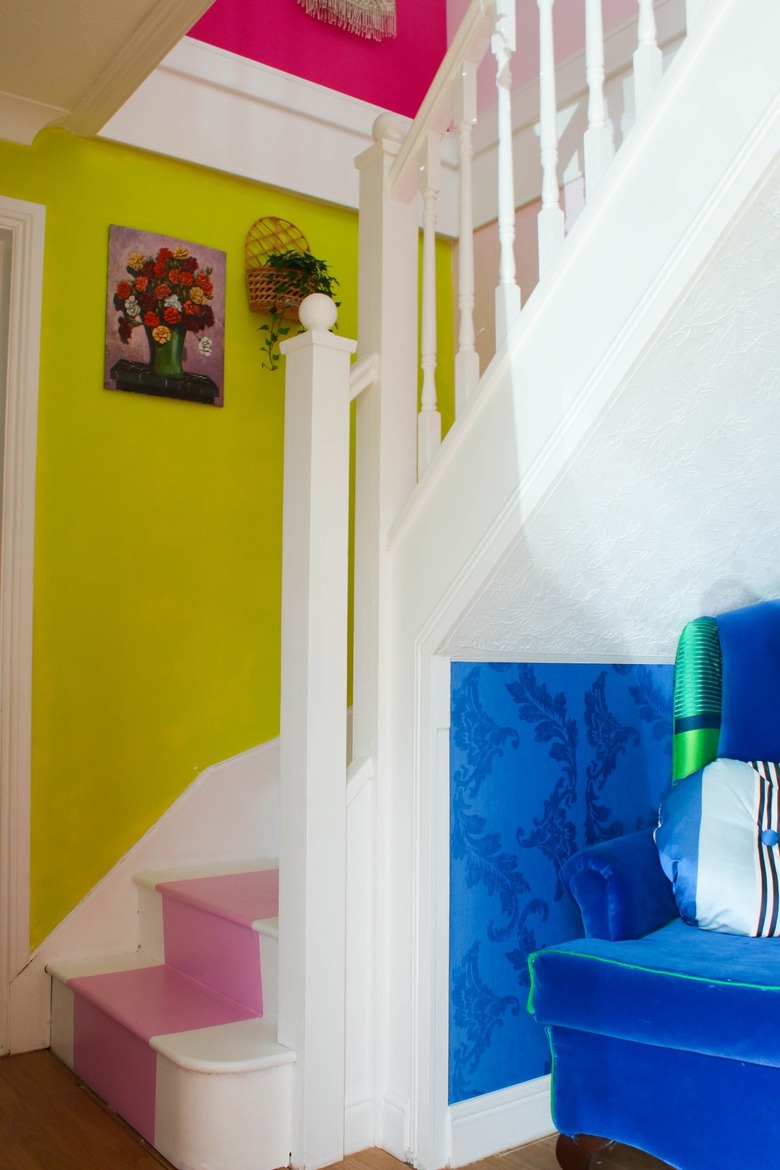
Designers Guild Alchemilla No. 112
Practically fluorescent — with green undertones and a bright, sunny demeanor — this luminous chartreuse paint color chosen by Ju of Blueberry Living & Co. is a surefire way to liven up a staircase. Paired with pink to heat things up and blue to tone them down, this combination of warm and cool is a great way to approach your color scheme. Not to mention, the bold yellow-green hue can instantaneously punch up any dark room or corner.
2.
Behr Pink Damask
 The House That Lars Built
As you search for color ideas, you may come across several color blocked spaces, and for good reason — they are very on-trend right now. We recommend trying out the look with a few warm colors to really brighten up your home. Brittany of The House That Lars Built employed the trend in her guest room using shades of pink and yellow, resulting in a space that's guaranteed to lift anyone's spirits. Keep the good vibes going with plenty of natural light, something that will make your vibrant color scheme look even better.
3.
Sherwin-Williams Lotus Flower
 Amelia Tatnall + Brittni Mehlhoff for Paper & Stitch
In the prettiest shade of pink, Brittni of Paper & Stitch transformed a seating area into a beautiful design moment. Typically, reading nooks gravitate toward dark, toned-down colors, but here, the feeling is lighthearted, especially when paired with cheerful pieces of home decor. This particular shade looks its best when showcased with white paint, in a room filled with natural light. And although the warm color idea works well in small spaces, like this one, you could always go for broke with a large pink accent wall.
4.
Benjamin Moore Montana Agate
 Oh Joy!
To offset all those warm colors, you can always anchor your palette with a few neutrals here and there. For example, in this living room styled by Joy Cho of Oh Joy!, the orange and pink walls and blush sofa pair quite nicely with a cream area rug and wood furniture. All that's missing is a bit of natural light to make this sun-kissed refuge perfect.
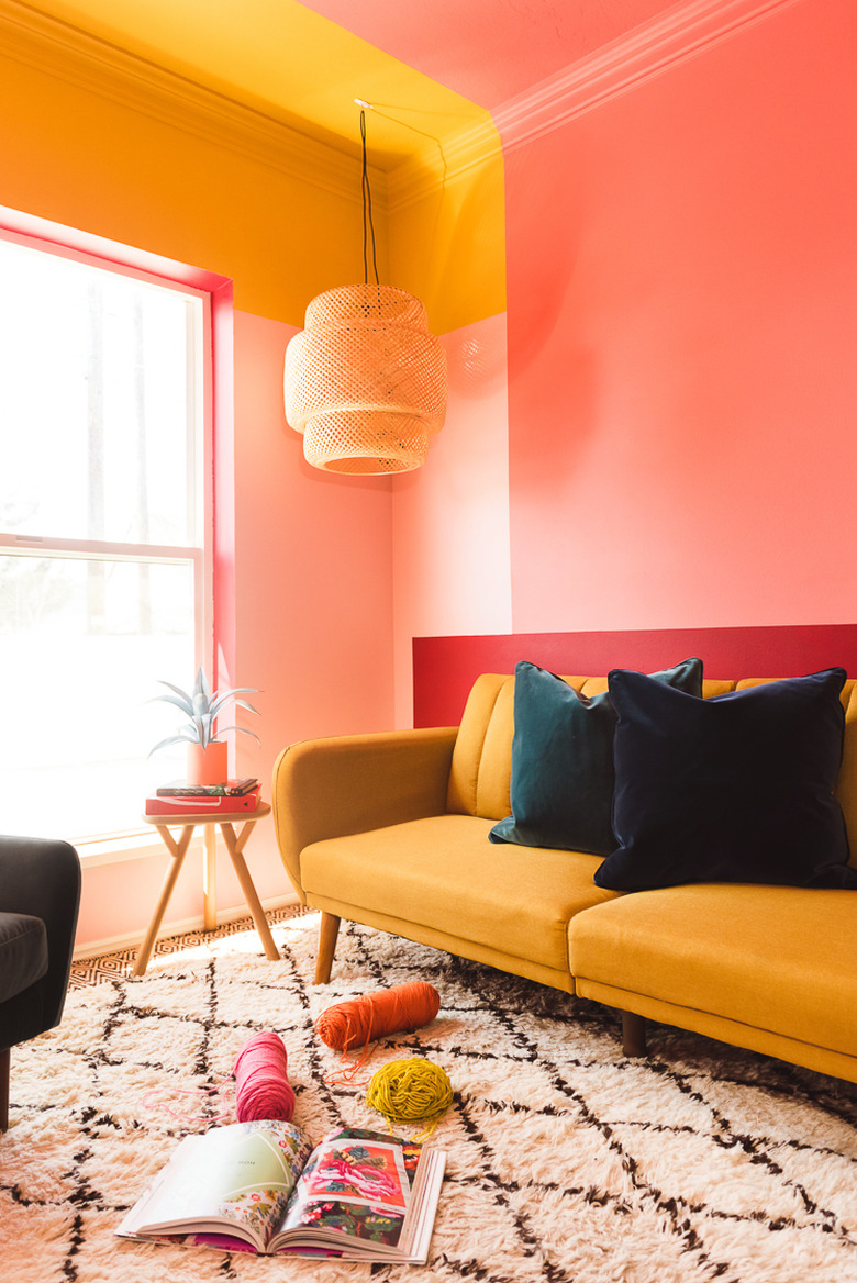
5.
Behr Priceless Coral
 Old Brand New
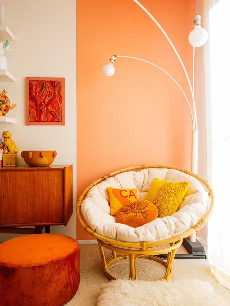
Want to push the envelope with warm tones? Get inspired by this space crafted by interior designer Dabito of Old Brand New. Simply looking at this corner — made up of an orange accent wall and decorative details that are just as warm — will put you in a good mood. Reminiscent of the sun, as it's swathed in natural light from a nearby window, this creamsicle hue is perfect for a joyful home office or a midcentury-style dining room.
6.
Benjamin Moore Banana Yellow
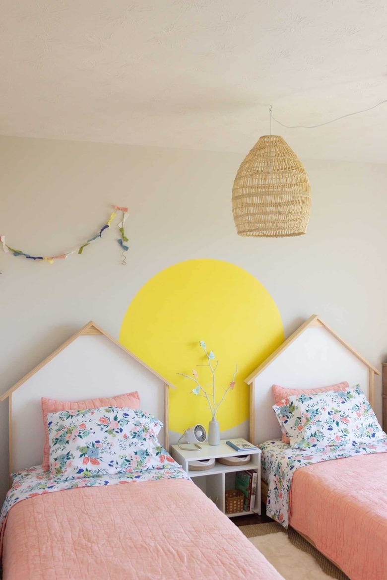 Free & Unfettered
For color palettes that are anything but shy, a vibrant shade of yellow is definitely the way to go. Although you could hypothetically cover an entire room in the sunny hue, it should really be reserved as an accent color. For instance, Jillian of Free & Unfettered used it to create a whimsical sun-inspired accent on the wall of her girls' shared bedroom. And the color looks even brighter thanks to the white walls and natural light pouring in from the window.
7. Dunn-Edwards Paints Often Orange
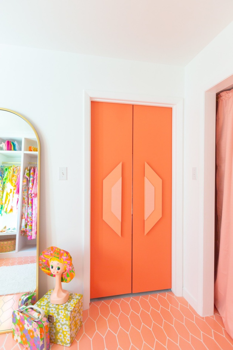 Aww Sam
Orange isn't a color for the faint of heart, but it's certainly one that can inspire a lot of happiness, as proven by Sam of Aww Sam with these blissful closet doors. With fiery red undertones, it's a versatile shade that works well indoors paired with midcentury style, or outdoors on the front door. And while it can absolutely revitalize a dark space, this shade shines when it's in a bright room.
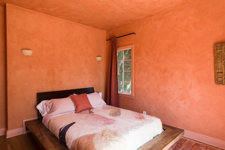
8. Behr Orange Flambe
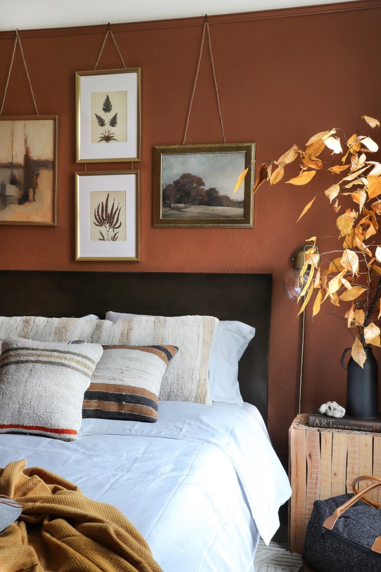 I Spy DIY
Perhaps super-bright palettes aren't your thing. That's perfectly alright, because you can always go to the "dark side" when it comes to warm paint colors. If you're someone who prefers earth tones, consider something more muted like terra cotta. It's a hue that feels on-trend, polished, soothing, and even a bit boho. Not to mention, it works equally well in light and dark spaces and it partners beautifully with chocolate brown, creamy white, taupe, or greige. And while this color would look stunning in just about any space, it is simply flawless in the bedroom, as evidenced by this dreamy scene from Jenni of I Spy DIY.
9. True Value Paint Orange Flower
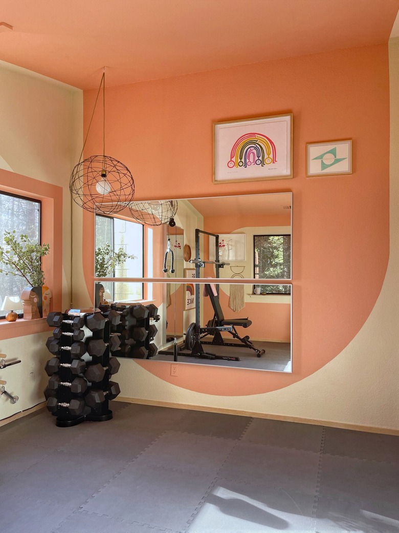 Orlando Soria
While homeowners often turn to neutral hues when painting a home gym, Orlando Soria chose not to go that route. Instead, he took a risk and painted this gym in a shade of pink-meets-orange, and it paid off. This color is sure to lighten the mood and energize anyone who walks through the door — making it a great fit for rooms where you want to feel inspired and awake, like the gym, home office, or even the kitchen. Paired with touches of warm neutral paint, this color will instantly invigorate any dark, dull interior.
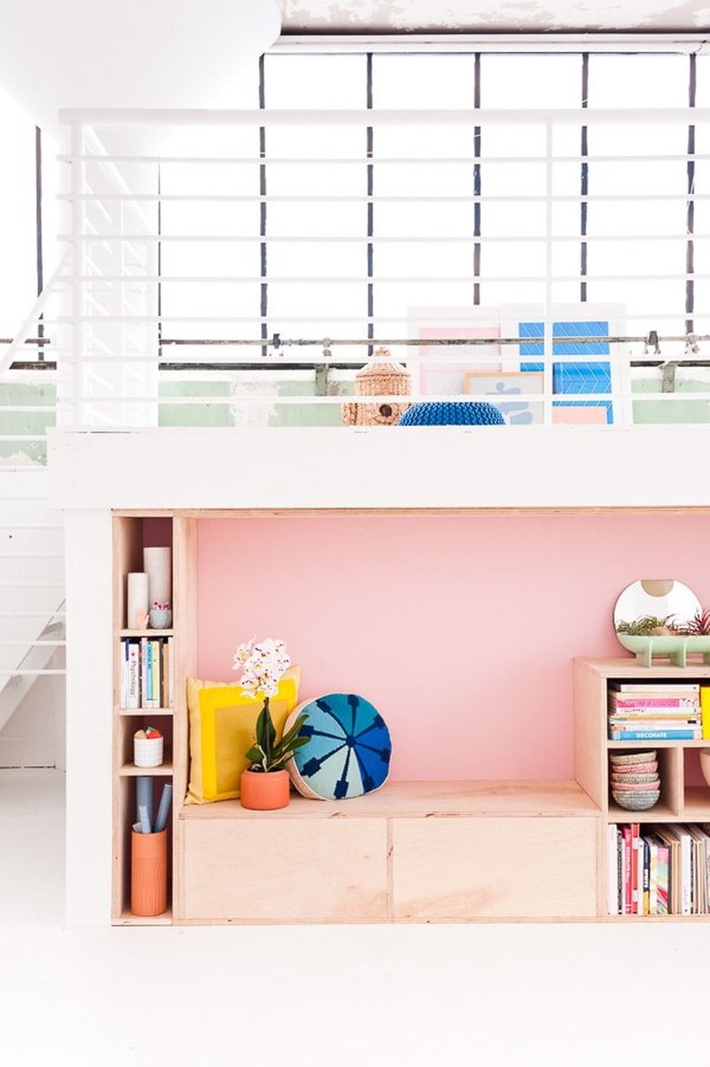
10. Benjamin Moore Springtime Peach
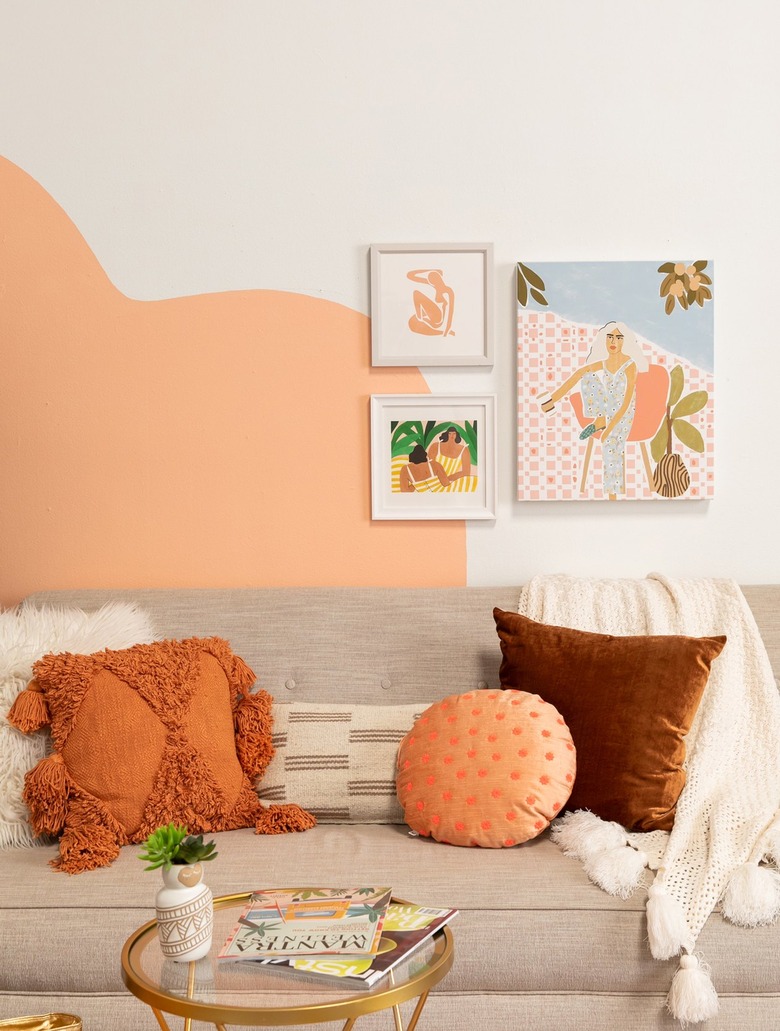 Oh Joy!
You can definitely go with the color peach on all the walls if it's your fave color, but here, in this living room dreamed up by Joy Cho of Oh Joy!, an artful splotch is all you need to add a jolt of happiness to your design. And while this color looks right at home in a modern, playful living space, we think it would be a delightful shade for the kitchen as well.
11. Farrow & Ball Babouche
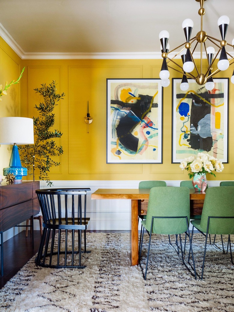 Old Brand New
Make like Dabito and go for broke when it comes to an ecstatic shade of yellow. In fact, cover the entire dining room in it, especially if your setup doesn't have windows and could stand a little brightening. The vivid color will blend in seamlessly with a variety of design styles — from modern to midcentury to eclectic — and will really shine when paired with cool shades, in the form of a blue lamp or green chairs.
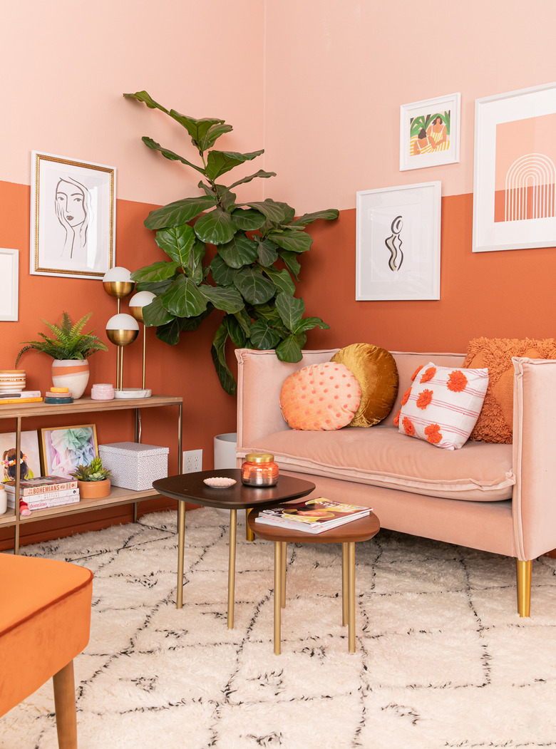
12. Sherwin-Williams Certain Peach
 Landon Vonderschmidt for Front + Main/West Elm
Are you longing for a living room that's almost as artistic as your art collection? Then take a page from Rubie Baker's space and alternate wall colors from crisp white to a light orange-pink shade. But don't stop at the walls: complete the look by continuing the warm hue onto the ceiling, too. The design choice is sure to lift your spirits and put a smile on your face every time you enter the room. And bonus: The color combo will make a stunning backdrop for a gallery wall or two.