6 Complementary Color Combinations That Will Make Your Home Pop
We may receive a commission on purchases made from links.
When it comes to interior design, there's one consideration that can easily make your head spin: color. There are so many shades to choose from, so it can be hard (read: seemingly impossible) to know where to start. This is where color theory comes into play.
Color theory is basically the science of color — and a lot of it boils down to the trusty color wheel. You likely remember looking at it in elementary school, but today, it can serve as a helpful tool when you're trying to decide on the perfect palette for your home. For instance, you may be familiar with the term "complementary colors." These hues are directly across from one another on the color wheel, and even though they are opposite, these shades partner up flawlessly — creating a palette that's perfectly pleasing to the eye.
Whether you're giving your living room a makeover or looking to punch up your kitchen, these six complementary color combinations will always look spot-on in any space.
1. Yellow and Purple
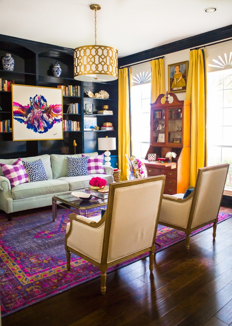
1. Yellow and Purple
To achieve a palette that would make any color theory pro happy, look to rich shades of yellow and purple to complete your living space. Cassie of Hi Sugarplum! artfully chose purple textiles and yellow drapes to achieve this vibrant mix.
2. Orange and Blue

2. Orange and Blue
If sunsets at the beach are your idea of a picture perfect scene, know that you can bring those same visuals into your home. Here, a warm, orange sofa coupled with a cool blue area rug and ottoman make the ideal pairing in a space designed by Justina Blakeney of Jungalow.
3. Pink and Aqua
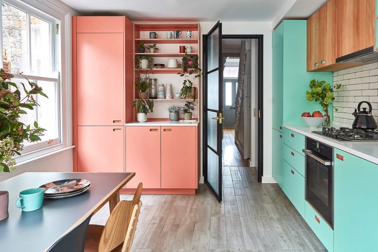
3. Pink and Aqua
Although pink and aqua tend to be hues associated with tropical locales, they also work as complementary colors in interiors. For example, you can weave the two shades into an effervescent, colorful kitchen, as proven by this space from the team over at Pluck.
4. Purple and Olive
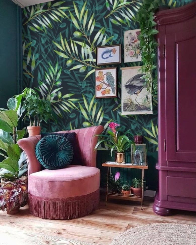
4. Purple and Olive
Color theory says that purple and olive are opposite each other on the color wheel, making them a seamless pairing in any space. Take this nook showcased on Etsy, the olive wallpaper pattern paired with purple furniture feels downright opulent.
5. Red and Green
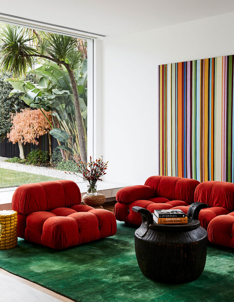
5. Red and Green
Although the complementary colors red and green are typically associated with the holidays, the festive palette can actually look pretty sophisticated when done correctly. For instance, in this living room belonging to Emma Abrahams — and featured on The Design Files — plush red seating and a lavish, emerald green rug look positively luxe together.
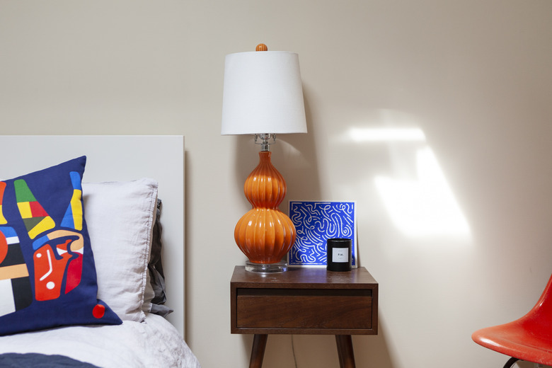
6. Turquoise and Red
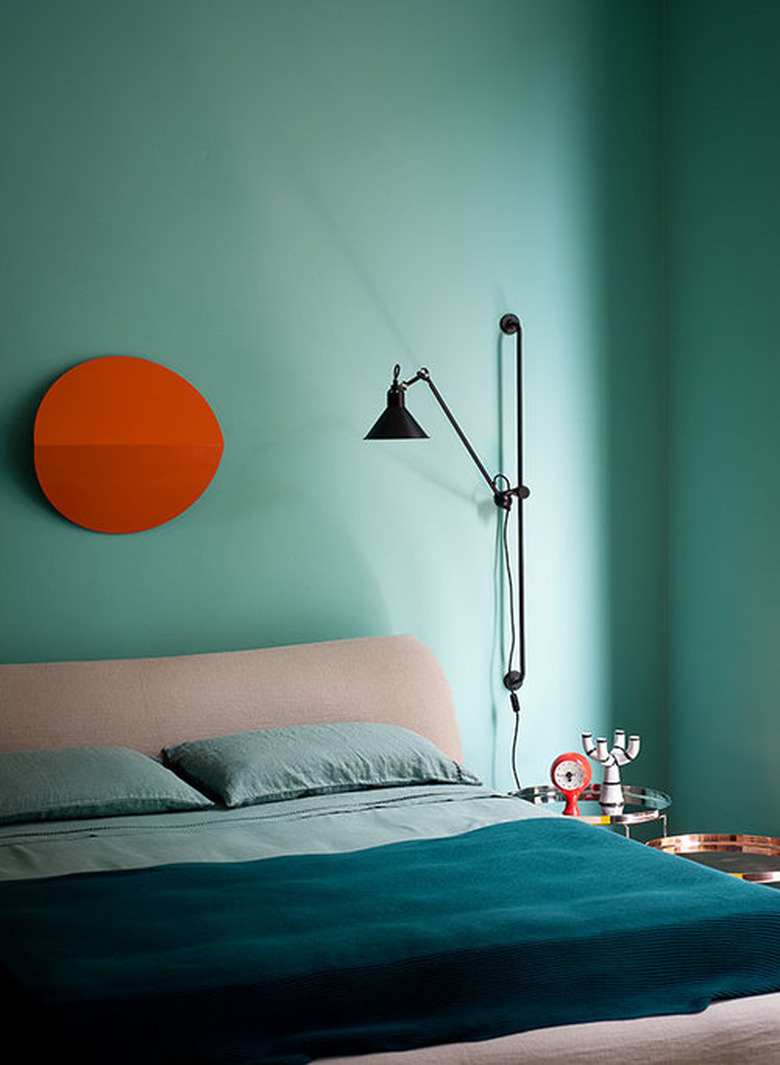
6. Turquoise and Red
Red also pairs quite well with turquoise. Before you dismiss the idea, consider painting your walls from top-to-bottom in the blueish-green hue, and then couple them with red artwork, à la this sleek bedroom setup by Studiopepe.