14 Two-Tone Color Ideas For Walls With Chair Rails
We may receive a commission on purchases made from links.
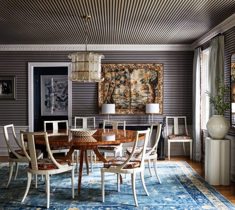
Chair rails, sometimes referred to as dado rails, are a type of molding that runs horizontally along the walls. Homeowners commonly pair them with wall paneling or trim such as shiplap, beadboard, board and batten, and picture frame molding to create wainscoting. Chair rail-type moldings can be traced all the way back to the Greeks and Romans, who used them purely as a decorative touch, but they became widely embraced in the 19th century as a functional element that protected walls from potential damage by the backs of chairs. When the Shakers attached pegs to them so they could hang up their chairs while they cleaned and swept, they became known as chair rails. Lately, however, we're seeing a resurgence in the use of chair rails, due to their ability to add understated depth and character to both expansive and petite spaces alike. They're also a great way to break up walls and add color.
While chair rails are typically associated with traditional design, the way you paint them can impact the aesthetic. For example, if a more modern or contemporary vibe is what you're after, opt for a tonal color idea by painting the walls above and below the chair rail the same hue. This tone-on-tone look creates cohesion and minimizes the chair rail's visual impact.
"Wall molding is back, and chair rails are the perfect way to dip your toe into the traditional wall treatment," says Larisa Barton, founder of Soeur Interiors. "Chair rails are also a great way to introduce an unexpected accent color into a design. I love pairing more earthy neutrals with pops of color — think a sage green wall with a bright sky blue chair rail. Once you see these two together on the wall, you can add the blue into the design via textiles [and] drapery, and suddenly, you can't imagine them ever clashing."
Chair rails are relatively easy to install (for those looking for a manageable DIY project), with one of the biggest considerations being: What height should it be? Because chair rails were originally used to protect walls from chairs, the height was around 36 inches from the floor which correlated to the height of most chair backs. But ceiling height is the biggest factor to consider when installing a chair rail — the higher the ceiling, the higher the chair rail should be off the floor.
When working with chair rails keep in mind the history and style of the house and let that be your guide when selecting your color palette. But if you could use a little help getting those creative juices flowing, here are 14 two-tone color ideas that will surely inspire you.
14 Two-Tone Color Ideas for Walls With Chair Rails
1. White and Beige
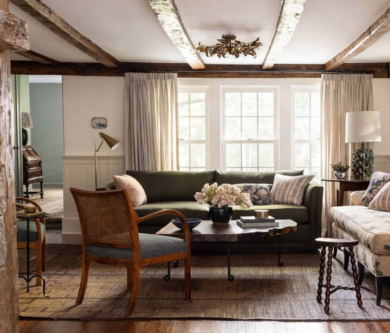
As mentioned, chair rails can be used in conjunction with other wall treatments, which accentuates the charm and appeal of older homes. In this living room by Heidi Caillier, beadboard is placed below a chair rail, painted a soothing shade of greige, and paired with creamy white walls. This subtle dose of color adds warmth yet doesn't compete with the enviable hand-hewn ceiling beams or overwhelm the low ceilings.
Becky Shea, founder and creative director of BS/D, wholeheartedly agrees, saying, "I love a good chair rail that has beadboard or shiplap meeting its edge. I personally love when you go really dark and bold and create layered contrast with some type of wallpaper application or [conversely] go completely monochromatic. Certain colors I'd consider are Iron Mountain and Dakota Woods Green by Benjamin Moore."
Get the look: PPG Paints Commercial White and Sherwin-Williams Repose Gray
2. Blush Pink and Black
 Neptune
The color black is a versatile shade that works with a range of interior design styles, including this Scandinavian-inspired kitchen seen on Neptune. Pair it with blush pink as a warm alternative to more predictable high-contrast pairings, such as black and white, for a result that's elegant and feminine while still having a strong foundation.
Get the look: Farrow & Ball Peignoir and Farrow & Ball Railings
3. Mint Green and Yellow
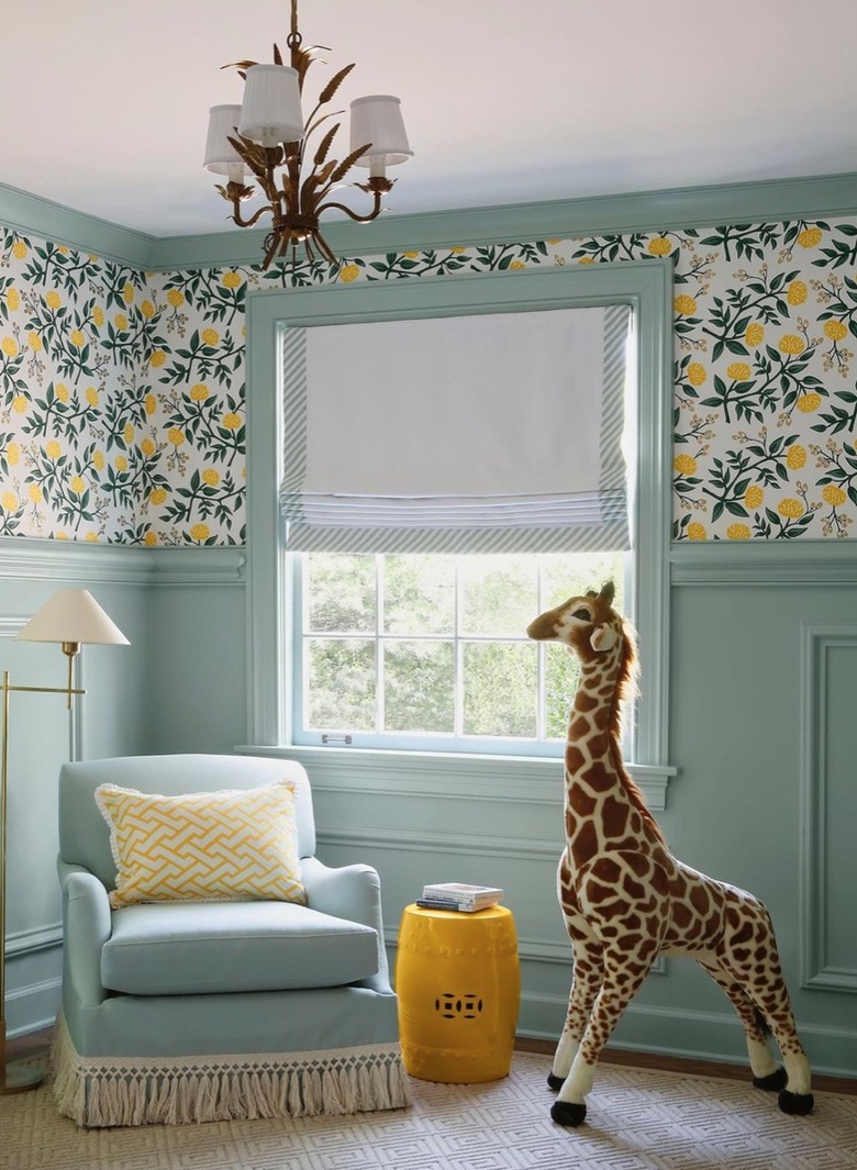 Sabbe Interior Design
If you crave a bolder approach, in lieu of painting a color above (or below) your chair rail, consider wallpaper. This gender-neutral nursery by Sabbe Interior Design flaunts a cheery lemon motif above a mint green chair rail and lower wall. The result is a timeless and age-appropriate haven that will easily evolve from nursery to bedroom.
Jessica Kain Barton, principal at J Kathryn Interiors agrees, saying, "Of course, if you're me, there is nothing more on point than painting the chair rail, bottom wall, baseboards, and crown [molding] the same color and wallpapering the upper wall. Any of these create a major moment for a simple architectural trim detail many would miss otherwise."
Get the look: Serena & Lily Somerville Wallpaper and Benjamin Moore Seabrook
4. White and Forest Green
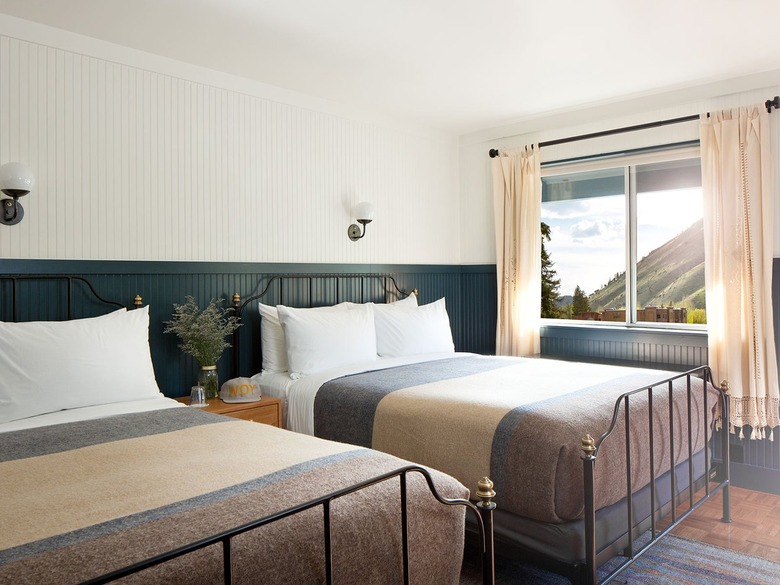 The Anvil Hotel
White and green are popular shades for bedrooms thanks to their relaxing and calming properties. This guest room spotted at The Anvil Hotel gives the duo a unique spin by first blanketing the walls in floor-to-ceiling beadboard divided evenly with the addition of a chair rail. The two-tone wall gives the space a refreshingly clean look with depth.
Get the look: Benjamin Moore Super White and Benjamin Moore Martha's Vineyard
5. White and Brown
 Jessica Helgerson Design
Lend a more natural look to your chair rail detail by staining it a rich shade of chocolate brown. This sitting room by Jessica Helgerson is the perfect example of how a chair rail, and wall molding in general, can transform a small space. Carrying the same dark wood finish from the floor up to the lower half of the walls maintains continuity and doesn't visually break up the space, something particularly important in spatially challenged rooms. White walls above reflect natural light and keep the space feeling welcoming and warm.
Get the look: Benjamin Moore Swiss Coffee and Home Depot Walnut Wood Stain
6. Beige and Peach
 Heidi Caillier Design
Chair rails afford another opportunity to introduce a bold color without overwhelming your space. Take this elevated living room by Heidi Caillier, for example. If the entire wall was painted a bright shade of peach, the hue would compete with the other beautiful elements in the room. However, since it is limited to the bottom third of the wall, and paired with white, it works to emphasize particular architectural features and adds welcome contrast.
Get the look: PPG Silver Feather and Farrow & Ball Book Room Red
7. White and Sage Green
 Raili CA Design
It's easy to get carried away with color in kid-oriented spaces, which can look dated or juvenile quickly. A muted shade such as sage green is an enduring hue that can be youthful or grown-up by merely switching out accessories and decor. In this moody bedroom, Raili CA Design opted for a khaki-colored chair rail and board and batten paneling for the bottom portion of the wall, which functions as a headboard and anchors the space. She balanced the look with cool white.
Get the look: Benjamin Moore Super White and Benjamin Moore Springfield Sage
8. Sky Blue and Pale Blue
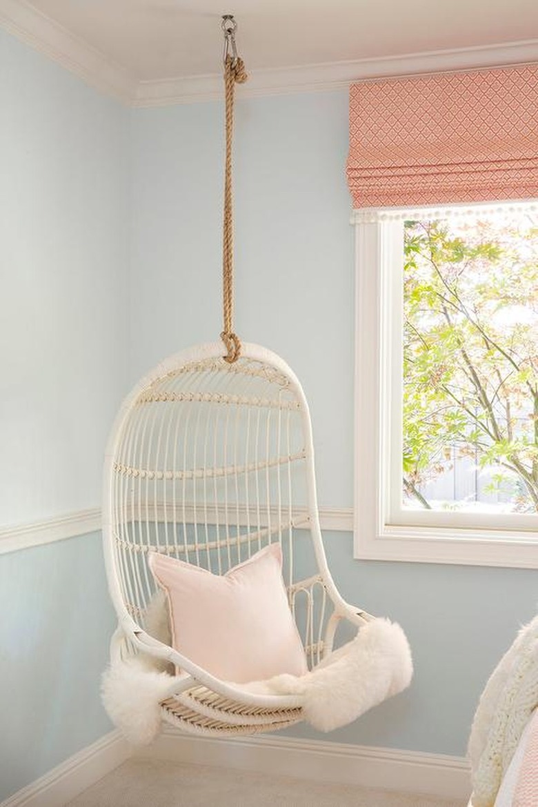 Lauren Evans Interiors
Allow the chair rail molding to pop against the top and bottom halves of the wall by painting it a completely different color. You can prevent the idea from reading busy by selecting hues from the same color family and employing white as an accent wall color, as Lauren Evans did in this bedroom. Dual shades of pale blue are simpatico, creating contrast while maintaining cohesion and allowing the white trim and chair rail, hanging rattan chair, and peach Roman shade to complete the relaxed and coastal vibe.
Jessica Kain Barton, principal at J Kathryn Interiors is a fan of tone-on-tone ideas as well, saying, "You can't go wrong painting everything the same color for a more contemporary take on a traditional design element. However, if you are looking for a little differentiation, you can paint the chair rail, baseboards, and crown [molding] all a beautiful color and the walls either a slightly less saturated version of the same color or completely contrast with a bright white."
Get the look: Benjamin Moore Icy Blue and Benjamin Moore Heaven on Earth
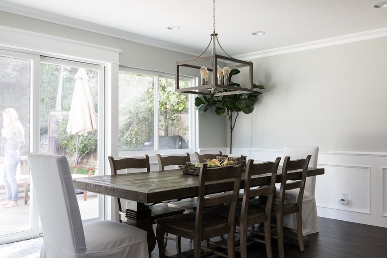
9. White and Greige
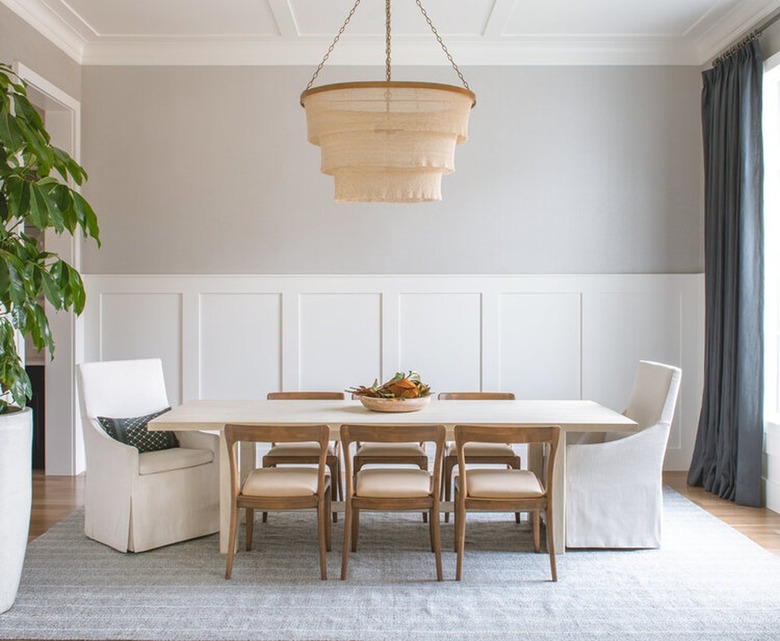 W Design Collective
In this charming dining room by W Design Collective, a greige and white color palette add loads of sophistication. The board and batten wall paneling echoes the ceiling, providing visual interest to an otherwise neutral and subdued setup. Charcoal gray curtains add the perfect dash of contrast.
Get the look: Clare Greige and Benjamin Moore Chantilly Lace
10. White and Pink
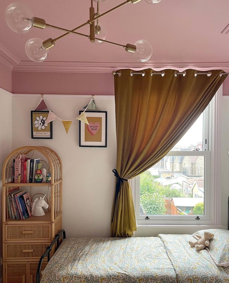 Instagram @adamsfamilyreno
Chair rail placement and color choices can do wonders at creating the illusion of taller or shorter ceiling heights. A higher than usual chair rail in this sweet little girl's bedroom spotted on @adamsfamilyreno makes a lofty ceiling appear lower, while the addition of pink trim that extends onto the ceiling creates a cozy vibe. Mustard-hued drapes help ground the look.
Get the look: Sherwin-Williams Memorable Rose and Sherwin-Williams Ibis White
11. Gray and White
 Chango & Co.
Chair rails aren't solely for traditional homes. The key to making them work in more contemporary and modern homes is color selection and placement. Many designers prefer painting everything a singular color from floor-to-ceiling, so the chair rail adds depth and interest without distracting, but this can also be achieved using two hues — as long as there isn't much contrast. The folks at Chango & Co. nailed the look in this streamlined foyer using gray and white.
Get the look: Benjamin Moore Decorator's White and Benjamin Moore Gray Cloud
12. White and Black
 Stacy Zarin Goldberg for Zoë Feldman Design
Make the dining room feel like its own unique space with the help of ornamental molding and patterned wallpaper. In this home by Zoë Feldman, a black and gray striped wallpaper covers the ceiling and upper portion of the wall, with the stripes running in opposite directions. To balance the busy pattern, the chair rail, lower portion of the wall, crown molding, and trim flaunt a cool shade of white.
Get the look: Norwall Simply Stripe 2, $25.04 per double roll and Behr Frost
13. Mustard Yellow and White
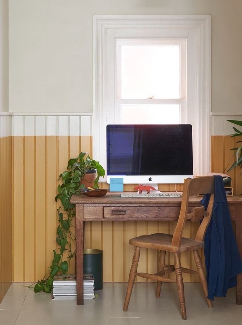 Farrow & Ball
Break the rules: While chair rails are a natural delineation for paint placement, stopping paint a few inches below or above the chair rail is a playful and unexpected way to emphasize the architectural detail. In this home office spotted on Farrow & Ball, a shade of mustard yellow paint stops just shy of the chair rail, where a cream paint color meets it and continues vertically to the ceiling. The result emphasizes the tongue and groove wall treatment and imparts a whimsical note.
Get the look: Farrow & Ball House White and Farrow & Ball India Yellow
14. Teal and White
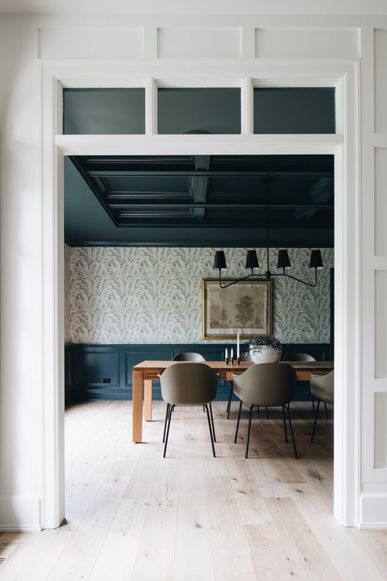 Jean Stoffer Design
Chair rails originated in dining rooms, so it's no surprise that today they still look fitting in this setting. In this striking setup by Jean Stoffer, a soothing color scheme made up of dark teal, white, and gray is the star of the show. The dramatic blueish-green hue on the ceiling and lower portion of the wall is separated by a cool white and gray floral wallpaper pattern, creating the perfect balance of light and dark.
Get the look: Magnolia Home Forest Fern Wallpaper, $150 per double roll and Benjamin Moore Dark Teal
Things to Consider When Painting Walls With Chair Rails
Things to Consider When Painting Walls With Chair Rails
Chair rails are an undeniable way to personalize rooms and add depth and interest to blank walls. Although selecting paint for the classic detail and the surrounding walls is a personal choice, there are a few things to keep in mind to help ensure positive results:
- Paint colors can look vastly different from room to room and throughout the day. Before you commit, test out different shades with paint samples and see how they look as the light shifts — both artificial and natural light can greatly affect the way colors appear in your space.
- Even professional designers refer to the color wheel to guide their color pairings. You won't go wrong with complementary shades (those located opposite from one other on the color wheel) or analogous hues (those located next to one another).
- Pay attention to paint undertones.
- A room's overall design style and aesthetic will influence the chair rail's placement and color selection. If your ceilings are low, consider placing the chair rail higher than the standard 36 inches. And for a more streamlined, clean look, select colors with less contrast — say white with gray.
- Using dark colors below a chair rail will help anchor the space.
- Avoid using dark colors above a chair rail in tiny spaces or they will appear cluttered and even smaller.
Best Two-Tone Color Ideas
Best Two-Tone Color Ideas
Now that we've gone over a few inspiring ideas and helpful tips to keep in mind when it comes to color ideas for walls with chair rails, it's time to make some tough decisions. Just to recap, the following list contains some of our favorite wall color combos worth considering for your own space:
- White and Beige
- Pink and Black
- Mint Green and Yellow
- White and Forest Green
- White and Brown
- Beige and Peach
- White and Sage Green
- Sky Blue and Pale Blue
- White and Greige
- White and Pink
- Gray and White
- White and Black
- Mustard Yellow and White
- Teal and White