20 Colors That Perfectly Complement And Enhance Pink
Pink continues to be a go-to color in the world of interior design. Although it feels like a relative newcomer that began with millennial pink fervor, pink has actually been used in homes since the 18th century. Once regarded as a daring option outside of nurseries and little girls' rooms, today, pink has firmly established itself as a restful backdrop in its palest form — as well as a vibrant option when most saturated — that can be used in any space. Often associated with love, romance, and tenderness, light pink can evoke feelings of calm and whimsy, whereas bolder shades can be surprisingly energizing.
"Don't underestimate the color pink! It's not just for little girls' rooms anymore," says Hema Persad, founder and principal designer at Sagrada Studio. "Earthy pink tones can be soothing and uplifting on walls and ceilings, [on] a living room sofa, or in a bedroom ... If you aren't ready to commit to pink walls, give it a try by mixing and matching bed linens or throw pillows in different shades of pink."
Despite its youthful, girly connection, pink has become a sophisticated choice for both public and private spaces, and adds elegance wherever it's applied. And although we are all for including bold swaths of the hue through paint, furniture, tile, and even appliances, you really don't need much to make an impact. Small doses of pink can be incorporated with easy-to-swap accessories and home decor, such as pillows, throws, vases, bowls, and trays, not to mention that it pairs easily with a number of colors, from white to yellow to green. Keep in mind that the room's aesthetic and overall ambiance will be dictated by the shade of pink selected.
Colors That Go With Pink
Colors That Go With Pink
When it comes to weaving the rosy hue into an existing scheme, having a solid grasp on the color wheel can be a major plus. If you're looking for a high-contrast pop, pair pink with its complementary shade, green, which is located on the opposite side of the color wheel. For a more subtle look, combining pink with analogous hues (those located directly next to it) will result in a tonal palette with depth.
When determining which colors you want to use with pink, it's important to keep in mind that all hues can be categorized as either cool or warm. Where a color falls on the spectrum affects a room's overall mood or feeling. For example, warm shades, like red, orange, and yellow, are energizing and breathe life into spaces. For a calm and soothing vibe, opt for cool hues, such as greens, blues, and purples. And surprisingly, even neutral colors, like white, cream, and gray, can work well with pink depending on their undertones.
There's no shortage of inspired ways to elevate shades of pink, but to help narrow down your choices, we've taken the liberty of rounding up the best colors to pair with the rosy shade.
|
Neutral Colors |
Warm Colors |
Cool Colors |
|
White |
Red |
Sage Green |
|
Cream |
Orange |
Navy blue |
|
Light gray |
Yellow |
Purple |
|
Charcoal gray |
Rust |
Turquoise |
|
Black |
Burgundy |
Kelly green |
|
Taupe |
Brown |
Cornflower blue |
|
Greige |
Peach |
Light blue |
20 Pink Color Combinations
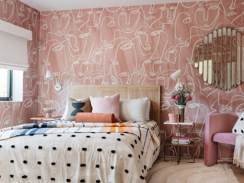
1. Pink and Orange
For a sunset-inspired look, consider pairing pastel pink with another warm color, like orange. And And And Studio did just that in this bedroom, and the result is a dreamy combo that beckons you to sleep a little longer. Invest in a bespoke orange headboard and blush pink bedding; then, pull the scheme together with pale orange drapery that lets in plenty of natural light. While this pairing works perfectly in a bedroom, it would also be a delightful option for a home office or a playroom.
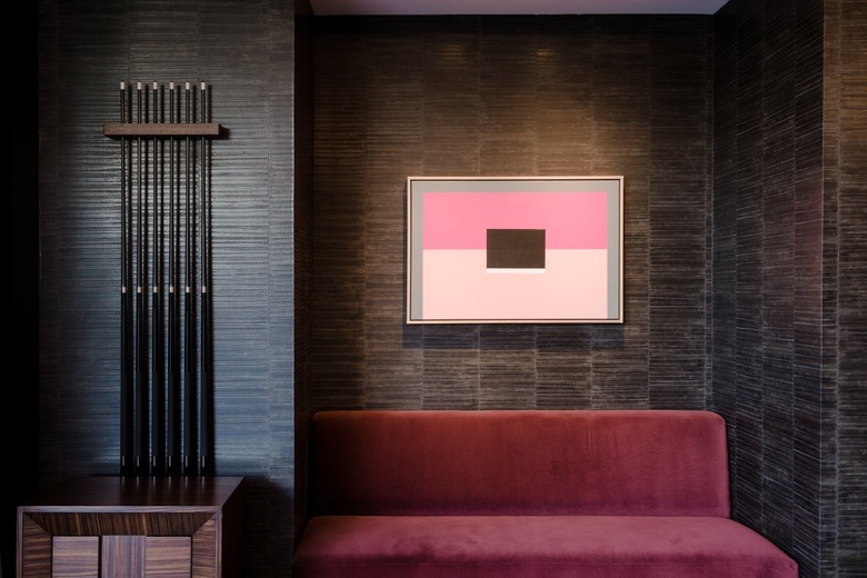
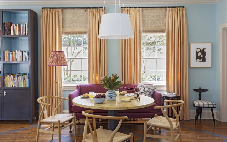
2. Pink and Burgundy
 Stacy Zarin Goldberg for Zoë Feldman
If you're going for rich contrast, consider pairing blush pink with a dark and moody burgundy shade. Interior designer Zoë Feldman showcases how powerful the color combo can be in this intimate breakfast nook. But the key to making this one work is sticking to a reserved palette of slightly saturated neutrals — here, that comes by way of the walls, lighting, and furnishings — and contrasting that with accent pieces in vastly darker tones.
3. Pink and Brown
 Stephen Paul for Hunker
As brown is a deep warm color, pairing it with pink creates a layered palette of related hues. While it might not seem like an intuitive match for pink, when used correctly, brown really does make a stunning companion. For example, this luxe game room nook showcases chocolate brown walls paired with a fuchsia pink bench and blush-hued artwork, resulting in a decadent scheme that instantly amps up the drama.
4. Pink, Navy Blue, and Green
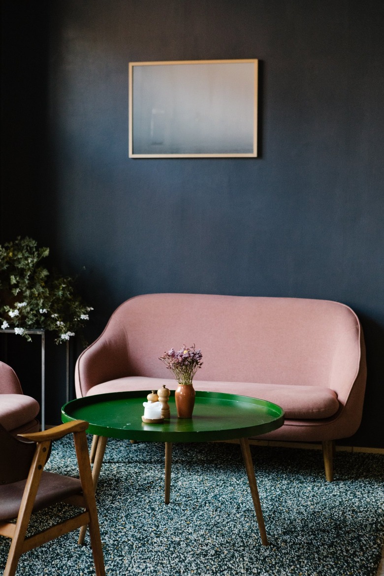 Nicole Mason
Speaking of high drama, this color combination is exactly that. Here, matte navy blue walls make a stunning backdrop for a pair of soft pink loveseats, allowing them to take center stage, while the emerald green coffee table is the icing on the cake. We love how the modestly sized abstract painting on the wall echoes the blue and pink scheme beautifully. And although this moody palette is perfection in an elegant lounge area, it would also look right at home in a bedroom.
5. Pink and Turquoise
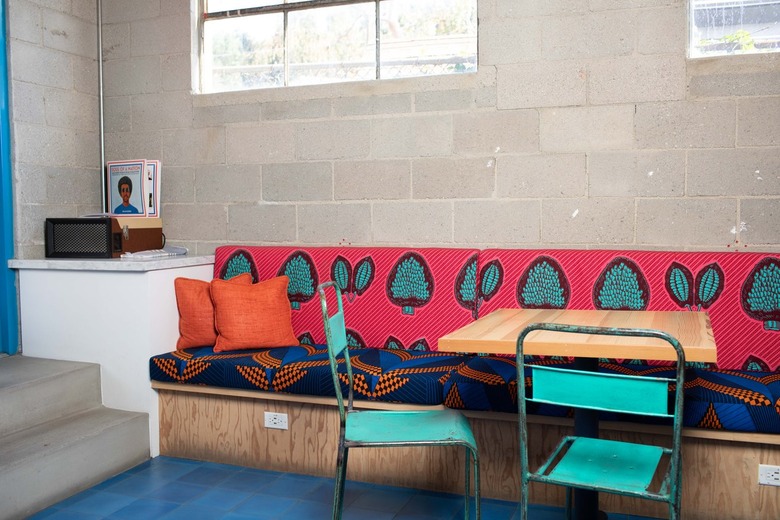 Stephen Paul for Hunker
Decorating with the color turquoise can be tricky, especially when attempting to pair it with an equally vibrant color, like hot pink, but the dynamic bench upholstery in this dining room is a lesson in doing it well. To make the combo feel fresh and modern, pair it with a few other saturated shades, as demonstrated by the blue and orange seat cushion and the blue flooring. Balance the strong dose of color by keeping the surrounding elements a bit more neutral (here, that would be the gray cinder block walls and light wood accents).
6. Pink and Red
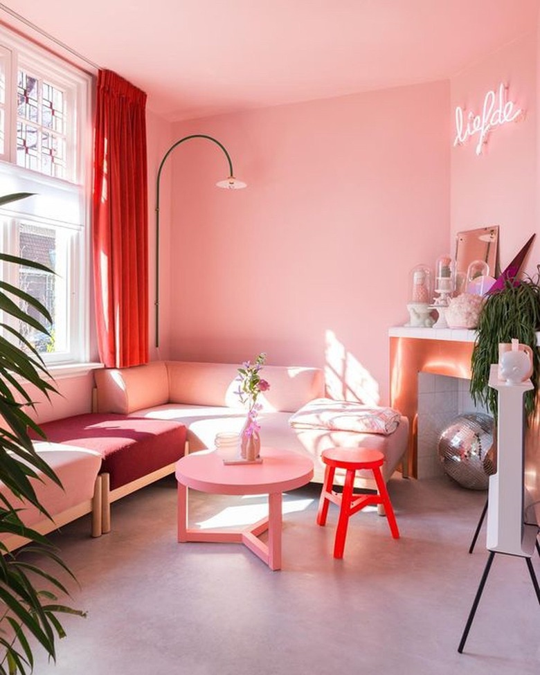 Instagram @zilverblauw
Consider red and pink a true power couple. Since pink is born from red, the two make for an effortless color palette and can be implemented in a wide variety of schemes. Aim for bold contrast between the hues, as seen in this living room belonging to Anki from Zilverblauw, to keep the finish chic and elevated. If you're feeling brave, follow the creative's lead and paint all of the walls and the ceiling in a rosy shade of pink.
7. Pink and Yellow
 TfDiaries by Megan Zietz
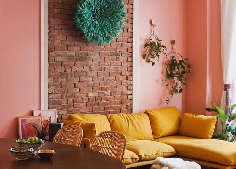
Mixed together, pink and yellow may make orange, but set against one another, the duo can offer a revitalizing contrast that feels fresh and contemporary. Don't just take our word for it — this colorful, modern living room belonging to Megan Zietz of TfDiaries is all the proof you need. She chose a rosy shade for the walls that is strong enough to hold its own next to her mustard yellow sectional sofa. Together (with a classic brick accent wall), the combination feels blissfully warm and inviting. We can just imagine this color palette in a nursery or kid's bedroom.
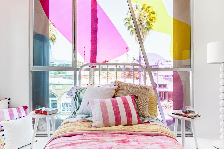
8. Pink and White
 Hunker in Partnership with Acme Real Estate
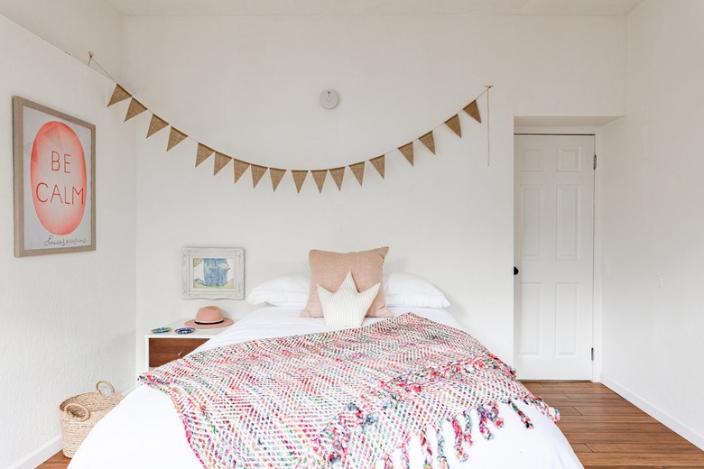
You can't go wrong combining pink with a classic neutral, like white. In this dreamy bedroom, the pair combines in effortless harmony, creating a darling escape that can only be achieved through color. Pairing the rosy hue with a pale neutral, like white or gray, is a surefire way to temper any shade of pink.
9. Pink and Kelly Green
 The Courts
If you stop to think about it, a pink rose looks so perfect because it embodies a pure balance of pink and green. Although the two shades are seemingly made for each other, the saturation level of each color can result in vastly different outcomes. In the case of this culinary setup, a muted blush hue helps neutralize the brightness of kelly green, resulting in a playful pairing with many potential applications.
10. Pink and Cornflower Blue
 2LG Studio
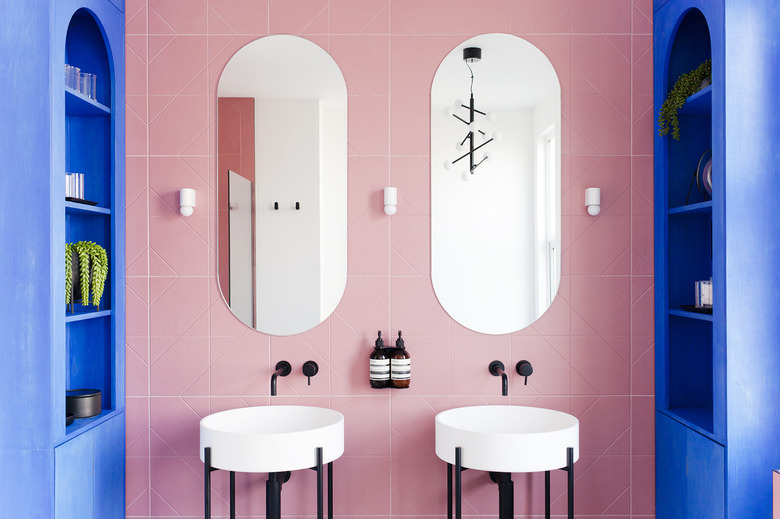
Pink and blue are oftentimes used together in kids' spaces. However, more saturated shades, like the cornflower blue and bubblegum pink hues used in this modern bathroom by 2LG Studio, give the youthful combo a grown-up twist. Punctuated by curved silhouettes and black accents, the color-blocked space makes a bold statement that's hard to forget.
11. Pink, Black, and White
 Oh Joy!
Give pale pink a grown-up makeover by pairing it with black and white. Clearly, Joy Cho of Oh Joy! got the memo, as she used the sophisticated scheme to transform this bedroom. The whimsical pink refuge feels light and airy with a hint of contrasting edge thanks to a small dose of black in the form of a polka-dot duvet cover.
12. Pink, Ochre, and Blue
 Sarah Sherman Samuel
On the other hand, if black is a little too bold for your tastes, follow the lead of interior designer Sarah Sherman Samuel and consider pairing pink with blue with a dash of ochre instead. She successfully employed the trio in this darling nursery, and we can't tear our eyes away. Traditionally, nurseries are drenched in soft pastel shades, but we love the modern twist using bolder hues. The end result is a little more sophisticated and design-forward yet still feels sweet and playful.
13. Pink and Sage Green
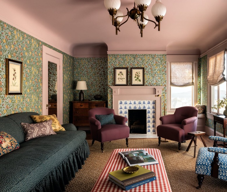 Heidi Caillier Design
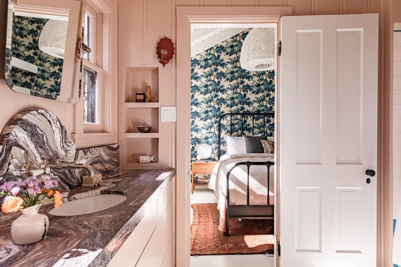
When it comes to subtle backdrops, white, gray, and black are often top of mind, but allow us to suggest using light pink instead. The rosy hue can serve as a practical backdrop for various patterns and colors while still managing to hold its own. In this cottage-inspired living room by Heidi Caillier, a blush ceiling and plenty of pink trim anchor a space that's bursting with colors and patterns, including sage green wallpaper, a red and white checkered ottoman, and a pair of aubergine club chairs.
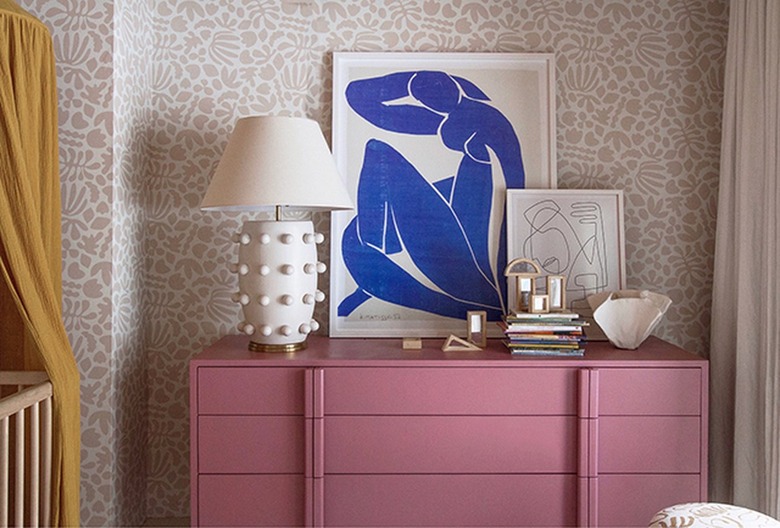
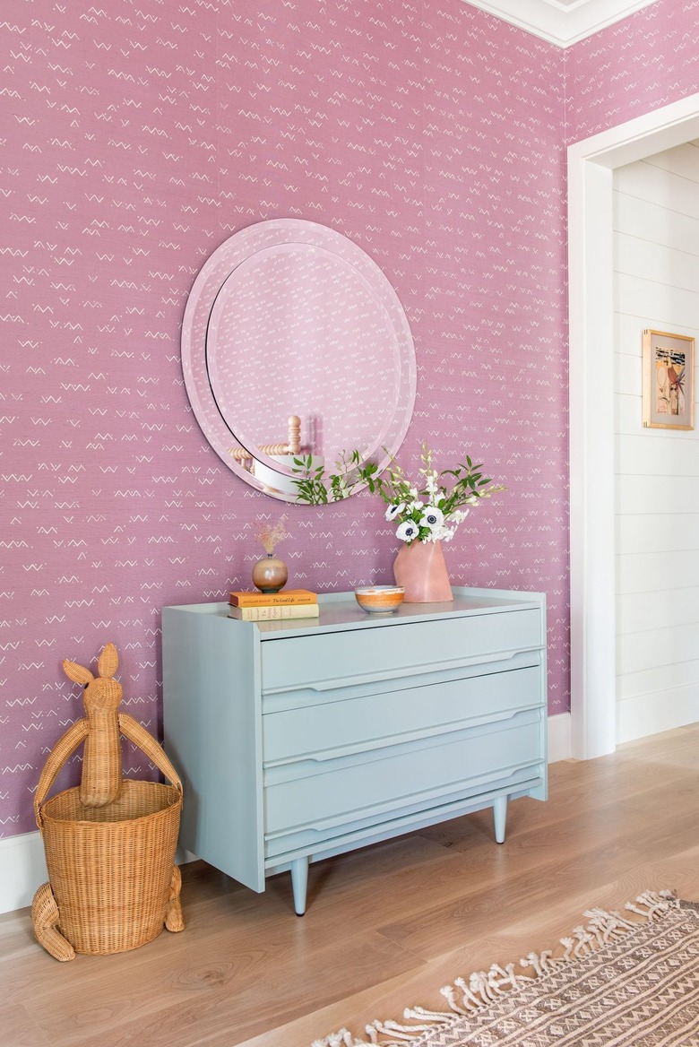
14. Pink and Greige
 Jessica Helgerson Interior Design
Lighter than gray and a bit darker than beige, greige is a pleasing neutral shade that adds depth and an almost imperceptible contrast to rooms. Although greige looks stunning with any number of colors, it makes a sophisticated counterpoint for pink, adding warmth and an earthy note. Jessica Helgerson used the color story in a cozy corner of a loft in Portland, where a pastel pink chair punctuates a predominantly creamy space and effectively becomes a chic centerpiece.
15. Pink, Peach, and Robin's Egg Blue
 Angie Hranowsky
Mixing pink with a spectrum of other hues is more difficult than the pros — like Angie Hranowsky, who has mastered the art of creating high-impact rooms — make it look. It's important to practice restraint, or you run the risk of designing a space that feels chaotic and disjointed. In this sorbet-inspired dining room, Hranowsky deftly uses shades of pink like fuchsia and peach alongside two shades of blue to create a perfectly edited space that manages to be both playful and elegant.
16. Pink and Olive Green
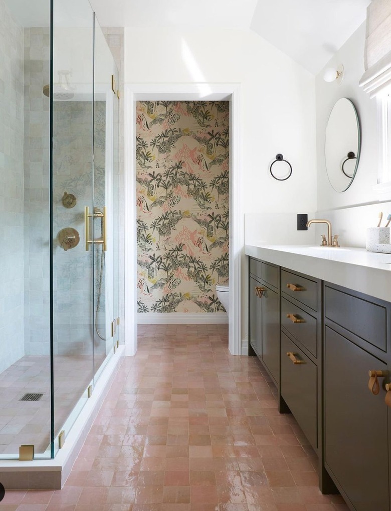 Veneer Designs
Complementary colors, or hues located opposite each other on the color wheel, are a no-fail pairing. With a tint of red (which is green's complementary shade), it's no wonder that pink and green look so splendid together. For instance, in this bathroom, Veneer Designs paired rose zellige floor tiles chock-full of character and charm with a vanity cabinet coated in dark olive green. It's a departure from the more traditional (read: bright) pink and green shades but no less stylish.
17. Pink and Light Blue
 Cortney Bishop Design
Juxtaposing warm and cool tones results in spaces that have an alluring tension. While blue and pink have an undeniable connection to cheerful kids' rooms, they often look juvenile in that setting. Cortney Bishop combined the two youthful shades in this bedroom yet managed to make them look elevated. In order to introduce a bit of edge and to keep the scheme from feeling overly sweet, Bishop paired a subtle pink wallpaper pattern that adds interest and depth to the walls with a streamlined dresser in powder blue.
18. Pink and Black
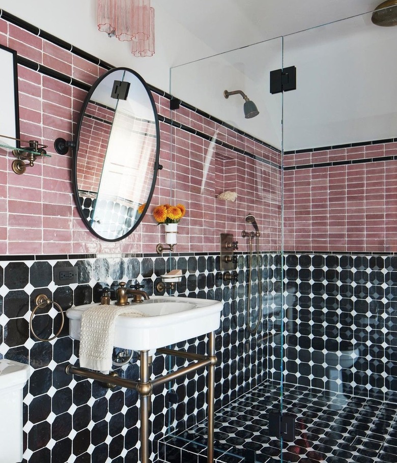 Instagram @blacklacquerdesign
Create a wow-worthy design moment even in a small space by pairing pink with black. Juxtaposing pink's sweet side with an edgy hue (like black or chalky gray) adds a dose of modernity and a welcome sense of drama that belies the blush shade's inherent innocence. Black Lacquer Design took this traditional bathroom to the next level by pairing pink subway tile with graphic black and white tile.
19. Dark Pink and Light Pink
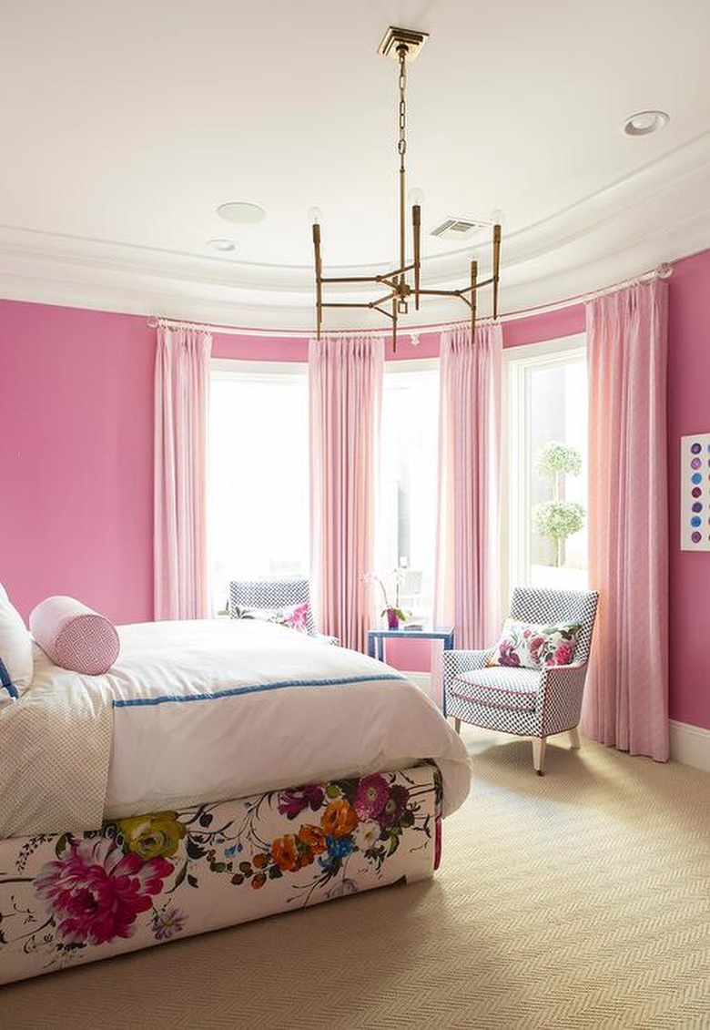 Caitlin Wilson Design
Layering colors from the same family in varying tones creates a cohesive look with subtle contrast and plenty of interest. Double down on different shades of pink, as Caitlin Wilson did in this glamorous bedroom, to break up an expanse of the color and prevent it from falling flat. Floor-to-ceiling flowing curtains in light pink soften bright rose walls and lend sophistication. A gold chandelier is a luxe addition.
20. Pink, Taupe, and Gray
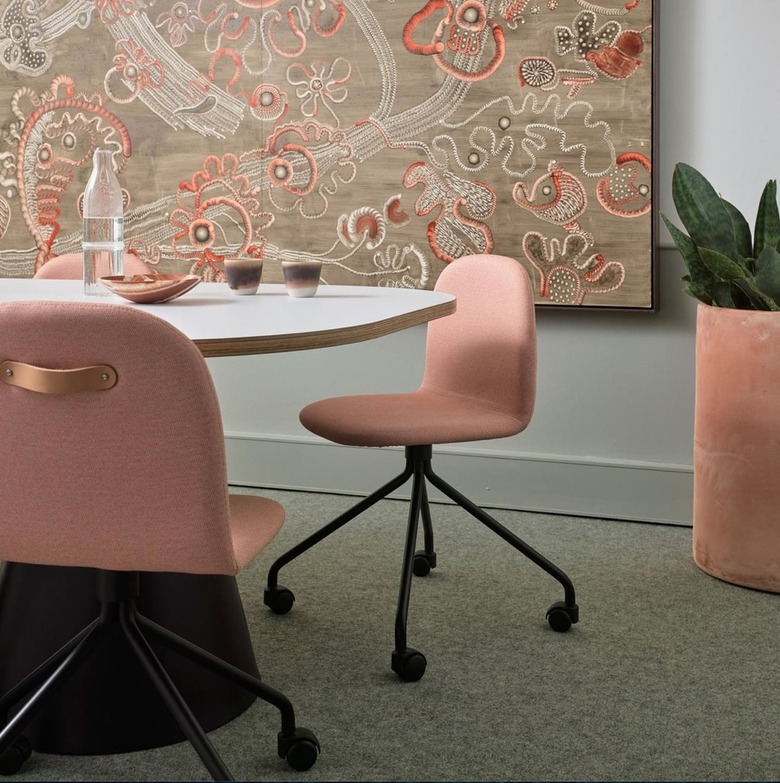 Arent & Pyke
Artwork is an easy (and often overlooked) way to echo a color pairing and inject pattern. Arent&Pyke selected a large floral canvas in taupe (a warm neutral) and blush to bring to life a conference room in the headquarters of wellness brand Vida Glow. Eschewing the standard sterile stereotype, this soothing space exudes elegance, softness, and the perfect amount of color thanks to the two soft hues and mood-boosting greenery.
Q&A
Q&A
References
What color family is pink?
A combination of red and white, pink is classified as a tint. And thanks to its red base and yellow undertones, pink is considered a warm hue. However, there are some cooler shades that are infused with blue undertones.
What are the benefits of pink color?
A derivative of the primary color red, pink comes in so many different shades, ranging from light pastel to neon fuchsia, which explains why the hue can play to a wide variety of decor styles and makes it easy to find colors that go with it. This wide spectrum also makes it possible to employ pink in so many different ways to evoke a particular mood or feeling.
"Pink has long been considered a color strictly for feminine spaces. But with its vast variety of hues, this color has the capacity to be applicable throughout the home. For example, dusty pinks are gorgeous ... Or using a powder pink to [add] contrast in a modern space creates a sense of juxtaposition, which will embolden a more modern aesthetic," says Emma Kemper, principal designer at Emma Beryl Interiors.
If you're looking to create a room bursting with personality and energy, pair a saturated pink with a vibrant shade, like ochre, violet, or teal. For softness and tranquility, look no further than blush pink combined with gray, beige, or white. The color pink works equally well on accent pieces as it does when it's applied from floor to ceiling. This versatility makes the blush shade an enduring color that designers turn to again and again.