What Are Analogous Colors? Here's Everything You Need To Know

It's no secret that neutral paint colors have reigned supreme in the world of interior design over the last decade, yet we can't help but wonder: How many of us are defaulting to neutral colors because they're our preference, and how many of us are choosing them simply because selecting a color palette is a daunting task? If the latter rings a bell, then allow us to introduce you to analogous colors.
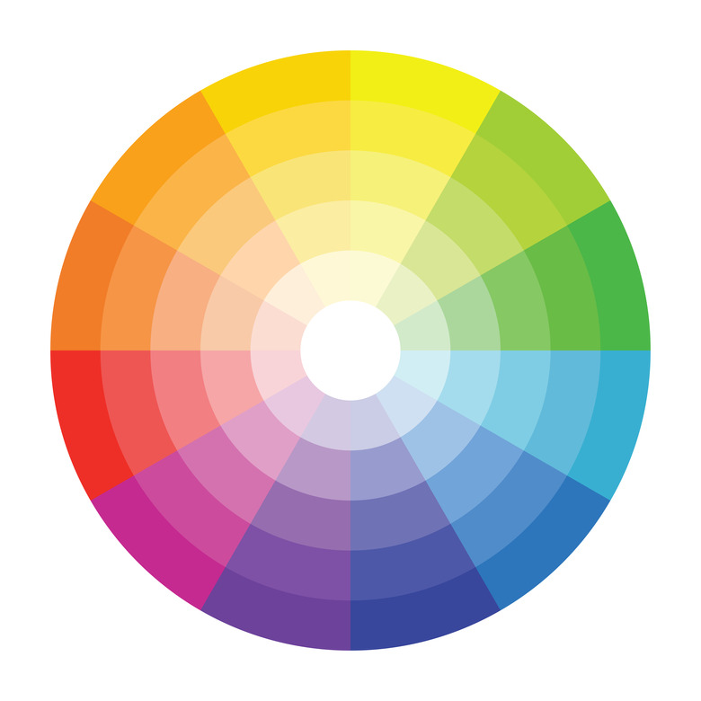
While the term may not sound familiar right away, chances are you've seen plenty of palettes that apply this exact color idea. Analogous schemes are made up of three hues that sit directly next to one another on the color wheel — including one primary, one secondary, and one tertiary color, creating an "analogy" or close relationship between these hues. Let's get even further into the nitty-gritty of color theory, something that many interior designers swear by. Primary colors are pure, or unmixed — this includes red, yellow, or blue. Meanwhile, a secondary color is created by mixing equal parts of two primary colors. For instance, this means that green is produced by equally mixing yellow and blue.
If you're wondering about the difference between secondary and tertiary, a tertiary color (also known as an intermediate color) is made by mixing equal parts of a primary color and tints of its closest secondary color on the color wheel. These are yellow-green, blue-green, yellow-orange, red-orange, blue-violet, and red-violet. Additionally, complementary colors result when two hues that are opposite from one another on the color wheel are combined, resulting in white or black. Simply put, mixing colors will produce new colors.
 Juan Ignacio Rodríguez Moronta/iStock/GettyImages
For an analogous scheme, the ratio between the colors should be 1/3 each, since three shades next to each other on the color wheel are analogous. These hues don't all have to be wall colors — they can also be represented through furniture, rugs, accents, and accessories. To create balance with these colors, inject a neutral or two into your space, either through the carpet, wood finishes, or a decorative piece or two. For contrast, you can't go wrong with a few black accents. Though these shades are similar to one another, analogous schemes create a bold look that's pleasing to the human eye, something that's certainly a departure from a monochromatic color palette. And best of all? They make color selection virtually foolproof.
"If you want an analogous color scheme in your home, think carefully," says design expert Amanda Lauren. She cautions, "If you're using bold colors like pink, purple, orange, or yellow, know it's a commitment that's not easy or inexpensive to undo if you change your mind." And Anna Franklin, designer and founder of Stone House Collective, believes that an analogous palette looks best when it's layered. She says, "When working with an analogous color scheme, adding in layers of texture is important to make sure the design stays multidimensional and interesting. Layer with different textiles, fabrics, and patterns in slight variations of the color in the space; this will highlight the different dimensions of the color scheme you are working with while making sure the design doesn't look flat or uninteresting."
Ready for a little inspo? Keep scrolling for five of our favorite analogous color ideas that are sure to add zest to any room.
1. Yellow, Yellow-Green, Green
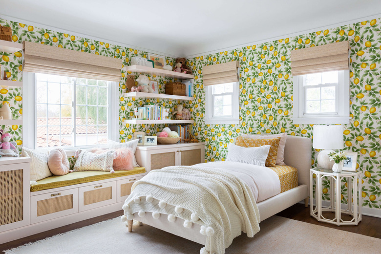
1. Yellow, Yellow-Green, Green
Thanks to patterned wallpaper that effortlessly ties in both green and yellow, this kid's room by Ginny Macdonald makes a bright and colorful statement. A chartreuse-colored window seat brings in the combined shades of yellow and green, while the golden, yellow-hued bedding keeps the overall look sophisticated.
This is a seemingly bright scheme, with the analogous colors tempered down by neutral shades throughout the rest of the space. This approach works beautifully with farmhouse style or anything that leans toward transitional styling. Capture the look for yourself by selecting wallpaper in the analogous yellow, yellow-green, green color combo, mixing it with neutral textiles and wood finishes to balance the colorful design.
Lauren agrees with this neutral-meets-bright-hued approach, saying, "The only way to make [an analogous color palette] work every time is by opting for neutrals like beiges, whites, and grays, or even some shades of blue. Remember, the bolder the color scheme, the bigger the risk."
2. Green, Blue-Green, Blue
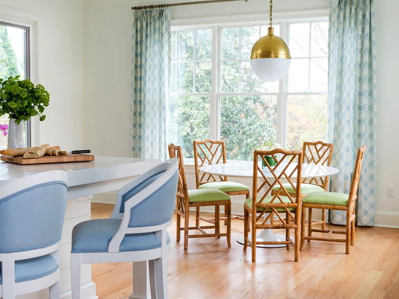
2. Green, Blue-Green, Blue
The analogous color palette in this dining room designed by Anna Matthews Interiors manages to feel fresh and simple, while still bringing in plenty of colorful details through textiles. Patterned drapery ties in the mix of blue-green and green shades, while blue barstools complement the light green dining chairs.
When it comes to color combinations, this one, brimming with cool shades, is quite soothing. It feels toned down and as such works nicely in traditional or coastal interiors. Incorporate the look in your own home with the help of curtains or other textiles, then weave in furniture pieces showcasing shades of green, blue-green, and blue.
3. Red, Red-Orange, Orange
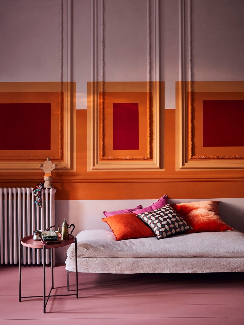
3. Red, Red-Orange, Orange
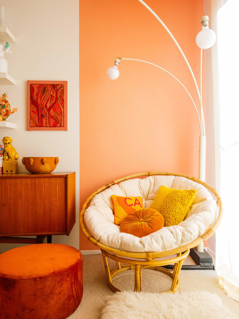
If warm colors are more to your liking, look no further than this vibrant living room swathed in red, red-orange, and orange by Annie Sloan for inspiration. To keep the mix of red and orange details from feeling overwhelming or harsh, pair them with neutral, large-scale pieces that will create a refreshing sense of calm against an energetic palette.
Going off of violet as a base color, this space is a bright way to incorporate analogous colors into a room. It's not for the faint of heart, but it pays off in a mural, and accompanying accents, that'll turn heads. These colors will work best in a contemporary space that isn't afraid to be artistic. Have freedom with your paint colors in shades of red, red-orange, and orange, and choose an anchoring shade, like violet, to bring it all together.
4. Blue, Blue-Violet, Violet
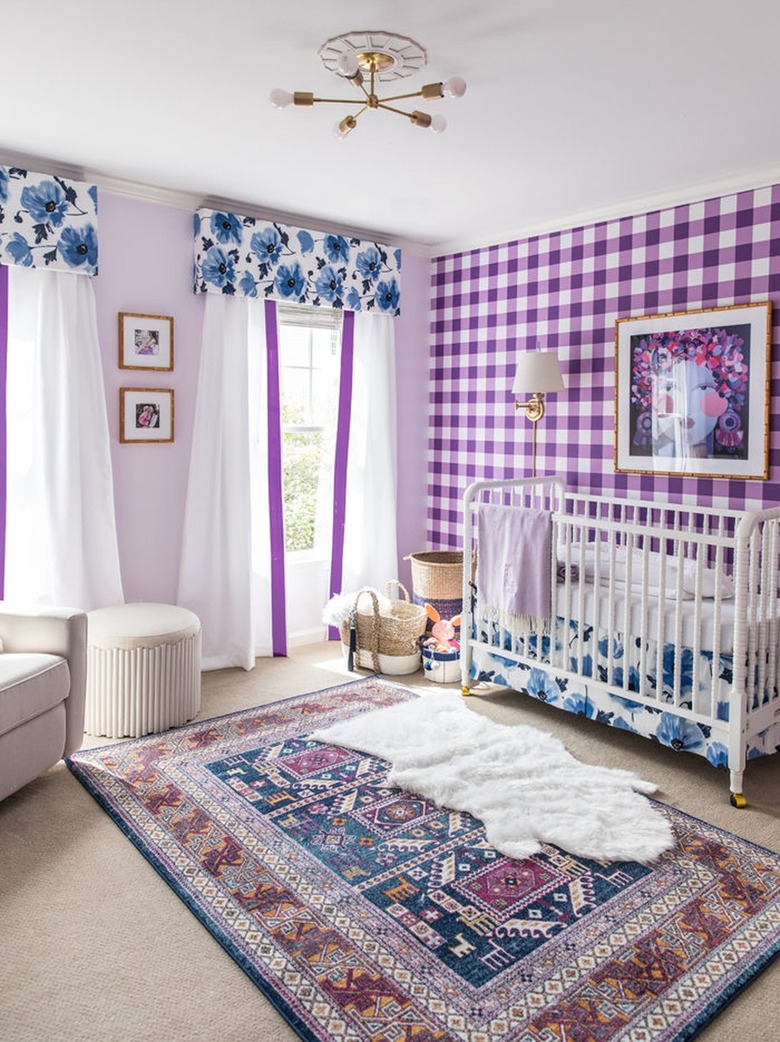
4. Blue, Blue-Violet, Violet
For true color harmony in a space, turn to the analogous combination of blue, blue-violet, and violet. It's a mix spotted in this dreamy nursery designed by Mallory of Style Your Senses. Shades of violet and blue-violet take center stage, while blue acts as an accent color. It's a bright combo that works seamlessly in children's rooms, or even home offices that could benefit from a little pizzazz. Recreate the look by being unafraid to mix these hues with patterns, such as the purple and white plaid accent wall seen here.
5. Orange, Orange-Yellow, Yellow
5. Orange, Orange-Yellow, Yellow
Leave it to Dabito of Old Brand New to flawlessly execute an analogous color idea in this living room. The orange velvet ottoman and yellow-orange accents perfectly balance the sunny yellow decor. Bringing in warm wood finishes keeps the entire space feeling grounded and grown-up.
Although it appears that orange is the dominant color in this space, it's complemented nicely by the yellow-orange and yellow hues that accompany it. If you're all about sunny shades, this vibrant scheme is right up your alley. The bold color palette would fit right into contemporary, artistic spaces, or ones with boho flair. Replicate the visuals by snatching up vintage finds showcasing these colors and painting part of the wall orange. While it might seem like the color-blocking effect would overwhelm the room, it actually adds a nice cheery pop.