Never Heard Of Tertiary Colors? Well, Now That You Have, You'll Be Obsessed
Have you studied up on color theory lately? Well, we did, and even though it sounds technical, color theory isn't as lofty as you might think — in fact, it's actually pretty fun, especially when it comes to selecting a palette for your home.
Although there are many lessons to be learned from color theory, for us, one stands apart from the rest: tertiary colors. These hues are created by combining a full saturation of one shade with a half-saturation of another. For example, orange is made by mixing together yellow and red; when it's combined with a full saturation of red, it becomes red-orange.
Here are five picture-perfect examples of tertiary colors to inspire you and your home's palette.
1. Red-Orange
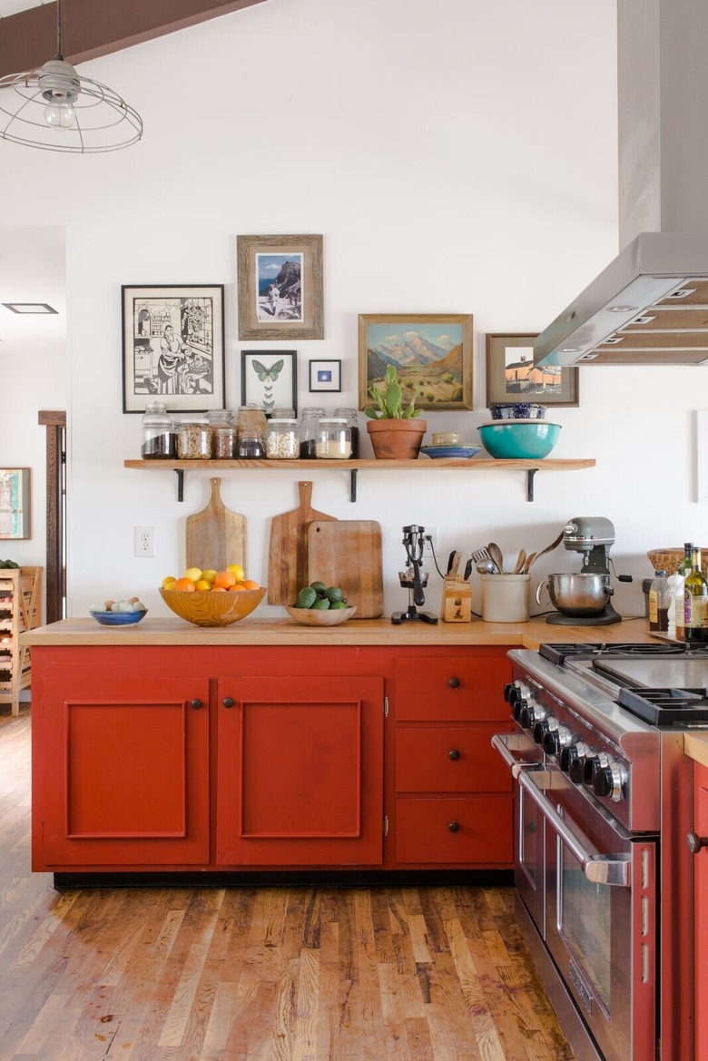
1. Red-Orange
Red-orange is a warm hue that can be used in a wide range of visuals, but we're particularly loving it as an unexpected pop of color in the kitchen. Carrie and Noelle from Theology of Home successfully spotlighted the shade on the cabinets in this midcentury-inspired cook space.
2. Red-Violet
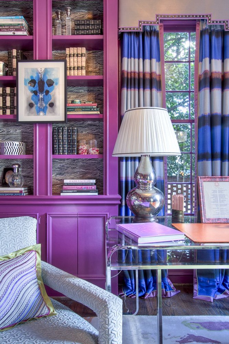
2. Red-Violet
Red-violet certainly isn't a color for wallflowers. The hue is perfect for anyone who likes to take risks, and it's guaranteed to liven up any room no matter the style. Take, for example, this library designed by Lindsey Coral Harper. The space suddenly goes from traditional to effervescent thanks to this vibrant shade.
3. Blue-Green
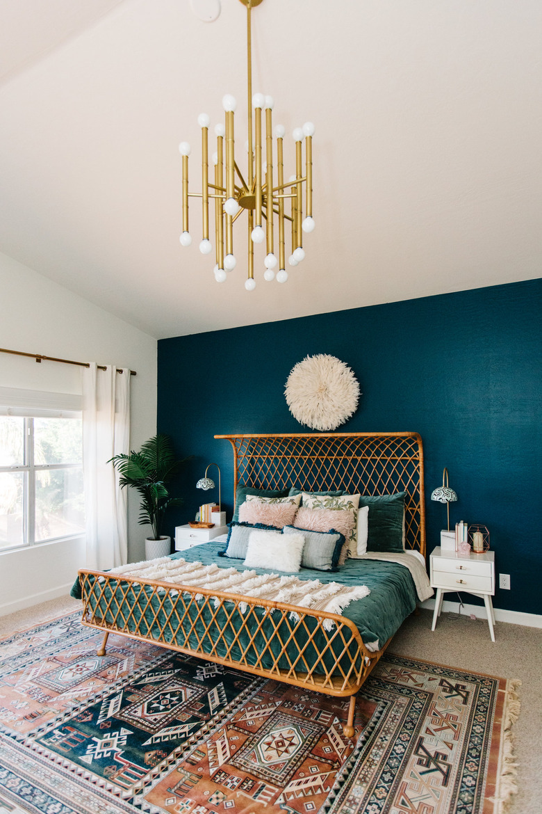
3. Blue-Green
Even though we tend to call it "teal" around here, blue-green is one tertiary color that's currently having a moment. From kitchens to bathrooms to bedrooms, blue-green can make a space feel both soothing and vivid at the same time. Let Alex of AVE Styles show you how to make the most of this vibrant hue.
4. Yellow-Green
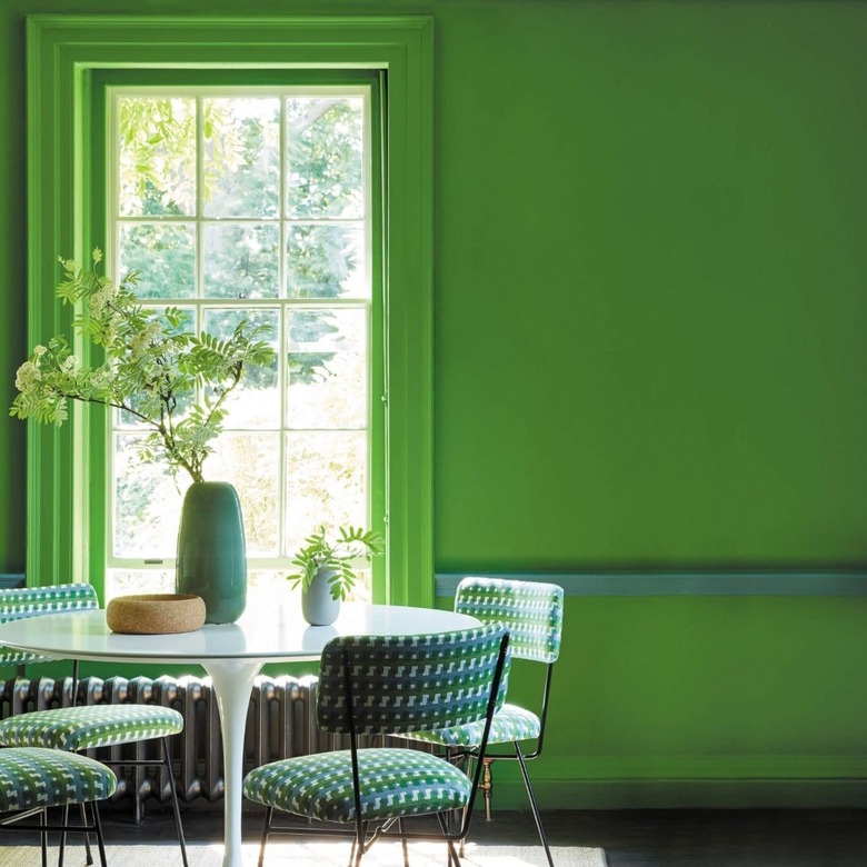
4. Yellow-Green
Yellow-green might just call to mind tropical locales or a sliced lime in a refreshing beverage. But don't be afraid to consider it for your interiors, too. It's simultaneously fresh and bold and gives a statement-making nod to the great outdoors, as proven by this dining room spotted on F&P Interiors.
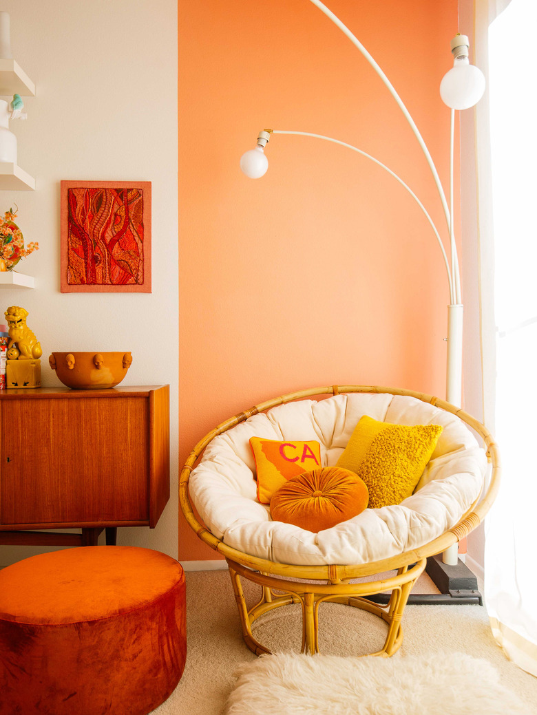
5. Yellow-Orange

5. Yellow-Orange
Dabito of Old Brand New has nailed the use of tertiary colors in this cheerful nook. While varying shades of both orange and yellow are displayed separately throughout, he successfully ties it all together with the help of decorative accents flaunting a warm shade of yellow-orange. Bravo!