18 Kitchen Wall Colors That Look Lovely With Cream Cabinets
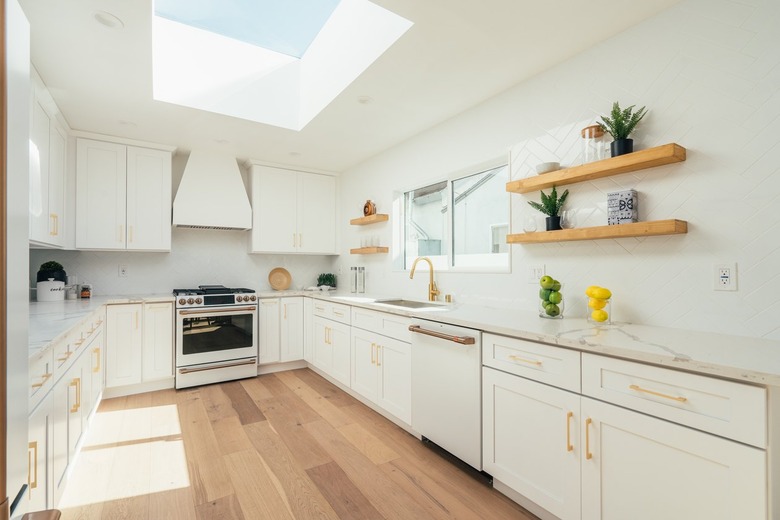
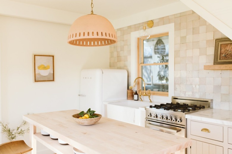
Want to make a splash in your kitchen? Painting your cabinets is a great place to start. With so many appliances to accommodate and a generally small layout to work with, painted cabinets can bring some character to the area without compromising its function-first purpose. And, if you're looking to hit that sweet spot between subtle and statement, cream is a solid choice that can withstand time and trends. An off-white shade with yellow undertones, cream is a versatile neural that provides the best of both worlds. It has the warmth of a typical beige or greige and the light, airy touch of a true, crisp white — making it a bright addition to any kitchen layout.
"I love the quiet sophistication of cream-colored cabinets," explains designer Christina Kim. "Sometimes bright white can give off a stock cabinet feel, especially in a new build, whereas the right cream color can elevate and soften a room."
But, as if finding the perfect shade of cream for your kitchen cabinets weren't challenging enough, you'll also need to think about the right color to paint the rest of your room. (Unless your entire kitchen is covered in a tiled backsplash, your walls will need some TLC, too.) Before you start swatching, it's a good idea to think about the overall vibe you want to create in your culinary corner. While coupling cream with another neutral can give your space a classic vibe, a brighter hue can create a bolder edge. Or, if you simply cannot get enough of cream, Kim recommends matching your cabinets, walls, and trim to "envelope the room."
Another thing you'll want to consider is undertones. Since cream normally has a tinge of yellow, paints with warmer notes will enhance that hue. Meanwhile, wall colors with cooler tones can undercut the yellow, bringing some balance to the space. To help get you started, we asked a handful of designers to share their favorite paint colors to pair with cream cabinets. From the pigmented to the pared-back, there's something here for everyone.
18 Kitchen Wall Colors for Cream Cabinets
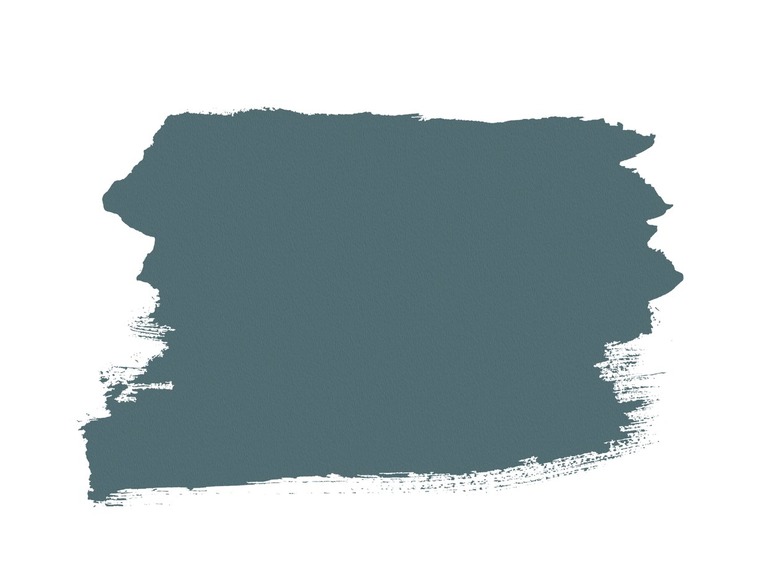
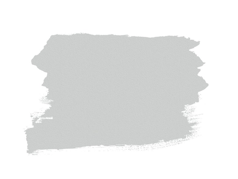
1. Benjamin Moore Nocturnal Gray
With subtle hints of teal, Benjamin Moore's Nocturnal Gray offers a nice, moody contrast to your brighter cream cabinets. "It reads soft [and] calm," explains Denver-based designer Nadia Watts. "This color is grounding to the kitchen because of its neutral base. I see it as an in-between color, which I love using."
2. Clare Meet Cute
 Hunker
Lean into those warm tones — and look at your kitchen through rose-colored glasses — with the help of Clare's Meet Cute. Though pink might be an unexpected choice for your kitchen walls, Vanessa Pierre of Vannie Paradis Design Studio says Meet Cute is a beautiful option for anyone who is on the hunt for a more understated option. "It's a perfectly muted blush color, and it will pair well with cream cabinetry and brass or bronze hardware," she shares.
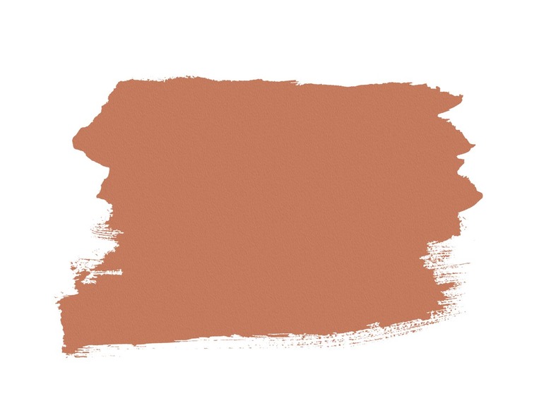
3. Sherwin-Williams Baked Clay
 Hunker
Alternatively, the warm tones of terra cotta are a trend-conscious way to give your kitchen walls a cozy, timely twist. Topping Pierre's list is Baked Clay by Sherwin-Williams. "This color combination would truly envelop you in the warm, cozy feeling that we all love," she adds. "It's also fresh and unexpected for a kitchen." While Pierre says Baked Clay is great for an accent wall, adventurous dwellers might want to paint all four walls this spicy shade.
4. Benjamin Moore Stingray
 Hunker
Though Benjamin Moore's Stingray has taupe undertones, it's a shade that changes with the light. Translation? It's an eye-catching option for minimalists. "Its strength is that it's not taupe, it's not beige; it can have some green and even a little purple, so it ends up being actually a great neutral color," designer Allison Babcock shares. "Stingray changes with the natural light throughout the four seasons, so it can keep your kitchen looking fresh and updated."
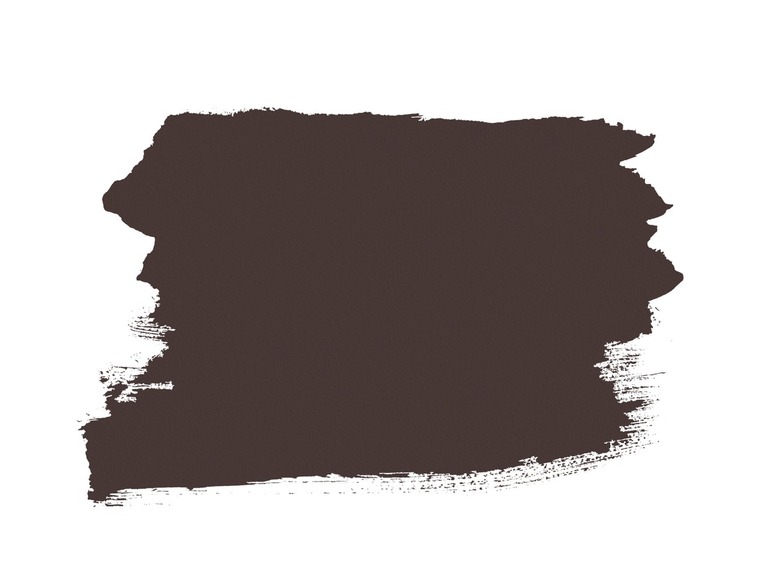
5. Benjamin Moore Wenge
 Hunker
If you want to bring Mother Nature's spirit to the great indoors, Babcock recommends Benjamin Moore's Wenge, which is a dramatic, earthy brown that will make your cream cabinets look really crisp and clean. "Wenge always looks good with greenery — from herbs growing in the kitchen to houseplants — [as well as] cream and white dishes and accessories," she shares. "A real bonus of using the color Wenge is that it is forgiving; it does not show kitchen mishaps."
6. Farrow & Ball Charleston Gray
 Hunker
If you want to create contrast — but find the color black a bit too severe — Ginger Lunt of Tantalus Studio is a big fan of Charleston Gray by Farrow & Ball. "It has a rich, earthy tone with both gray and brown undertones that would pair beautifully with woods like a bleached white oak or a golden natural walnut," she explains. "It feels calm and enveloping; the emulsion finish is still easy to clean but has the matte look of a plaster."
7. Benjamin Moore Chantilly Lace
 Hunker
Put your cream kitchen cabinets front and center by swathing your walls in Chantilly Lace by Benjamin Moore. "I think it is really handsome with cream [cabinets] because it is a pure white," says Robert Ventolo, a designer at Crain & Ventolo Associates. "It does not have any pink, purple, or yellow hues that would conflict with the cream cabinets." This power-coupling will give your kitchen a soothing yet textural finish.
8. Farrow & Ball Railings
 Hunker
What's black, white, and chic all over? Cream cabinets that are coupled with Farrow & Ball's Railings. The magic of this power duo lies in the bluish undertones. "It's like a tuxedo effect with the white and black, but the cream really changes the look to feel richer, warmer and softer," Canadian designer Melanie Hay explains. "Railings has a rich, wonderful blue undertone to it that pairs really well with brass accents. A beautiful, timeless pairing."
9. Benjamin Moore White Dove
 Hunker
Bring some extra depth to your cream cabinets with an off-white shade like Benjamin Moore's White Dove. "Cream is always very nuanced, and the undertone of a hard finish like cabinetry along with the light in your home will dictate the best paint option," Libby Rawes of Sharp + Grey Interiors explains. "For a light option, I would recommend starting with Benjamin Moore White Dove, [which is a] warm, creamy neutral that may work perfectly with cream-colored cabinets."
10. Farrow & Ball Brinjal
 Hunker
For a bolder pairing for your cream cabinets, designer Noz Nozawa prefers Farrow & Ball's Brinjal, which means eggplant. "Warm, creamy neutrals are so iconic in a high-gloss finish, especially set against rich, earthy jewel tones like aubergine," she shares."Brinjal has a brick-brown undertone that feels simpatico with cream cabinets, while also being a vibrantly saturated contrast that works great in a kitchen."
11. Benjamin Moore Quiet Moments
 Hunker
While opposites attract, they don't have to feel so dramatic. For a calming yet creative combination, reach for Quiet Moments by Benjamin Moore. "It's a light shade of blue-green that adds a wonderful contrast to an agreeable cream color without being too drastic or dramatic," says Zandy Gammons of Miretta Interiors. "It's a great way to add color for those who are a bit skeptical to anything other than neutral!"
12. Farrow & Ball Skylight
 Hunker
Looking for a paint color that's equal parts soft and statement-making? Designer Joy Williams in a big fan of pairing cream cabinets with pastels — specifically Farrow & Ball's Skylight. "Together, they give a space a dreamy, soft, otherworldly quality," she explains. "Most people are surprised when they love a room with soft pastels, but there's something ethereal and settled about a space using colors of our childhood."
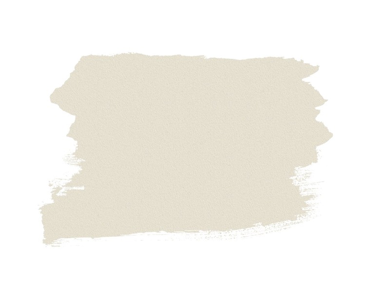
13. Sherwin-Williams Grecian Ivory
 Hunker
For Leslie Murphy, owner and creative director of Murphy Maude Interiors, finding a color that echoes the cream cabinets is an easy, low-maintenance pairing to make a kitchen feel sophisticated and light. That's why she's such a fan of the beige shade Grecian Ivory by Sherwin-Williams. "By using a similar tone on the walls alongside the cream cabinetry, it creates a welcoming and cohesive kitchen," she explains. Murphy adds that she would incorporate a countertop and backsplash of a similar hue for a luxurious look.
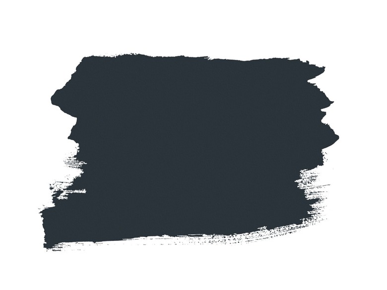
14. Farrow & Ball Hague Blue
 Hunker
According to Michelle Murphy, the designer behind Demi Ryan, you cannot go wrong with a combination of blue and cream. While any shade of blue will counterbalance cream's yellow undertones, she has a soft spot for Farrow & Ball's Hague Blue. "A navy blue gives such bold contrast but is still aesthetically pleasing to the eye," she says. To keep this deep hue from feeling too stark, Murphy recommends layering on the textures — be it a great tile backsplash, stone countertop, or detailed hardware.
15. Farrow & Ball De Nimes
 Hunker
Another blue to add to your paint shortlist is Farrow & Ball's De Nimes. This shade has a tinge of gray, so it hits that sweet spot between an effortless neutral and exciting pop of color. "We love the contrast of the cream with the slate-blue-gray, which draws your eye around the entire room and makes the space feel larger," designer Robin Gannon adds.
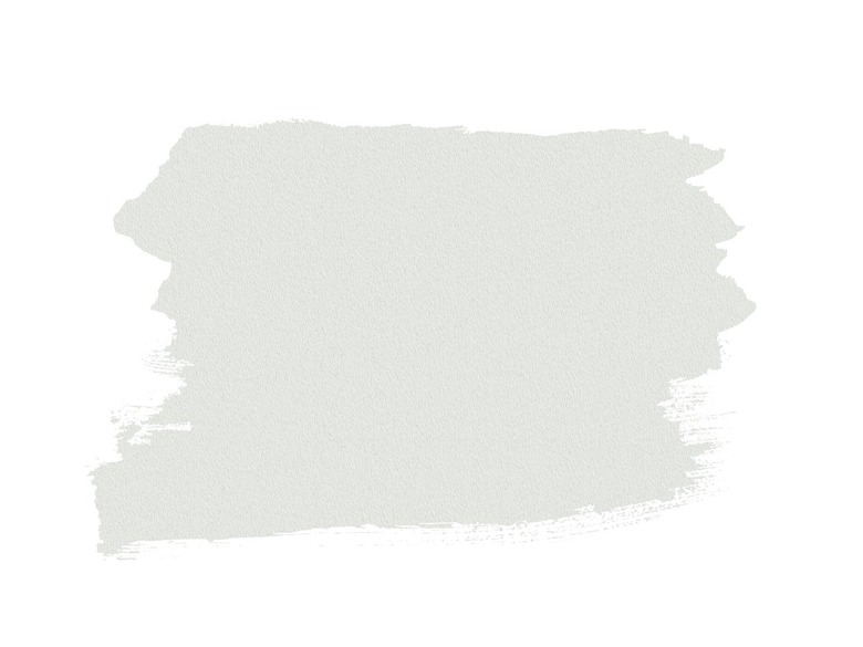
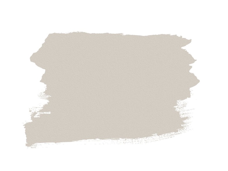
16. Sherwin-Williams Agreeable Grey
 Hunker
If you want to highlight the warm, inviting tones in your cream cabinets — but aren't sold on the monochrome look — greige is a great hue to choose. Designer Christine Vroom loves Sherwin-Williams' Agreeable Grey, a goes-with-everything basic that has a bit more pigment than your typical cream. "It is still a really calming and gentle neutral," she shares. "It has the perfect blend of taupe and grey, which is what I believe is the perfect neutral right now." Vroom adds that Agreeable Grey works with a range of metals, making it a great base for your culinary space.
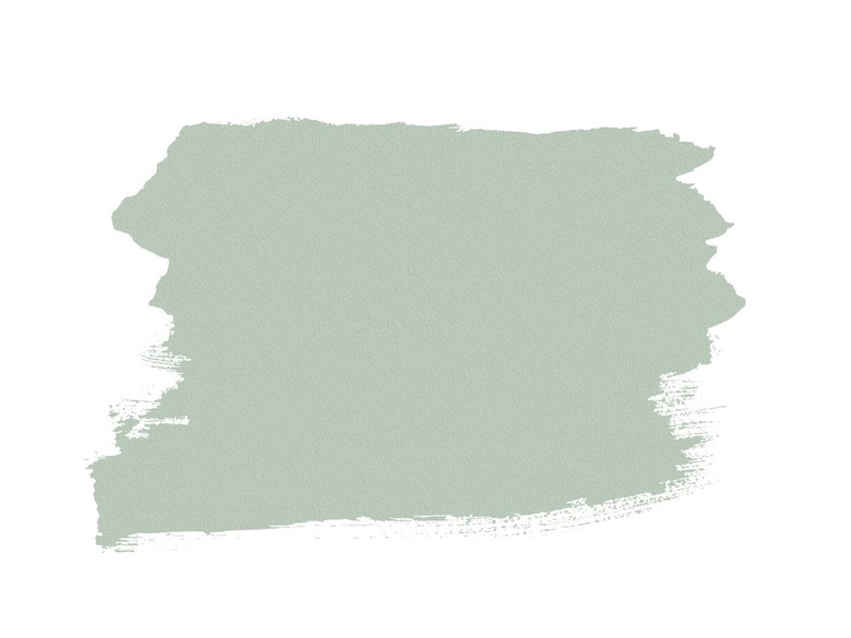
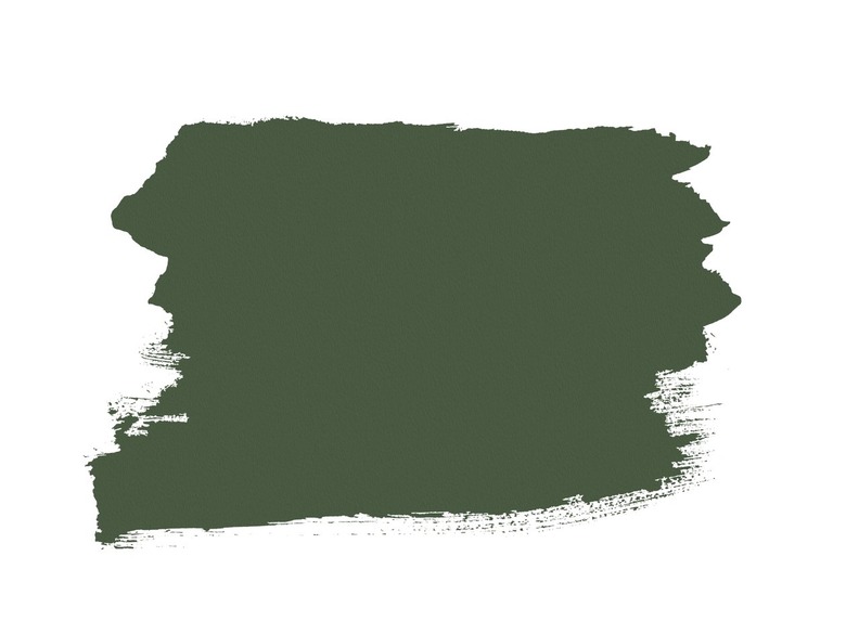
17. Sherwin-Williams Courtyard
 Hunker
Though blue and cream is an unbeatable color combination, you may be craving an unexpected option that can yield equally gorgeous results. For a perfect solution, Lisa Gilmore favors Courtyard by Sherwin-Williams. "This saturated earthy green is the perfect shade to balance with cream and bring it a bit more life," she shares. "I can see it paired with accents of goldenrod or coral for an extra splash of color."
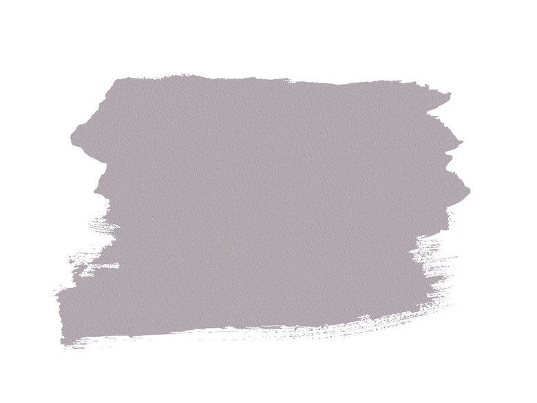
18. Sherwin-Williams Beguiling Mauve
 Hunker
If you want a pinkish tone that can balance your cream cabinets' yellow undertones, the violet notes in Sherwin-Williams' Beguiling Mauve make this shade an enchanting option. "[Beguiling Mauve] is the perfect companion for cream if you are looking for a bit of a feminine twist," Gilmore shares. "It's super soft and calming, not overwhelming at all, and it would pair perfectly with a soft sage accent."
Kitchen Colors That Go With Cream Cabinets
Kitchen Colors That Go With Cream Cabinets
Since cream usually has a hefty helping of yellow undertones, it's important to think about how different colors of wall paint will interact with your cabinets. If you want to create a sense of balance and decorum, look for hues with cool undertones: Blue, green, gray, and even mauve can undercut cream's yellow tinge. Alternatively, you may want to highlight your cabinets' warm tones, which is when you should move toward the opposite side of the color wheel. While ivory and off-white offer a subtle way to make cream pop, warm colors like pink and terra cotta provide a high-impact alternative.
To help ease your search, these are some of the best paint colors for highlighting cream cabinets:
- Benjamin Moore Nocturnal Gray
- Clare Meet Cute
- Sherwin-Williams Baked Clay
- Benjamin Moore Stingray
- Benjamin Moore Wenge
- Farrow & Ball Charleston Gray
- Benjamin Moore Chantilly Lace
- Farrow & Ball Railings
- Benjamin Moore White Dove
- Farrow & Ball Brinjal
- Benjamin Moore Quiet Moments
- Farrow & Ball Skylight
- Sherwin-Williams Grecian Ivory
- Farrow & Ball Hague Blue
- Farrow & Ball De Nimes
- Sherwin-Williams Agreeable Grey
- Sherwin-Williams Courtyard
- Sherwin-Williams Beguiling Mauve