These Midcentury Modern Color Palettes Are Decidedly Retro
We may receive a commission on purchases made from links.
Midcentury modern design is known for a lot of things. Sputnik chandeliers. Walnut finishes. Abstract wall art. And color. Lots and lots of color. Back then, mid-mod palettes would gravitate toward hues that were punchy, vibrant, and joyful — colors that can still be seen in homes today. Orange and yellow tones were top choices, along with saturated blues, bubbly pinks, and daring reds. All of them created a beautiful juxtaposition when paired with rich wood finishes on the furniture, built-ins, and wall paneling.
You can go authentic, with colors that were seen in many 1950s homes, or you can choose a more au courant direction with neutrals or even a pop of black here and there. In an effort to help you decide, here are some of our favorite midcentury modern color palettes, showcased by designers and homeowners who clearly have an eye for all things retro.
1. Jewel Tones
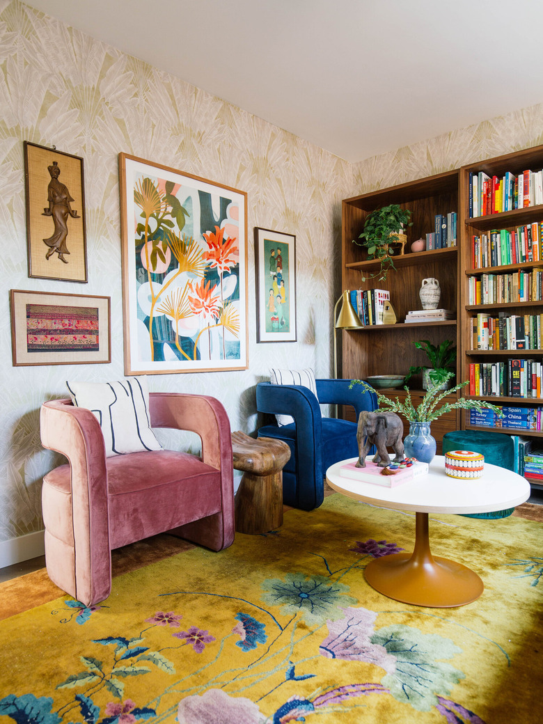
1. Jewel Tones
Jewel tones are frequently seen in contemporary spaces, but they also happen to have roots in the midcentury modern era. When setting up your space, weave in jewel-inspired shades, like emerald and mauve, along with rich colors like navy blue and mustard, a palette that's been perfectly captured in this home office by Dabito of Old Brand New.
Get the look: Milton & King Travelers Palm Wallpaper (two roll set), $238 per set
2. Turquoise, Pink, and Brass

2. Turquoise, Pink, and Brass
Midcentury interiors are known for their artful use of metal finishes, generally leaning toward brass — which looks particularly amazing in this dining room. Annette of A Vintage Splendor created cohesion in her home with a brass chandelier, candlesticks, and bar cart and paired them with turquoise lamps and rosy chairs.
Get the look: Jonathan Adler Meurice Rectangle Chandelier in Brass, $1,673.25
3. Teal and Orange
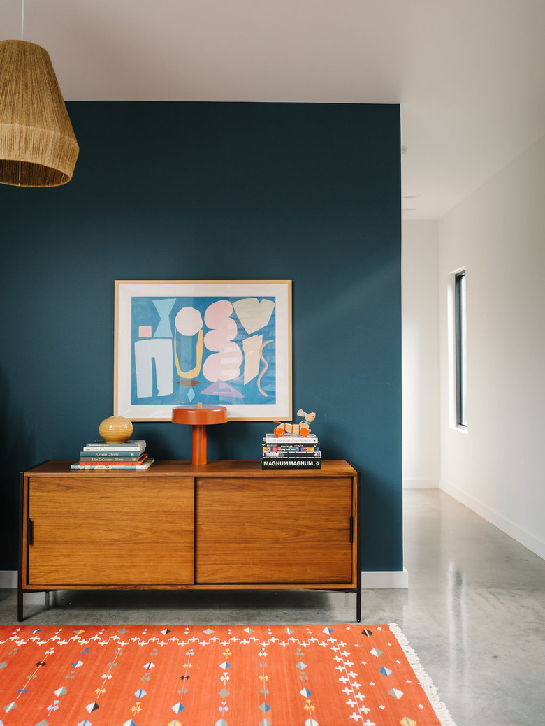
3. Teal and Orange
Orange was certainly a designer darling among midcentury modern colors, and it's still picked today for many retro-inspired spaces. Orange partners quite nicely with teal, creating a sumptuous color palette that also has a lighthearted feel. It's a spot-on vibe for this midcentury-inspired playroom styled by Jen of The Effortless Chic.
Get the look: Rejuvenation Burton Walnut Media Console, $1,999
4. Neutrals
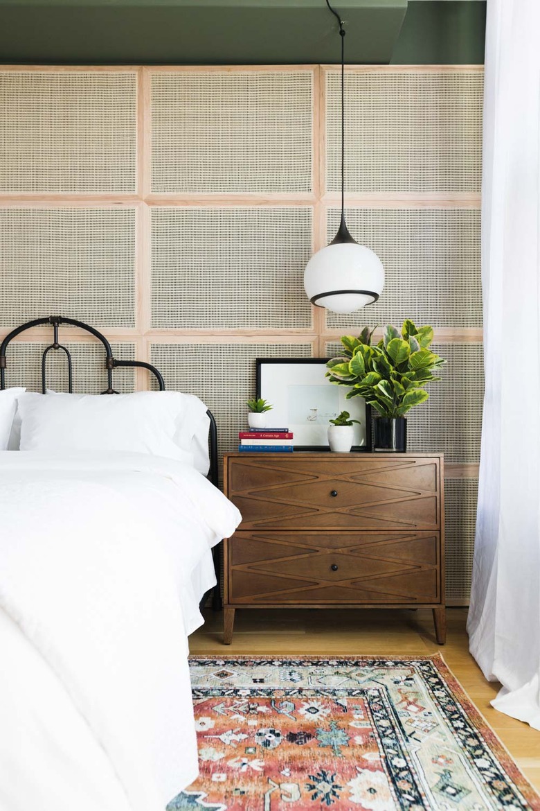
4. Neutrals
We'll let you in on a little secret — you don't always have to go with bright colors for a mid-mod space. In fact, many midcentury homes back in the day embraced a neutral color palette, displaying whites, creams, and subtle greens. If citrusy hues just aren't for you, opt for something a little less flashy marked by cane, warm wood finishes, and crisp white, an aesthetic Mandi of Vintage Revivals chose for this bedroom.
Get the look: Mitzi by Hudson Valley Lighting Reese 1-Light Old Bronze Large Pendant, $276
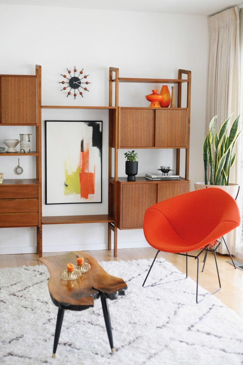
5. Orange and White
5. Orange and White
Midcentury modern colors are typically bold and brave, never shying away from hues like orange and yellow. You can bring those hues into your space, like Jenny from Suburban Pop did in her den, but tone the palette down a bit with the addition of white and dark wood finishes.
Get the look: Harry Bertoia for Knoll® Bertoia Diamond Lounge Chair, $1,393 – $2,304