We Talked To Color Experts About Pantone's Color Of The Year
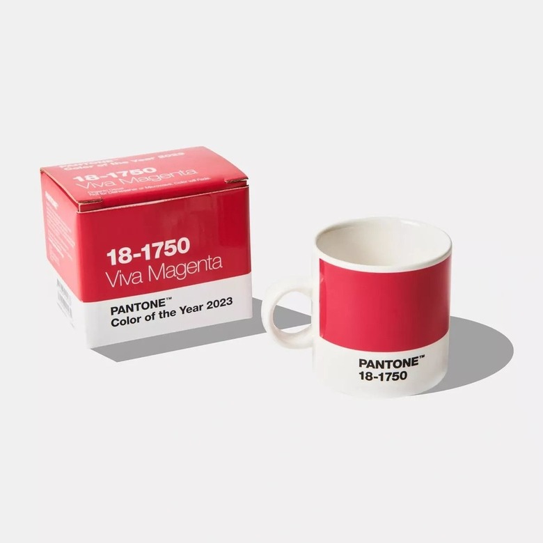
Unless you've just returned from an off-the-grid retreat where you were cut off completely from the outside world, you know by now that Pantone's Color of the Year for 2023 is a rich, jewel-toned hue called Viva Magenta. The bold, eye-catching color was selected by Pantone for its invocation of nature and inherent strength.
Of course, everyone and their mother has an opinion about Pantone's color choice each year, given the brand's stature and influence within the design world — and Viva Magenta is no different. To cut through the noise of hot takes, we reached out to a few bonafide color experts to get their reactions to Pantone's selection.
Marketing manager and Glidden color expert Ashley McCollum reflected upon what Viva Magenta represents as a color, unifying the past and present. "Pantone's choice of a bold magenta dabbles in designs of decades-past, while also being versatile enough to blend multiple trends together," she told Hunker. "We see this shade as a retro, yet futuristic, playful, and experiential shade that was influenced by our digital selves and the continued evolution of the metaverse."
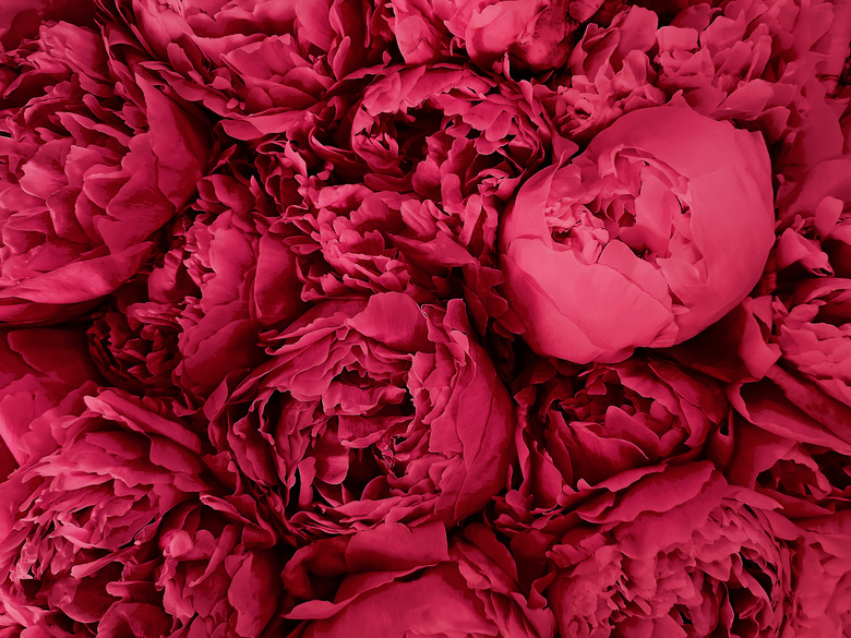 Chiociolla/iStock/GettyImages
Glidden themselves chose a "bluish-greenish-something-in-betweenish" hue called Vining Ivy as their 2023 Color of the Year, which is similarly rich and adaptable. McCollum suggests pairing Viva Magenta with Vining Ivy in your home "for those who aren't afraid to experiment with color." She also recommends using Vining Ivy on your walls with Viva Magenta accents in the form of throw pillows, blankets, armchairs, and other pieces of home decor.
For those who skew more minimalist in terms of color, McCollum offers letting your Viva Magenta walls stand on their own and pairing them with neutral accents like using Glidden's Delicate White on surrounding trim. "For a truly luxurious look, consider pairing with gold and brass metallic accents and hardware," she added.
Color skeptics might also consider easing their way into a bright color like Viva Magenta by first trying it out in a smaller space like a bathroom or on an accent wall. "But don't just stop at the interior of your home," said McCollum. "You can bring a pop of plush color to the exterior of your home by painting your front door to up your curb appeal."
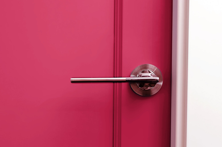 Chiociolla/iStock/GettyImages
International Color Consultant and the founder of the color app Color911, Amy Wax, was not shy with her praise for Viva Magenta. "I love the passionate quality of Viva Magenta," she shared with Hunker. "It takes a classic red and adds a little bit of sass to it. It [also] has a warmhearted quality too, and is a bit more creative and gregarious than a typical red."
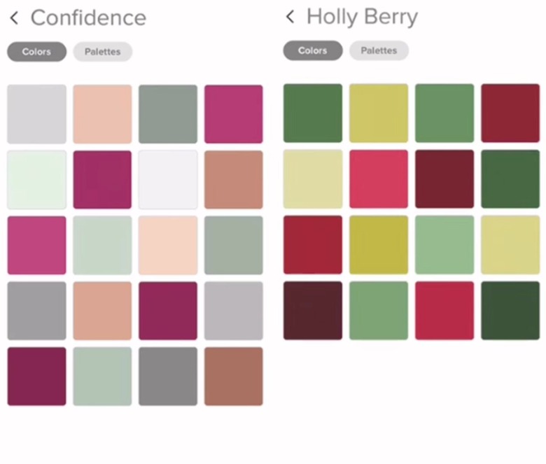 Color911App/Instagram
As soon as Viva Magenta was unveiled as Pantone's Color of the Year, Wax created color themes with the Color911 app to show several options for how to use the tone with other colors. These include five different color palettes that inspire a range of pairings. "The beauty about Viva Magenta is that it has the elegance of a classic burgundy, but with a little more sweetness to it," she continued, and added that it's a rambunctious color, and imbued with enthusiasm.
Well, that settles it then! Viva Magenta is a winner.