10 Brilliant Paint Colors For Low-Light Rooms
In a perfect world, every room in your house would be bathed in warm, natural light. However, oftentimes this isn't the case. Rooms that don't get a lot of natural light are often referred to as low-light spaces, but they're not doomed to look gloomy. With the right shade of paint, they can be every bit as beautiful as bright rooms.
Jennifer Verruto, founder and CEO of Blythe Interiors, explains that there are two ways to go about choosing paint colors for rooms with little to no natural lighting. The first is creating a "dark and dramatic space," she says. The other is going in the complete opposite direction by embracing a light, bright, and airy color palette. "White reflects, so using a bright white will help create a brighter room," Verruto explains.
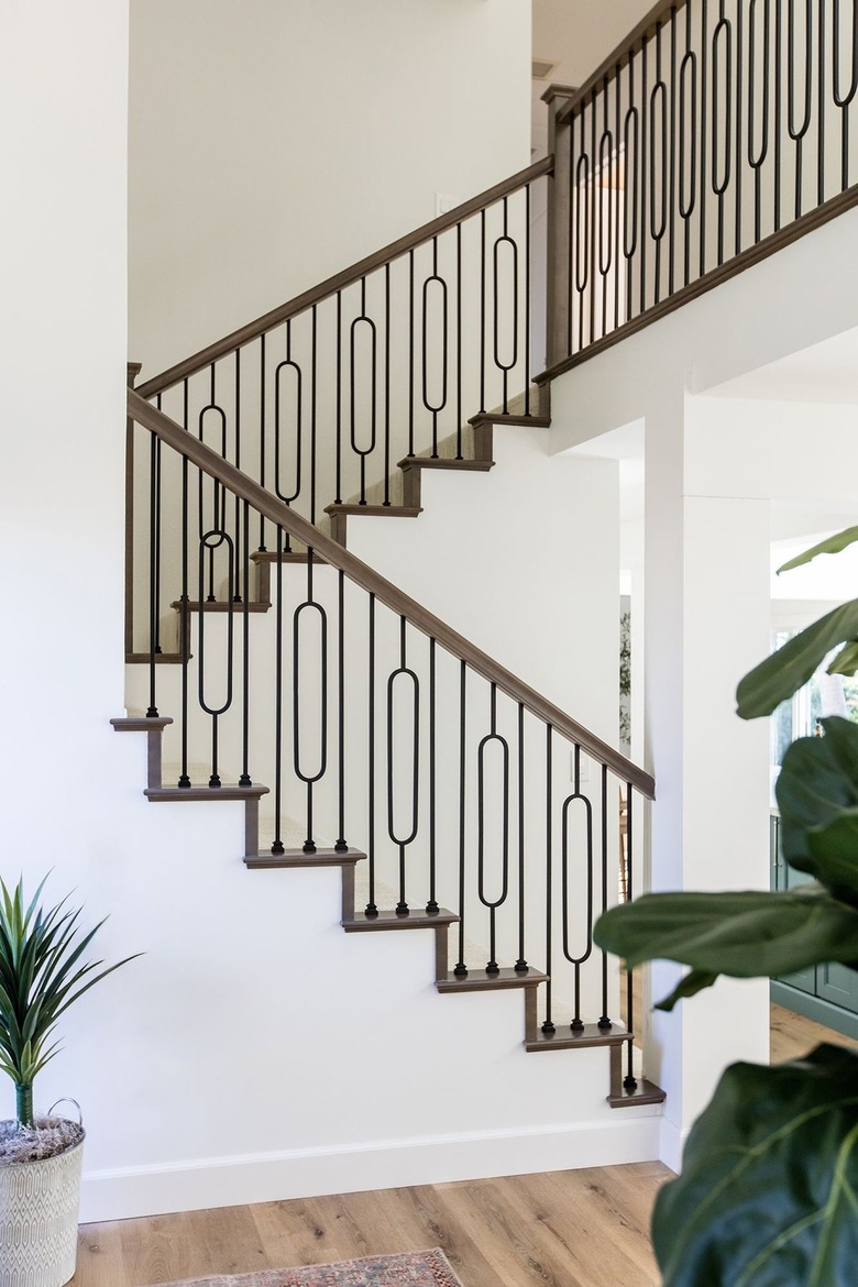
How to Select Paint Colors for Rooms With Little Natural Light
How to Select Paint Colors for Rooms With Little Natural Light
When choosing paint color for low-light rooms, keep in mind that any shade will look different on your walls than it does in the store or on a screen. "Rooms with little natural light don't have reflections or absorptions, so they will appear different from what you see in a well-lit room, especially because you'll almost always need artificial lighting," Verruto points out.
Prior to choosing a paint, consider what kind of mood you want to create. Are you looking for drama? Relaxation? An energizing atmosphere?
Also, take into consideration the room's other design elements. "Decor and accessories like mirrors and art help create balance," Verruto says. Whatever point along the spectrum you choose — from dark and moody to light and bright — ensure there is an element of contrast, in order to create visual depth. For example, if you are using dark paint, add bright tones, like brushed brass finishes or textured mirrors.
You might also want to consider color theory when using paint to help define the mood. "Deciding if you want a monochromatic palette or color variations will help narrow options down," says Verruto.
While you can get color swatches for free at most paint stores, Verruto recommends buying a small sample of each paint color you are considering and painting a 12" x 12" test swatch. This way, you can observe the paint color with any artificial lighting in the room at different times of the day. "The tone of a light bulb can drastically affect a paint color's appearance," cautions Verruto.
Below, we've gathered some of our favorite colors for low-light rooms.
11 Paint Colors to Brighten a Room
1. Seafoam Green
Oyster Bay is a timeless seafoam shade that will bring a calming feel to any space. "This color is unique in that it can read as either blue, green, or gray depending on its surroundings," says Verruto. While it's considered a cool color, she points out that its earthy tone allows it to pair well with warm colors like natural woods and brass hardware.
Get the look: Sherwin-Williams Oyster Bay
2. Gray
 Natalia Robert for Blythe Interiors
French Gray leans towards cool tones but is balanced enough that it is considered a neutral gray paint, explains Verruto. "We love to use it on cabinetry, since it will work with a variety of other finishes and colors," she says. "This shade of gray can help ground or pull a space together, giving it depth, without it feeling drab, aka 'too gray.'" It is considered a "historical" color and pairs well with matte blacks and bronzes to enhance that timeless look.
Get the look: Sherwin-Williams French Gray
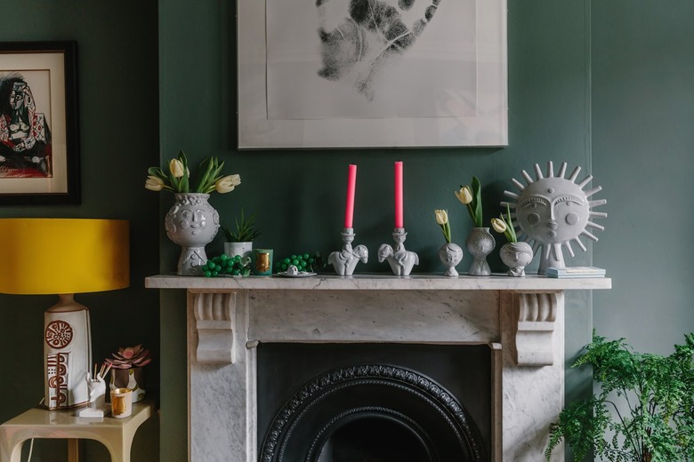
3. Teal
 Natalia Robert for Blythe Interiors
Verruto recommends Sherwin-Williams Pewter Green, a rich, earthy shade of teal, for dark spaces. "Often described as green/gray, it creates a grounded sense of nature and is conducive to creating connection with the outside elements," Verruto says. This hue pairs well with any shade of white, even creamy tones, thanks to its yellow undertone, as well as natural wood. It also provides a nice element of color, while still functioning as a versatile neutral.
Get the look: Sherwin-Williams Pewter Green
4. Greige
 Tracey Ayton Photography
Slightly more beige than gray, greige is a neutral hue that will brighten up a space. Make sure to pick a lighter shade if you want to maximize light. Anything too dark might end up looking muddy. Benjamin Moore Revere Pewter is a popular color used by interior designers because it looks great in most spaces.
Get the look: Benjamin Moore Revere Pewter
5. Navy Blue
 Nicole Mason
A great navy blue paint never goes out of style. Both moody and classic, navy is an excellent option for low-light rooms. Consider pairing it with a bright white trim or ceiling to really make it pop. "We prefer to think of it as a grounding blue that can elevate a space to create an unspoken sophistication," says Verruto. "This regal blue is often used to create a dark pop of color in a lighter space. Gale Force works well with cool tones and is often paired with grays."
Get the look: Sherwin-Williams Gale Force
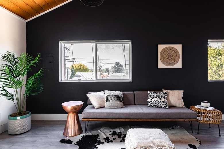
6. Black
 Natalia Robert for Blythe Interiors
Iron Ore is the perfect black, without being too dark, says Verruto. "Although it is described as a rich charcoal gray, it is often used as a black paint, to create a warm and moody space" that doesn't feel too dark, she explains. Iron Ore's party trick is its ability to balance warm and cool tones. "It's a perfect pairing with any other color, since you don't have to worry about undertones," adds Verruto. She often uses it in dark entryways or powder rooms to create a statement, and in large rooms to create a cozier feel. "We love to use brushed brass finishes with Iron Ore to create a sense of drama," she says.
Get the look: Sherwin-Williams Iron Ore
7. Purple
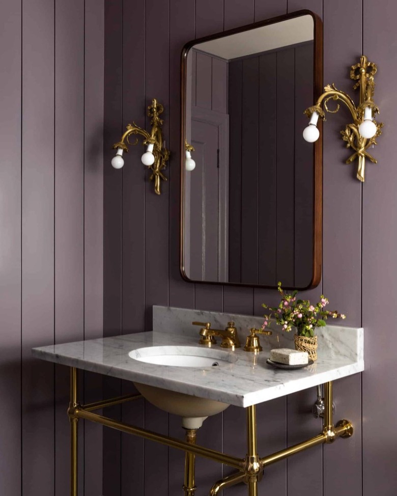 Heidi Caillier Design
Similar to an earthy green or moody blue, a deep, rich purple can make a major impact in a room with little natural light. Since this is such a bold color, it might be better suited for a smaller space, like a powder room or laundry room. Also consider brightening up the space by adding contrasting design elements — like the gold fixtures and wood-framed mirror in this stunning space by Heidi Caillier Design.
Get the look: Clare Prince
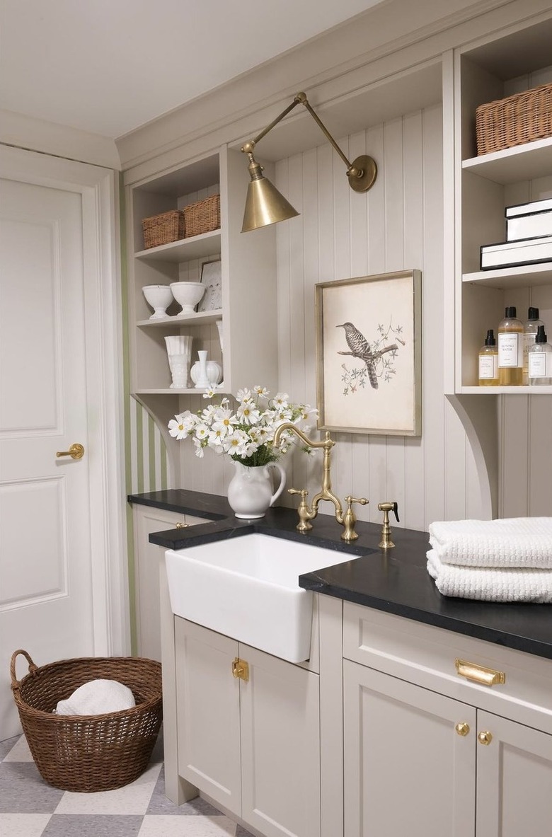
8. True White
 Natalia Robert for Blythe Interiors
Snowbound is considered a true white because it has very little undertone, allowing it to reflect the colors around it, Verruto says. "This neutral white is used to create a sense of lightness in darker spaces or as a bright backdrop to let other elements in the space shine ... It is also a top contender for kitchen cabinets, since it will work well with any wall color or countertop and not be a 'glow in the dark' white." Polished nickel finishes work well with this shade.
Get the look: Sherwin-Williams Snowbound
9. Off-White
 Natalia Robert for Blythe Interiors
Greek Villa is a warm white with creamy undertones. "This inviting color adds warmth to a room and is often used when we're updating traditional and transitional spaces," says Verruto. Because of its hint of cream, this eggshell hue pairs well with browns, brighter whites, and earth tones. Also consider using it by itself, on the walls, trim, and ceiling to make your space feel double its actual size. Want dark navy tile, but a bright bathroom? Paint the walls a bright white for contrast and reflection, Verruto suggests.
Get the look: Sherwin-Williams Greek Villa
10. Pale Pink
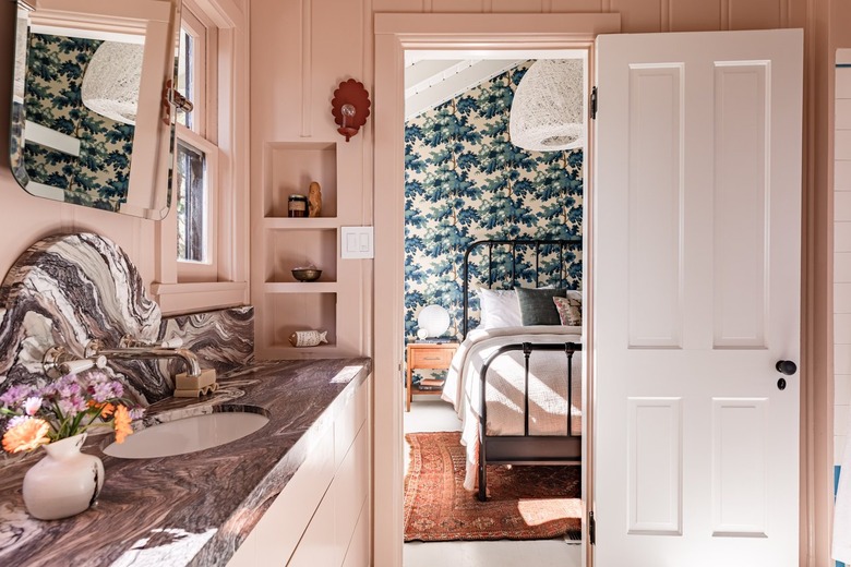 Stephen Paul for Hunker
If you want something a little more feminine than plain gray or greige, choosing a slightly tinted hue is the way to go. Pale pink not only has a brightening effect, but it also makes a room feel calm and relaxing. Make sure to choose a shade with just a touch of pigment to keep the space bright.
Get the look: Sherwin-Williams Intimate White
Paint Colors for Low-Light Rooms
Paint Colors for Low-Light Rooms
A dark room with little natural light may present a challenge, but the right paint colors (along with thoughtful lighting design) can go a long way toward making it look its best. As Verruto says, there are two basic paths you can take: go light, with a shade like bright white or light blue, or steer toward dark colors for a moody, dramatic feel.
Here are some of the best colors to make darker rooms feel like they have just enough light:
- Seafoam green
- Gray
- Teal
- Greige
- Navy blue
- Black
- Purple
- True white
- Off-white
- Pale pink