A Decade Of Pantone's Color Of The Year Tells Us That Nothing Really Changes
We may receive a commission on purchases made from links.
It's that time of the year again: when we get to find out what the color experts at Pantone select as the official Color of the Year. Love it or hate it, each year the COTY elicits a reaction from decor lovers, graphic designers, and casual hue lovers alike. As evidenced by the reactions to 2015's COTY, Marsala, it's not always a positive one.
Every year, the COTY makes a connection between our shopping habits and the political, cultural, or economic climate of the time. Yet, looking back, we can see some overlapping themes. Despite this, the excitement over each year's announcement has stayed strong. Before we dive into just what makes COTY so intriguing, it's worth taking a quick look at Pantone's history.
Pantone as we know it today basically started with Lawrence Herbert. In 1956, he became part of the printing company as a color matcher and went on to buy the company in 1962. He created the Pantone Matching System, aka his color legacy, in 1963 and by the 1970s, according to the New York Times, Pantone "was making more than a million dollars a year in licensing fees."
 Pantone
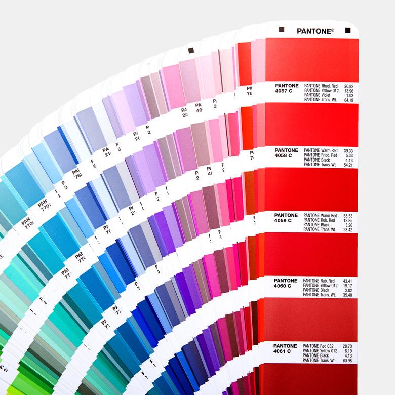
Today, the Pantone Color System is divided into The Pantone Graphics System and The Fashion, Home, and Interiors System. Each color in the Graphics Systems has a unique number so that you can be sure the finished product is the right hue, no matter where it gets printed (you've got Herbert to thank for that). As the Pantone website states, this system "is recognized around the world."
In 2007, the New Jersey-based company was purchased by X-Rite, which focuses on "color measurement and color management" for everything from photography to printing to paints, according to a press release. But the COTY trend comes down to one department: the Pantone Color Institute. It offers color consulting services using "the science and emotion of color." And it turns out each COTY is very much about the cultural climate — and has been since its inception.
A press release from April 26, 1999 reads: "The official color of the millennium is Cerulean Blue PANTONE 15-4020 TC, the color of the sky on a serene, crystal clear day." COTY officially kicked off in the year 2000, aka Y2K. That was a time of uncertainty when we thought maybe our computers would crash, our technology would fail us, and the aliens would come. Pantone predicted that society would "be searching for solace" from a "stressful, high-tech era" — which sounds relevant to our current moment, too.
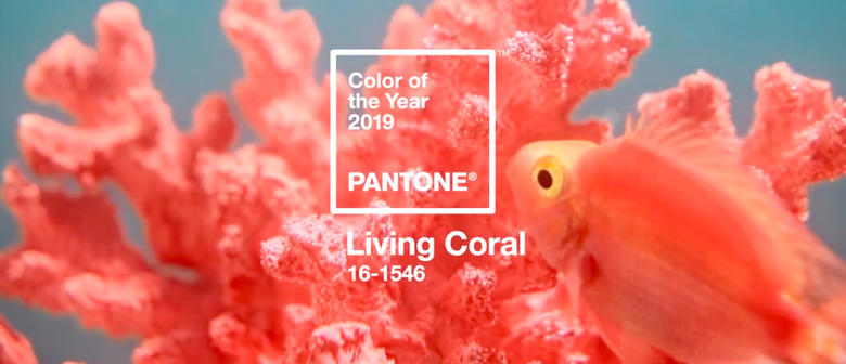
Out of the last COTY selections from 2000-2019, Hunker found that almost 30% were a shade of blue; 19% were pink; and 9% were red, purple, or green. Some overlapping themes: wellness and serenity, but also energy and individuality. Even when there are colors that differ greatly from year to year, like 2004's Tigerlily orange, the words "hopeful" and "rejuvenating" play a big role. For the most part, these hues veer on the positive side, as a sort of refuge from chaos. One small exception was 2019's Living Coral, which is a peachy, cheerful hue that tied to a larger conversation about climate change and an initiative to protect damaged coral reefs.
 Pantone
Economic uncertainty comes up more than once; in 2009, for example, Pantone chose Mimosa because "no other color expresses hope and reassurance more than yellow." Turns out we still needed that hope in 2010, when Pantone chose Turquoise, a "comforting escape from the everyday troubles of the world."
A focus on wellness really picks up around 2016 with Rose Quartz and Serenity Blue, which Pantone selected as a response to consumers searching for "an antidote to modern day stresses." Nature and mindfulness play big roles in the COTY choices for the next few years.
Laurie Pressman, Vice President of the Pantone Color Institute, says that the process of choosing the official hue each year has basically remained the same.
"What has changed are the areas we additionally look to as influencing color, some of which may not have existed in 1999 when we began this educational program, i.e. technologies such as social media or certain types of digital affects or animations," Pressman tells Hunker.
 Pantone
So why do we care so much about the announcement each year?
"There's sort of a mystery about it," Matt Johnson, PhD, Professor and Founder of the Neuromarketing Blog, PopNeuro, tells Hunker. "Pantone's done a really, really good job of keeping this all pretty secretive, nobody's really sure what the process is."
We know there's a committee and that they find inspiration from fashion, travel, and well, everything around them. But the ultimate decision from the Pantone Color Institute still feels like a mythical one. Pressman says that ultimately, the Institute's choice each year needs to "be showing up across the globe throughout all areas of design across all ages and genders."
Pantone has used marketing, including social media, and collaborations to drive home its authority on color — even placing itself into moments that reach people beyond the color-obsessed community. Perhaps you'll stumble across Minion Yellow, the official hue for the goofy characters created with Universal Pictures and Illumination. Or maybe you'll read an article about Pantone's fashion color trend report, ahead of New York Fashion Week. Even decor retailers like Apt2B create items based on COTY. All these contributions position Pantone as specialists on color, so that when COTY is revealed, you will already recognize the company's name.
Johnson says that COTY has "definitely entered into the national consciousness," specifically because it's been "commercialized in terms of companies wanting to piggyback on this popularity." In 2016, Johnson points out, there was even a Sephora collection based on Rose Quartz and Serenity. More recent collaborations include a collection developed with Dove "to show that gray hair is more than one shade," according to a recent Instagram post.
 Pantone
But why do we care so much about each year's color? Short answer: color psychology. There are many studies about the effects of color on our mood, shopping habits, and lifestyle choices. COTY participates in this conversation by allowing us to reflect on the year ahead; Pressman stresses that "color psychology has always been foundational" to COTY.
Pressman says the Institute reflects on questions like: "Why is this color showing up around the world? Why are individuals gravitating toward a particular color family and color at this time?"
Long answer: because we want to find the right color for design and marketing projects. But also for art making and personal enjoyment. As Kassia St. Clair explains in The Secret Lives of Color, artists have always been searching for more colors. "Those who produced and traded in colors were known as colormen, and procured rare pigments from across the globe," St. Clair writes. In a way, Pantone has become a modern day version of this. Johnson explains that when it comes to our everyday conversations around color, the company has "expanded that conversation to look at every hue in the color spectrum."
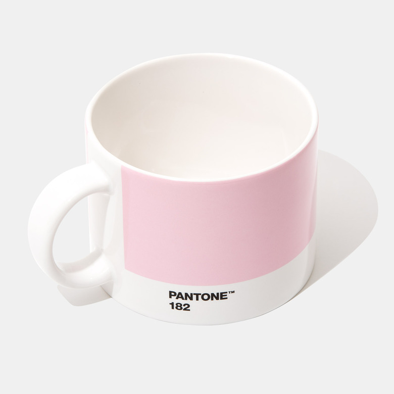
You might relate more to one hue than another or maybe you just have a favorite — thus the popularity of items like Pantone notebooks, mugs, and even holiday ornaments. These purchases say that not only do you care about color, you know exactly which shade of pink fits your personality.
 Pantone
Ahead of the COTY announcement this month, Pantone's already building up the anticipation through its social media posts. The next decade will surely offer some major cultural moments for COTY inspiration. Pressman doesn't see the selection process changing much in the next 10 years, although there could always be some adjustments.
"If there are changes we need to make as we move forward, we will certainly do so as we always want to make sure that the color we select each year to be our Pantone Color of the Year best reflects the integrity of the program," Pressman says. "And that the color we select best symbolizes the mood of the consumer."
Johnson feels that COTY could still expand its influence into mainstream conversations and that Pantone's hold over COTY isn't going anywhere any time soon.
"We haven't seen an Apple Mac color of the year or iPhone case or anything like that in terms of major companies adopting these things," Johnson says. "I would predict at least for the next few years that companies would still try and ride this trend."
Just recently, Pantone added 294 new colors to its Pantone Matching System. With its library continuing to expand, Pantone probably won't be stopping its conversations about color any time soon. And now, we wait.