Inside The Paint Biz, With A Woman Whose Job Is Figuring Out Color Trends
Here at Hunker, we're obsessed with color — after all, working with color is one of the easiest and most cost-effective ways to change up your home. And when it comes to paint, we are always particularly intrigued by new colors and palettes paint companies put out with new seasons. But with every new color, we have to wonder: Who is creating these colors? How are they deciding? Is there a job where you get to figure all this out? Turns out there is, and one person lucky enough to hold such a creative position is Erika Woelfel, VP of color and creative services at Behr. We were able to sit down with Erika during Behr's Color of the Year reveal earlier this month (FYI Behr's 2020 color is "Back to Nature," and it's a wellness-inspired green), and ask her everything about her job and the inner workings of paint color creation.
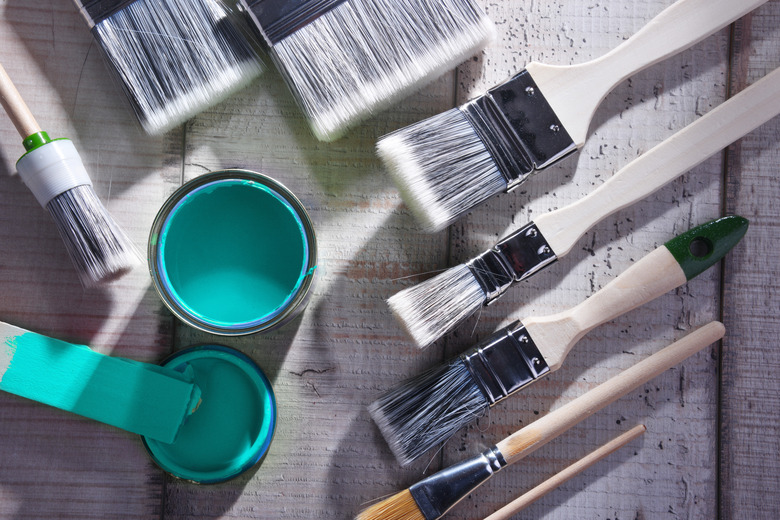
 Behr Paint
Hunker: So, first question we're dying to ask is, how do you get this job?
Erika: I went to design school, and I actually thought I was going to be a writer. I studied English lit [and] philosophy. I thought I was going to be a novelist. I actually interned with a woman who was doing color marketing, and this is way, way, way back before the internet, before all the research that we now have available. She was doing color trend work for different textile companies and different paint companies. I interned with her in college and I was like, I love this; I love what she's doing. She's going out there, she's presenting to groups, she's traveling around the world, she's going to all these different shows. I never knew that color marketing was actually a career. They don't tell you that in school.
[After design school], I went to work for an ad agency. I worked in their graphics department, and then a few years later, my same mentor was like, "I'm going to be retiring. Do you want to take over my business?" I went and worked with her for a few years and when she retired I came on board as a color consultant and I worked with different paint companies all over the world for about 15 years. I worked with companies here in the U.S., in Europe, in China, [and] Australia, and went everywhere.
How did you start working at Behr?
Behr was always one of my customers. About 10 years ago I came on board at Behr, started working with the color marketing team, and then started also working with the design and the graphics team a few years ago, doing all the packaging work. But now really what the job has turned into is a content job. Content creation, whether it's color palettes, whether it's all the beautiful room vignettes that you see that we promote online, in social media, in our how-to's. It's all of that visual storytelling.
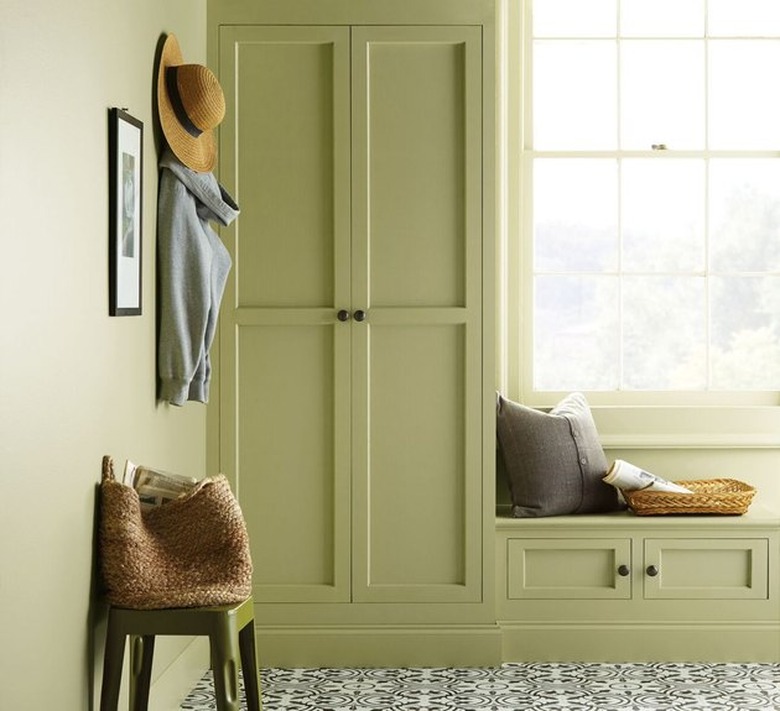 Behr
Behr
So, when you're looking to release a new color, or in this case, figure out your color of the year, what's your research like?
We're looking at what's happening in pop culture, we're looking at what's happening in art galleries and fashion. Fashion's really an amazing informer for what's happening in color that eventually translates into home decor. Now with the internet, I mean, it used to be when we were looking for inspiration 20 years ago, going way, way back, we'd pull tear sheets out of magazines and gather all that. Now you go online and you look for your favorite influencers, your favorite storytellers, you go on Pinterest. It's just endless. There's endless inspiration. So for us, distilling it down means that we take all of our favorite inspirations and put them into buckets by color family. Reds, blues, greens, yellows, oranges, and we just distill it down from there for what feels most appropriate for our market or for trends, because we're all about curating for our customers.
You mentioned earlier that you do a lot of travel as well. Where have you been recently?
I've been to Switzerland, I've been to Hawaii. [My colleague], Rob, has been to Croatia, Italy, [and] the big design show that's in Paris, Maison et Objet. We don't go to as many of those shows as we like to. I mean, NeoCon in Chicago, [and] we get to New York.
And when you're on the road, what things are you looking for?
We're looking for food; we're looking for design style. Is there a resort theme or a beachy theme that's going through? And because we knew that nature was going to be a driving influence [for the 2020 color of the year], it was, What kind of nature are we seeing here? We took video of the beaches, of cane fields, [and] just gathering all of that storytelling. Elements of waterfalls, lagoons, blues, greens.
So, how do you name a color? Does the name come first and then the color comes? What's the order of operations?
It depends on the product. I mean, because at Behr we're developing interior products, exterior products, wood stain, and specialty, decorative finishes. It's really if it's a new product, we look at how it's being applied, who might be using it, who's the target audience, how comfortable would they be buying a color like this. And then we back the names into it that way. We're always thinking about the storytelling aspect. If you can put a little story into two words, how would you apply it? So again, we get out the maps, we get out the gemstone books, we get out all the travel tour guides. I mean, we're looking at menus for food and drinks. We're very jealous of what the cosmetic industry gets to do because they're more edgy and out there.
True, but there have been horrible mistakes made in the cosmetics industry especially.
Yes. All of our names go through a legal process. They get vetted throughly so they're not inappropriate or culturally insensitive in any way. We have a mass audience and we want to make sure they're approachable. We have to be sensitive, because I mean, [Behr is] everybody. We're all ages, all demographics, we're everybody. We have to be very, very socially aware.
I imagine when you're selecting that color of the year, you've got to be thinking about the longevity of it. Because, with fashion, you can say, "Oh, this color is in," and all you have to do is change your sweater. Whereas —
You paint a room and it stays on there. I mean, that's why it's a totally different thing. When we're considering that color of the year, how timeless is it? Are people going to love it three years from now, five years from now, seven years from now? What other colors can they bring in to update that color easily? These are all things that factor in, too. Just the versatility. How many rooms can it go into? Inside, outside? Can you start at the front door and go through the entire house with this color?
When you select a color of the year, is there any internal war between something that really makes a splashy, bold statement versus something that's more of a neutral or a basic?
We go back and forth between that. I think the balance that we strike is, if it's a color of the year, it's got to be user friendly, easy to use, effortless, versatile; there are other colors in the palette that are maybe a little bit more spontaneous, push the envelope a little bit further in that sense. I would say are our color of the year tends to be typically a little bit more conservative for that.
So with "Back to Nature," where on the spectrum of bold vs. "effortless" does it fall?
[Our 2020 color of the year] is still on trend, it still feels like it's of the moment, but it still has to be a color that's approachable and easy to use by most folks. Because there's going to be people, quite honestly, who are going to be totally okay picking up a really crazy out there color, and I think our trends are more for those folks who are like, "I need help, where do I start?" This is a good place to start and we can build from here. Those colors are easy to mix and match. The color of the year is like that hub, and the other colors are the spoke. So we can get a little bit more playful with some of the others.