The 30 Best White Paint Colors For Your Home
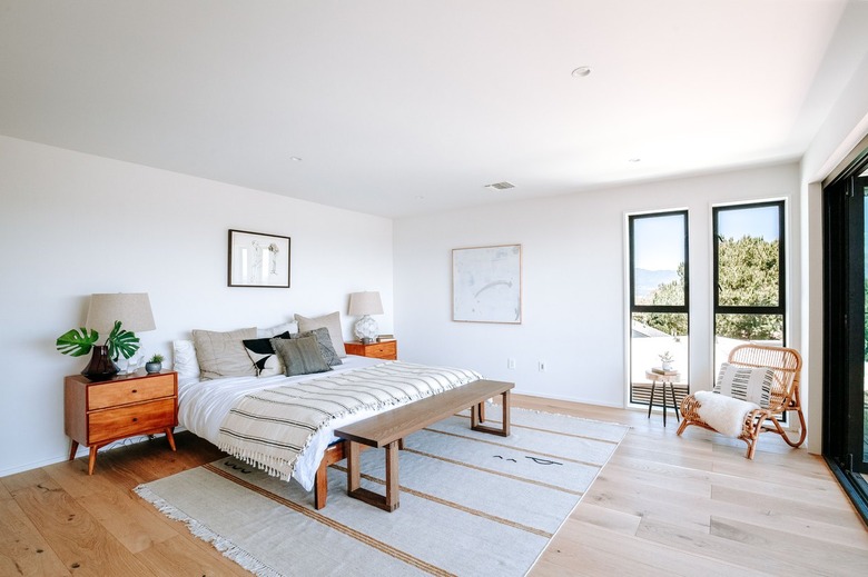
White wall paint gives you the option to have a clean slate — literally. You can play with the color palette by changing up the accompanying decor as much as you like. Or, change the entire design style on a whim, since white goes with everything from farmhouse to modern to bohemian. It's also a great way to make a small room seem larger or a dim room seem lighter and brighter.
There are a few cult favorites out there. Shea of Studio McGee has a penchant for Alabaster by Sherwin-Williams and Chantilly Lace by Benjamin Moore, among others. Joanna Gaines turned to "Alabaster" when she painted the living areas of her own home — but she also favors the color Shiplap from her own Magnolia Home line.
Designers will always shout out a diverse array of favorites. But what is the most popular white paint color nowadays? Pure White by Sherwin-Williams tends to top a lot of lists. At Benjamin Moore, although the company shares several popular neutral shades, White Dove comes in first. Unsurprisingly, the most neutral shade of white paint is going to be a pure, bright white — one that doesn't lean toward hints of yellow, gray, blue, or green. This is a color that will defy the trends and look good for years to come.
Not quite sure where to start? Here are 30 options to spark your inspiration.
30 White Paint Colors to Try
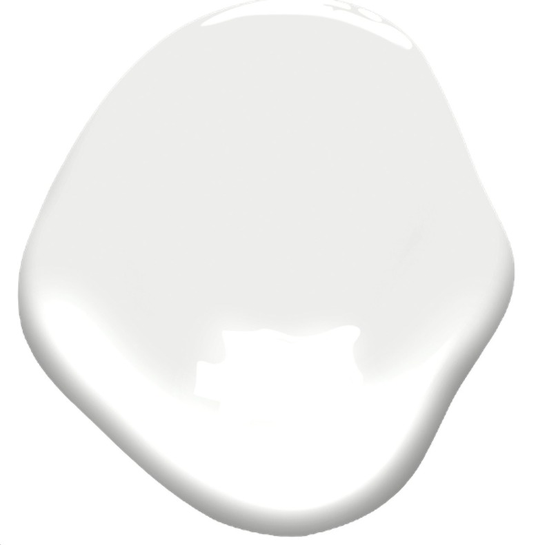
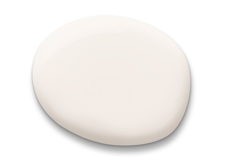
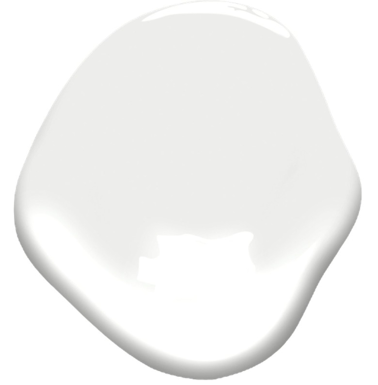
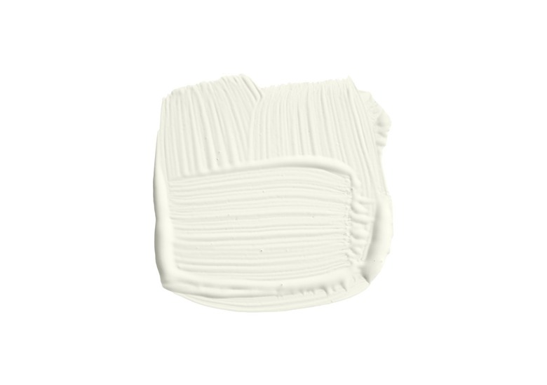
1. Benjamin Moore White
If you're searching for a paint color that will result in a true white wall — nothing fancy, trendy, or elaborate, no undertones lurking below the surface — go with this standard shade of white from Benjamin Moore. The brand describes it as classic, crisp, and all-purpose, meaning it can go anywhere with ease.
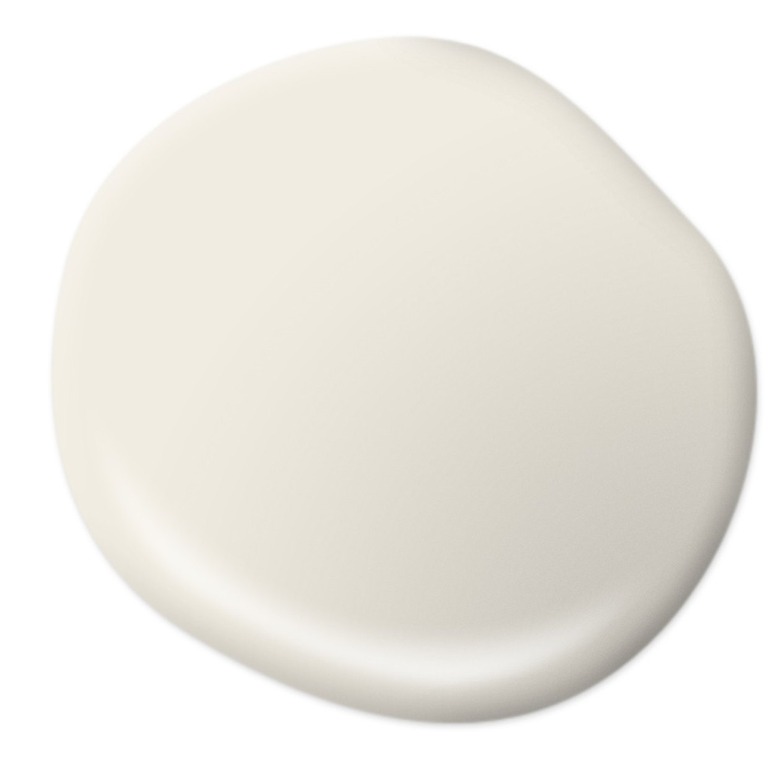
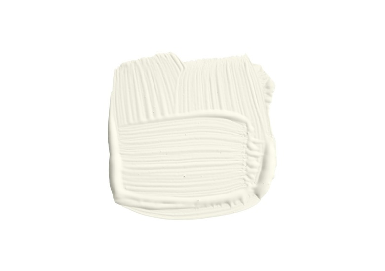
2. Sherwin-Williams Pearly White
 Courtesy of Sherwin-Williams
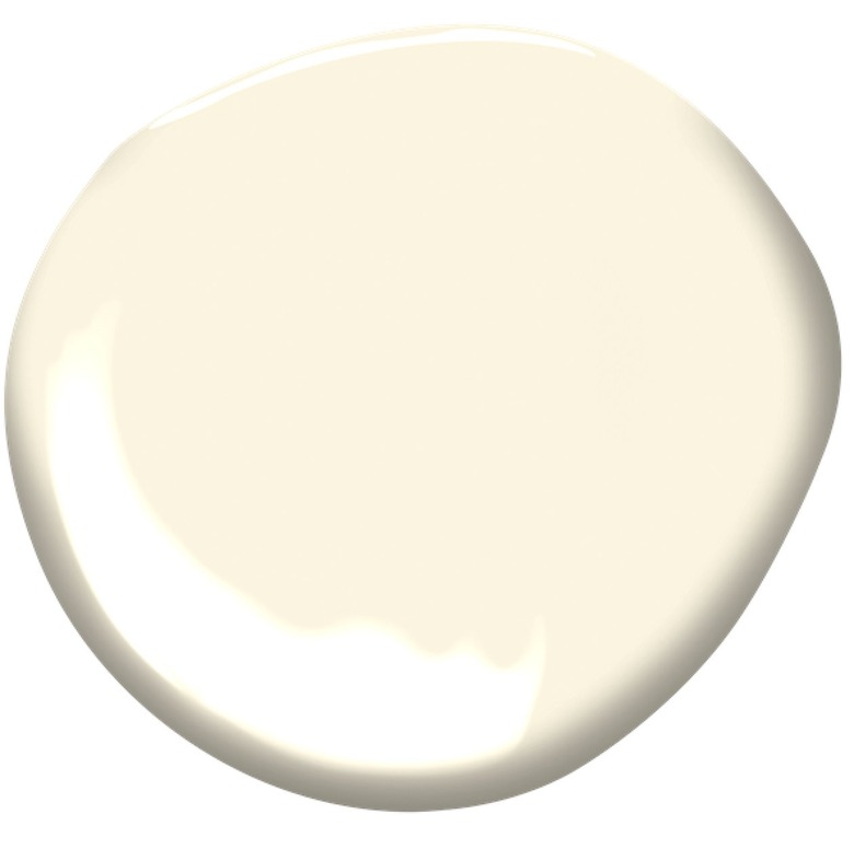
For a warmer white shade that ever-so-slightly showcases subtle hints of brown, consider Sherwin-Williams' creamy paint color Pearly White. Unsurprisingly, it pairs well with other shades that also carry brown tones, like Jogging Path and Grapy. The other bonus of this incredibly velvety hue? It can be used indoors and out.
3. Behr Whisper White
 Courtesy of Behr
Are you on the hunt for a white paint color that's not quite white? But not quite off-white either? You're in luck with this shade created by Behr, which combines a dash of each respective hue. Plus, it also happens to be Christina of The DIY Mommy's favorite white paint color, so you'll be in good company.
4. Farrow & Ball Wevet
 Courtesy of Farrow & Ball
Farrow & Ball is a British paint company that's quickly become a hit here in the United States, and for good reason. The brand makes some of the most unique white paint colors around, including shades that carry plenty of visually interesting undertones. Wevet, a color that'll look idyllic on kitchen cabinetry, gently leans toward gray.
5. Sherwin-Williams Alabaster
 Courtesy of Sherwin-Williams
Known and praised by many to be an ideal warm white, Sherwin-Williams's Alabaster has become a cult classic. It can be used indoors and out, and it's beloved by bloggers like Jenna Kate at Home and Heather of Heathered Nest. It matches up beautifully with Pure White by Sherwin-Williams as well.
6. Behr Bit of Sugar
 Courtesy of Behr
Looking for a shade of white that's a bit on the sweet side? Then look no further than Bit of Sugar from Behr. Some have said that it slightly resembles Benjamin Moore Chantilly Lace without the cool tones and will look ideal in any farmhouse space. Kevin Francis O'Gara of Thou Swell calls this "the best bright warm white paint color for walls."
7. Benjamin Moore Decorator's White
 Courtesy of Benjamin Moore
This shade of white from Benjamin Moore isn't called Decorator's White for nothing. Known to be a designer darling, it's described as "sophisticated." It's a simple shade that is subtly off-white and would look particularly chic, and even amazingly tranquil, in a living room.
8. Sherwin-Williams Ibis White
 Courtesy of Sherwin-Williams
Have you ever seen a white ibis out in the wild? This paint by Sherwin-Williams seems to perfectly capture its beauty. Geared toward both interiors and exteriors, the hue will look especially flawless when paired with other trending colors, such as the dusty rose-hued Malted Milk and the earthy Hushed Auburn.
9. Farrow & Ball Shadow White
 Courtesy of Farrow & Ball
If you tend to be drawn to Instagram images of interiors filled with shadows instead of natural light, this Farrow & Ball paint color might be the perfect one for you. Appropriately called Shadow, it has a gray undertone that'll blend in splendidly with a variety of wood finishes and trims. We'd call this a moody shade of white.
10. Behr Night Blooming Jasmine
 Courtesy of Behr
Perhaps you're continually on the lookout for the perfect shade of white for your family room. Something that's not too cool, not too warm, and guaranteed to go with everything — even if your tastes change over the years. Enter Night Blooming Jasmine. This hue is sure to look just as pretty on your walls as its name suggests.
11. Farrow & Ball Shaded White
 Courtesy of Farrow & Ball
Maybe the sound of an all-white room in the purest, cleanest white doesn't sound so great to you. In this case, we recommend heading (slightly) to the dark side with a color like Shaded White from Farrow & Ball. They call it a "light gray-beige," which is certainly true.
12. Benjamin Moore White Opulence
 Courtesy of Benjamin Moore
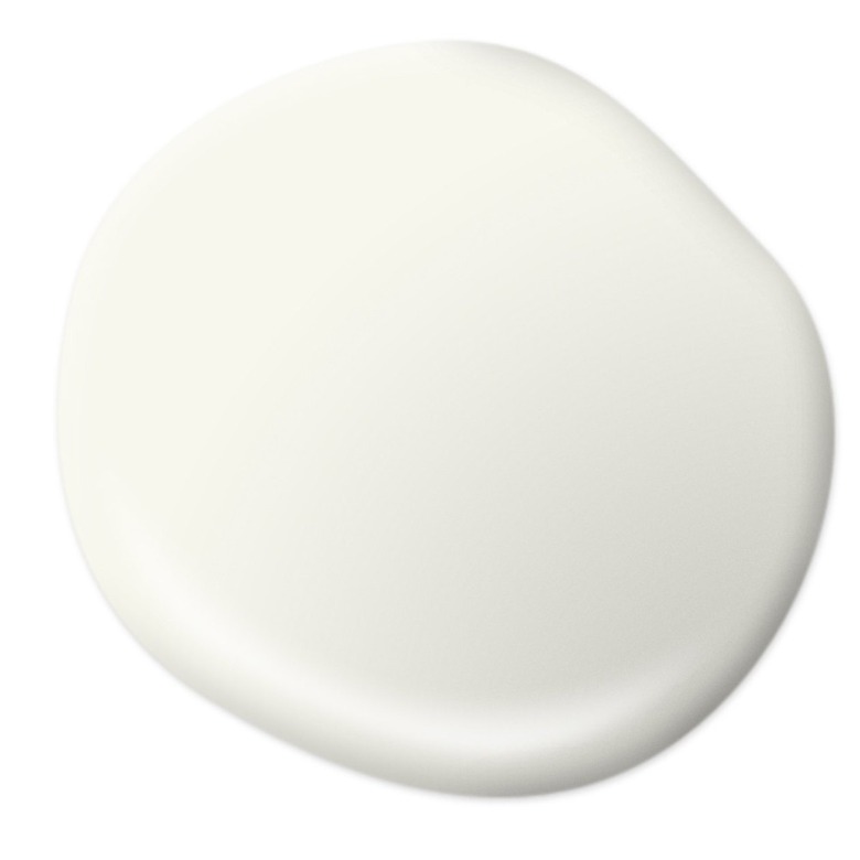
Want to go with off-white for your space, but not too off-white? This paint color lightly dips its toe into the off-white waters. This one won't show off too many yellow undertones, if that's something you're concerned about, and it's been named by Vogue as one of the best white paint colors.
13. Farrow & Ball James White
 Courtesy of Farrow & Ball
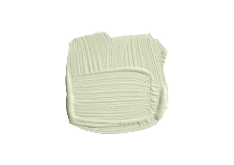
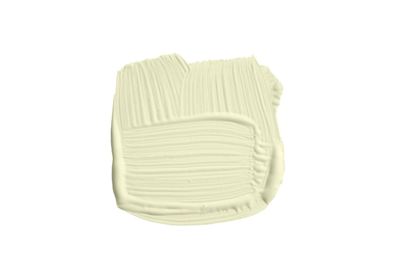
Sometimes, paint colors carry the names of the people who first used them in their homes, like this shade from Farrow & Ball. It's named James White after a doctor who first used the off-white hue in his garden room many years ago. This shade feels slightly green, which sounds perfect for a room filled with plants.
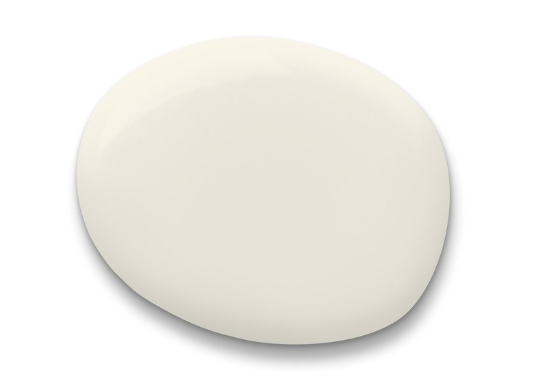
14. Benjamin Moore French Canvas
 Courtesy of Benjamin Moore
Clean? Classic? With a delicate yellow undertone? Benjamin Moore's French Canvas checks off all of these boxes. Not to mention, Sara of Sara Lowman Interiors used the shade in her eat-in kitchen and the soft off-white shade is simply stunning.
15. Benjamin Moore Stone White
 Courtesy of Benjamin Moore
Benjamin Moore's Stone White is the true wild card on this list. Does it lean gray? With its blue undertones, does it look more like a soft, ocean-inspired hue? This is a shade that doesn't quite know what it is, and that's perfectly fine. It's guaranteed to add dimension and visual interest to any space.
16. Sherwin-Williams High Reflective White
 Courtesy of Sherwin-Williams
You could very well be in the middle of searching for the brightest of white paint colors. Good news: Your search is over. High Reflective White is a super white that promises to brighten up any interior. It's also an ideal match for the truest of farmhouse spaces that bask in natural light.
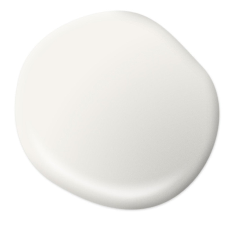
17. Benjamin Moore White Vanilla
 Courtesy of Benjamin Moore
Is anyone else craving a scoop of vanilla ice cream after looking at this paint shade? Somehow, Benjamin Moore has perfectly nailed the color of this classic confection. The brand calls it a "very light off-white" that "taps a yellow undertone for added depth." It also just makes us want dessert.
18. Farrow & Ball Pointing
 Courtesy of Farrow & Ball
Simply called "Pointing," this Farrow & Ball paint color is referred to as a warm and delicate white. According to the description, it got its name from the "lime pointing," or grout, used in traditional brickwork.
19. Behr Sleek White
 Courtesy of Behr
What words do you use to describe your design style? Uncomplicated? Sophisticated? Minimalist, even? Then allow us to direct you to Behr's Sleek White, a study in unfussy color ideas. Kevin Francis O'Gara of Thou Swell used it to punctuate paneling in one of his projects, and it happens to look gorgeous with Behr Rain Dance.
20. Sherwin-Williams Roman Column
 Courtesy of Sherwin-Williams
You want your dining room to look elegant and timeless, right? To achieve that, start with this pretty much perfect backdrop. With understated touches of yellow, making it a creamy off-white, Sherwin-Williams's Roman Column will make your artwork pop off of the walls. And as a bonus, it won't overwhelm any grand lighting or furniture that you include.
21. Benjamin Moore Baseline White
 Courtesy of Benjamin Moore
Inspired by Fenway Park's baseline, this shade of white brings to mind clean, classic, and even a hint of Americana. It goes with other shades from Benjamin Moore's Fenway Collection that includes Green Monster Green, a surprisingly chic green hue. Together, these colors could make for a stylishly on-trend office.
22. Farrow & Ball Wimborne White
 Courtesy of Farrow & Ball
This paint color from Farrow & Ball is pretty much the truest form of off-white that you can get. With oh-so-British roots (it was named after the market town of Wimborne in Dorset (also known as Farrow & Ball's headquarters), it's a shade that's sure to look gorgeous in any kitchen.
23. Behr Swiss Coffee
 Courtesy of Behr
Behr Swiss Coffee has become a cult favorite among design devotees, resembling the exact shade of coffee with a hefty splash of milk. Erica Van Slyke of Designing Vibes has had great success with this paint color, proving that it's an ideal backdrop for boho-meets-modern decor.
24. Farrow & Ball Strong White
 Courtesy of Farrow & Ball
Don't let the name fool you. Even though this "Strong White" from Farrow & Ball might sound as if it's the whitest of whites, it's actually a gray-based shade, as the company calls it. It's a cool white that's just the thing for modern spaces and pairs wonderfully with black accents.
25. Sherwin-Williams Snowbound
 Courtesy of Sherwin-Williams
Perhaps your favorite version of white is winter snow. In this case, we'll direct you to Sherwin-Williams's Snowbound. Partnering nicely with deeper gray hues, it's a color that's particularly beloved by bloggers the world over, like Amanda Katherine, Lauren of Love Remodeled, and Kylie M. Interiors.
26. Benjamin Moore Moonlight White
 Courtesy of Benjamin Moore
Can it get any cleaner and simpler than Moonlight White? This nature-inspired hue from Benjamin Moore is just off-white enough, resulting in a calm atmosphere in any room — it'll look incredible in a bedroom where you're aiming for a soothing vibe. Additionally, Brooke and Henry of Plank & Pillow named it one of their best interior white paint colors.
27. Farrow & Ball Blackened
 Courtesy of Farrow & Ball
Blackened. Doesn't really sound like a white paint color, right? Well, we assure you that it most certainly is. In fact, it's Farrow & Ball's coolest white paint color, a hue that toes the line between white and gray. It's sure to look outstanding in any modern space, and the company says that it also shines in industrial rooms as well.
28. Behr Polar Bear
 Courtesy of Behr
Behr has flawlessly captured the exact color of a polar bear's fur with this particular paint shade. It's beautiful and wintry in the best way possible, so it's no surprise that it was in the running when farmhouse-decor expert Liz Marie wanted to paint the exterior of her home. We think it would look perfect paired with any farmhouse or rustic aesthetic.
29. Sherwin-Williams Dover White
 Courtesy of Sherwin-Williams
Dover White by Sherwin-Williams is a deep shade of off-white that's been named a trending color of the month by the company MHM Professional Staging. And it's a favorite among designers, too. Painted by Kayla Payne used the cool color to completely transform a set of kitchen cabinets.
30. Farrow & Ball School House White
 Courtesy of Farrow & Ball
If the look of a bygone schoolhouse could inspire your home's aesthetic, consider Schoolhouse White by Farrow & Ball. This shade is the brand's lightest, softest off-white, and with no cool undertones, it is also a timeless choice. And as the name suggests, it's very similar to the color once used in schoolhouses of yore.
4 Fail-Proof Tips for Selecting White Paint
4 Fail-Proof Tips for Selecting White Paint
1. Look for the undertones.
Remember that most white paints aren't truly white. Many lean toward warm or cool colors, sporting a subtle pigment of yellow, gray, blue, or green. Be sure to carefully read the description of each paint color to learn more about its unique undertones.
2. Think about lighting.
Is your room dark? Full of light? Does it bask in natural light, or is it filled with lamps galore? These are things to consider when selecting white paint since every shade will look different with varying types of light. For example, the less natural light, the more warm undertones will show through.
3. Consider your design style.
To the everyday onlooker, white just looks white. But to a trained, well-researched eye, shades of white vary with just the tiniest bit of subtlety between them. While warm whites show off red and yellow tones, cool whites can look ever-so-slightly blue or gray in a certain light. Think about how a warm white will look in your space as opposed to a cool white, and how these shades fit into your overall decor scheme. Cool whites usually look best in modern spaces, while warm whites lend themselves to traditional or vintage-inspired rooms.
4. Test, test, test.
As with any paint color, it's imperative to test it out before fully committing to it. Many brands have "visualizer" programs available on their websites so you can digitally apply paint colors to a room before making your decision. Or you can always go the traditional route of ordering paint swatches or sample cans from your local home improvement store.