These Are The Paint Colors That Will Help You Get A Better Night's Sleep
We may receive a commission on purchases made from links.
Struggling to catch up on zzz's after Daylight Saving Time? Sleep Week is here to help. From editor-tested bedding and slumber-friendly products to bed cleaning hacks, we've got everything you could ever need to up your sleep game. Happy snoozing.
When aren't we trying to get a better night's sleep? We probably all know someone who has purchased a product (or five) that promises to help them catch some Zzzs — like sound machines, lavender pillow sprays, weighted blankets, or light-blocking curtains. But rather than adding items to your room to help you sleep better, what if you started out by asking yourself: "What is the ideal bedroom paint color for getting the best night's sleep?"
Nancy H. Rothstein, MBA, also known as The Sleep Ambassador®, tells Hunker, "Bedroom paint colors should be soothing, relaxing, and calming ... Most people will not gravitate to reds, oranges, and black to arrive at a sense of peace." We reached out to additional sleep experts, home design specialists, and painting professionals to help us pick the best hues for drifting off to sleep.
1. Soft Blues
1. Soft Blues
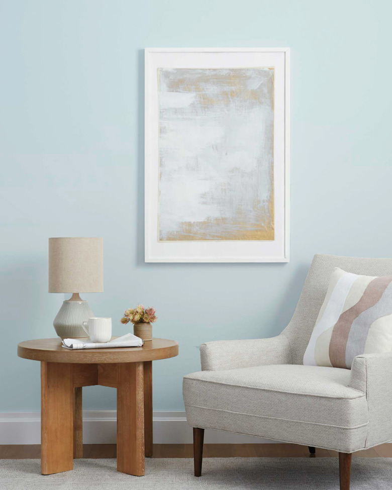
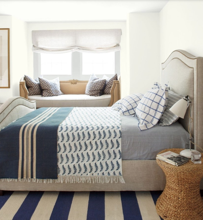
Liz Brown, a certified sleep science coach and founder of SleepingLucid, tells Hunker that blue is one of the best colors to promote sleep because "it helps set a calm and relaxing sleep environment." Specifically, Brown explains, "this color also triggers your eyes' ganglion cells, which transmit messages to the parts of your brain that control your circadian rhythm, making it easier for you to attain the optimal conditions for sleep." In fact, a 2013 survey conducted by Travelodge found that Brits with blue bedrooms were getting an average of seven hours and 52 minutes of sleep every night. Does that not sound like a dream?
However, make sure that you're going with a soft shade of blue. According to Steven Wood, an interior designer and writer for home DIY site SwankyDen, "light pastel or muted shades of blue are the best." He also suggests going with a flat sheen so that the paint doesn't reflect light while you're trying to snooze. When it comes to a specific shade of blue, Nicole Gibbons, founder of paint company Clare, recommends the brand's icy, cool blue color Frozen. "The soothing effect is perfect for a better night's sleep," she tells Hunker.
2. Earthy Greens
2. Earthy Greens
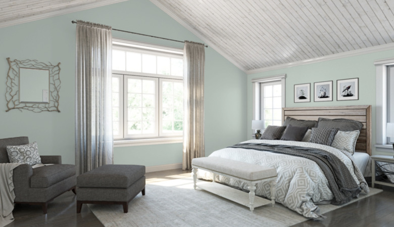
Consider colors that remind you of the peace and quiet of nature. Ahmed Ali, an outreach consultant at home management app Centriq, tells Hunker that green is great for the bedroom because of its nature-associated properties — and more. "People commented that waking up in a green color bedroom makes them feel positive," he said. "The natural green color is linked to love, positive energy, reputation, and fame." Cate Griffing — who runs painting blog West Magnolia Charm and owns New Jersey-based painting company Wow 1 Day Painting — tells Hunker that she particularly likes using Sherwin-Williams's Rainwashed, a sage green, for bedrooms.
Designer Gina Tomczak of Looney & Associates is currently renovating the 610 guest rooms at the JW Marriott Chicago and has chosen an ivy green color for the walls. "Green hues can also represent growth and renewal," she tells Hunker. "When used in a guest room, the traveler's sanctuary, greens can help to create a restorative experience." A great option you can buy at The Home Depot is Glidden's English Ivy with a flat finish.
3. Pale Yellows
3. Pale Yellows
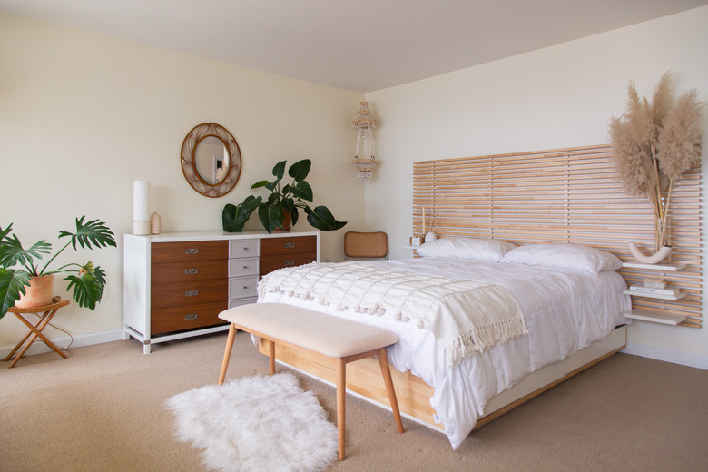
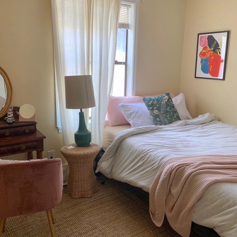
When describing the color yellow, Ali calls it a sunny color that promotes comfort and relaxation. Yet, like with blue, you want to make sure you're going for a more muted yellow, as opposed to a bright hue that makes you feel wide awake.
Sleep Authorities web content writer Julia Quade adds that, according to Psychology Today, you should pick a paint color based on the temperature it is associated with. She tells Hunker, "Choose warm colors to feel warmer, like yellow, and cool colors, like gray or blue, to feel cooler." For the type of warmth yellow gives off, Natalie Ebel, co-founder of Backdrop, suggests the brand's Palo Santo, a warm beige with a hint of yellow, or Mood Lighting, a neutral yellow-beige.
4. White
4. White
"You can also never go wrong with a pure bright white," Ebel says. Backdrop's Supermoon is described as exactly that. Holly Waterfield, lead designer for interiors at The Brooklyn Home Company, says that white is also her preferred color for bedrooms. "Benjamin Moore's Simply White is my go-to white for bedrooms," she tells Hunker. "It's warm enough to not be stark, but still a crisp white." She adds that it's the type of color that allows your mind to focus on rest because it's not stimulating or distracting.
If you're looking for more of a creamy white, Sue Wadden, Director of Color Marketing at Sherwin-Williams, tells Hunker that one of their most popular whites is Dover White because it has a "rich creaminess that is warm and welcoming."
5. Gray
5. Gray
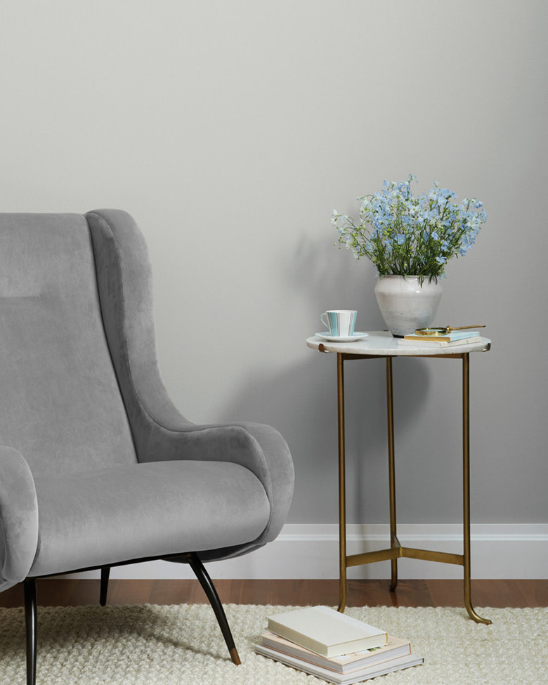
Soft, subtle colors like gray can set a serene mood for the bedroom, according to Gibbons. "Clare's ultra pale greige Penthouse is the perfect mix of warm and cool, and is our bestselling neutral," she reveals. "Another great neutral option for a bedroom is Seize The Gray — it's the perfect shade of gray with no undertones, and is versatile and calming."
For help winding down, Ebel recommends Backdrop's Moonstone, an off-white color with a hint of gray, or Ritual Unions, which is a neutral, light gray. "They are both really clean and make you feel at ease before bed," she says.
If you're unable to choose between the nature-evoking green and the serenity of gray, Wadden has a suggestion. "Silvermist SW 7621 is a soothing, muted silver sage that brings calm serenity, creating a sanctuary space in a bedroom," Wadden says. It's the best of both worlds.
6. Peachy Pinks
6. Peachy Pinks
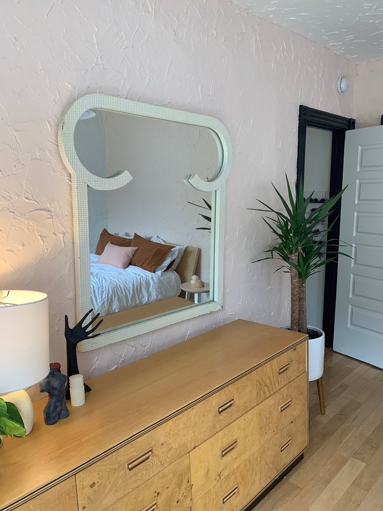
When asked about the bedroom color she suggests to her clients, Karen Haller — author of The Little Book of Colour, How to Use the Psychology of Colour to Transform Your Life — tells Hunker that two good options are soft pinks and apricots. "Our bedrooms are the place where we rest, restore, and get ready for the next day," Haller says. "Soft hues offer us a better night's sleep as they are soothing."
Paige NeJame, owner of CertaPro Painters, seconds this, saying that it's also the case with children's bedrooms. If, for instance, the company is called on to paint a nursery pink, they will choose a muted pink over a stimulating one. Backdrop's Harajuku Morning fits the bill, and Ebel specifically recommends it for this reason.
