4 Unexpected Kitchen Trends That Will Make Your Space Look Dated In 2026
Kitchen remodels are a big undertaking. They take a major toll on your free time, emotions, and wallet. Hence, it's completely understandable to want to do it once — and do it right — by picking timeless materials and making design decisions you'll enjoy for years to come. However, as an interior designer, I can't begin to tell you how often homeowners think they've chosen something with staying power, only to realize they've created a space that dates itself before the paint is even dry. How is this possible? The issue is that, in place of thoughtful, intentional selections, many are quick to jump on trend bandwagons in an effort to craft what they see as a design-forward space with widespread appeal. Instead, they're creating a room with an invisible timestamp that loudly announces to people exactly when it was designed. As you'd expect, that never ages well.
So, if you're about to embark on a kitchen renovation, how can you avoid these trendy pitfalls and which are the worst offenders for instantly dating a kitchen in 2026? From choosing the wrong quartz countertop pattern to incorrectly illuminating the space, there are a few major no-nos I see floating out there all the time disguised as "popular" design decisions. As with most things design-related, the distinction is all in the nuance of the details. Without further ado, let's break down the four unexpected trendy kitchen elements that will pigeonhole your space into looking like it's straight out of the late 2010s or early 2020s.
Choosing permanent finishes with stark, cool undertones
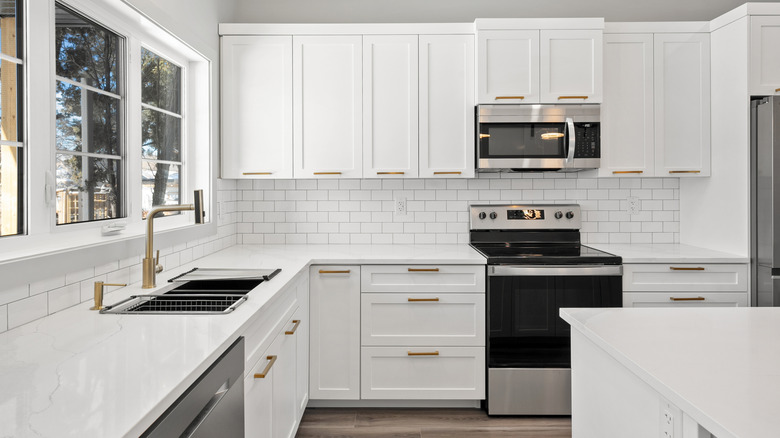
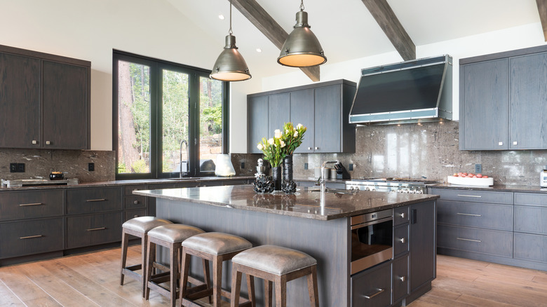
When choosing a time-tested color palette for your kitchen, it may seem like a no-brainer to embrace a chic, versatile design of neutral tones and materials. I mean, who can go wrong with white, right? Well, not so fast. While neutral palettes in general are classic and will never go out of style, the type of go-to neutrals has shifted in recent decades.
In the days of white-on-white-on-white (or silvery gray) kitchens being at the height of popularity in the 2010s, homeowners relied on bright whites and soft grays with cool undertones for that crisp, clean look. However, it became quickly and abundantly clear that the resulting spaces ended up sterile, boring, and rather lifeless. Choosing permanent finishes with cool undertones today will instantly transport your kitchen back to these days ... and who wants a brand new kitchen that already looks a decade and a half old?
Instead of opting for stark white kitchen cabinets, pure white countertops, and (please no) solid white polished subway tile, people are gravitating toward materials with more warmth, depth, and interest. To achieve this, look for neutrals with warm undertones — think creamy off-white, greige, beige, oatmeal, taupe, or mushroom — to give a cozier, more welcoming ambiance than those almost clinical cool neutrals of years past. Pair these homey, earthy hues with natural materials, like wood and natural stone with warm veining, along with rich metal finishes. Something like antique brass or polished nickel is sure to keep the warm vibes going all around. By leaning even the slightest bit warmer with your material selections, you create a space with intoxicating depth and an organic richness that avoids looking like a love letter to the 2010s.
Relying exclusively on recessed lighting
Opponents of recessed lighting in the kitchen claim this modern form of illumination does nothing to lend personality to the space, is overly sterile, and doesn't have a place in historical homes where it wouldn't have been original. I agree these points are all valid, but I also feel those who say recessed lighting in a kitchen is totally "out" are being a bit unrealistic. This type of lighting source is typically more of a necessary evil than something to be entirely omitted. While a huge ceiling full of recessed lights may not add much design value, not being able to see what the heck you're doing is arguably even less charming.
However, the opposite is also true — relying solely on recessed lighting is a huge mistake that will leave your space looking dated and aesthetically lacking. There has to be a balance to ensure your kitchen is both illuminated to function properly and features decorative fixtures that add visual interest to the space. The key is to implement a more harmonious lighting scheme with various layers of task, ambient, and accent light.
Consider layering your kitchen with oversized island pendants or a chandelier for a dramatic statement fixture that provides ambience. Include under-cabinet lighting for a subtle glow and extra countertop task illumination, and flank the stove or sink with decorative wall sconces to serve as an intimate source of beautiful accent lighting. In the event you must rely on a few recessed lights for proper illumination (most do), opt for smaller, more discreet fixtures with a dimmer to reduce the glaring "big light" interrogation room effect, and choose bulbs with a color temperature no higher than 3000K to avoid cold, sterile light.
Trading upper cabinets for high-maintenance, cluttered open shelving
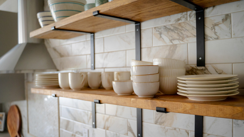
As a designer, watching the short lifespan of an impractical trend surge and dwindle is all part of the job — as is advising against said trends until they've run their course. One such trend is none other than the ubiquitous walls of kitchen open shelving. Before we go any further, I have to say that there's a definite distinction between open shelving installed as a "functional" alternative to upper cabinets and a small section of decorative shelving meant to liven up the place. Decorative shelving, especially a unique application like ceiling-mounted French bistro shelves, can add to the aesthetic value and tell your home's story. Floating shelves for the purposes of storing dishes and kitchenware like a cabinet, however, have proven over the past few years to be far more of a hassle than they're worth.
Sure, the airy, unencumbered aesthetic looks gorgeous in photos, but the reality of living with open shelving is typically more of a cleaning nightmare, storage downgrade, and cluttered eyesore. Dishes exposed to constant dust and grime without the protection of cabinet doors require so much extra cleaning that it's a dealbreaker for most right there. Others are shocked by how much storage they actually lose, unsure where to now stash all of the ugly kitchenware they once could hide behind closed doors. And nearly all, unless the homeowner happens to be a talented stylist, lack the cohesion, nuance, and skill it requires to actually style an open shelf to look beautiful rather than chaotic. And so, unless you love dusting your cereal bowl before breakfast, let's just say that open shelving was a moment in time (which has passed).
Installing faux-marble quartz with thick, overly uniform gray veining
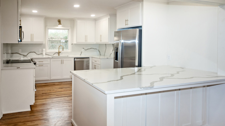
This kitchen trend is a textbook tale of "all materials are absolutely not created equally." The material in question that can make or break the look of your space is an imitation marble quartz countertop. Real marble is stunning, but impractical and unaffordable for many families as a kitchen countertop. So, it's understandable why marble-look quartz options have flooded the market over the past decade. And while quartz will never look 100% like real marble, that's not really the problem — it's that some do a far better job at pretending than others, and a bad pick will make your kitchen look instantly dated.
The problematic faux-marble quartz slabs are those with heavy gray veining that looks too defined and uniform to be anything but manmade. These stripy rivers of gray run thickly across a pure white background without so much as a thin vein or warm undertone in sight. The Calacatta marble lookalike slabs are often the worst offenders, churning out thick gray and white patterns under the guise of boldness. But instead, the overly simplistic, striped appearance looks cheap and fake.
To avoid this pitfall but still get the marble look with low-maintenance, affordable quartz, pick a slab that has a higher-quality, more convincing natural pattern — one that includes variation and intentional "imperfections" to feel less artificial. Likewise, choose a background that's off-white or creamy rather than stark, pure white, as well as veining with warm undertones instead of strictly cool gray, so it feels more organic and from the earth.