Designers Say This Calming Living Room Paint Choice Is Kicking Stark White To The Curb

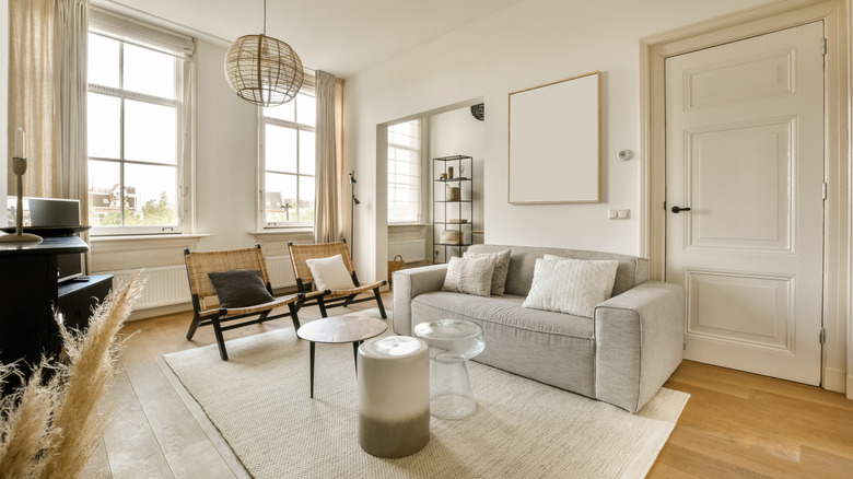
While white paint is a great color choice for living room walls, shades that are a little bit too white can feel quite clinical instead of cozy. That's why designers are kicking stark white to the curb, and embracing creamy off-whites with heated undertones instead. "Soft, warm whites can make a space feel serene and timeless while offering versatility," designer Nicole Roe told Real Simple when discussing living room colors. And her pick for the best place to start? "As the name suggests, Sherwin Williams' Creamy adds warmth to a space, making the room feel inviting and relaxed," she said.
Living room walls are shifting away from stark whites off the back of a distancing from 2010s minimalist design. Cool white paint colors were everywhere as people attempted to curate serene living rooms; however, the chilly undertones of certain shades of the color made most living rooms feel more like a doctor's waiting room than a home. So now, things are turning away from this look and towards a trend of warmer, creamy hues and places that look more lived-in in general, across all mediums. "You may have the best intentions in creating a light and airy space, but a stark white can make a living room feel sterile," designer Margaret Donaldson told Southern Living. Warm off-whites are the solution to this problem, and an easy fix at that.
How to pick the perfect creamy off-white paint color for your living room
When selecting the perfect off-white paint color for your living room, always look for options that have warm undertones. If you aren't sure which way a color leans, its website description will usually tip you off, as it lists what hues make up the mix. However, there is another trick, too. "By viewing white paint colors next to one another, the undertone will become more obvious, making it easier to select a white option that leans warm or cool," color and design expert Andrea Magno told Benjamin Moore. So comparing swatches (or asking a paint store employee!) will lead you in the right direction. Remember, the three colors that are mixed in to give off-whites their cheerful tone are red, orange, and yellow.
For example, the designer-approved Sherwin Williams' Creamy is formulated with a touch of yellow, which really dials up the warmth. These undertones are just present enough that the color doesn't feel sterile, but they're not intense enough that it feels too buttery, either. Another paint color that accomplishes something similar is White Dove OC-17 by Benjamin Moore, which is a favorite of designers in 2026. This shade also has a subtle yellow undertone, the opposite of a stark white.