Say Goodbye To Beige And Hello To This More Timeless Neutral Paint Trend
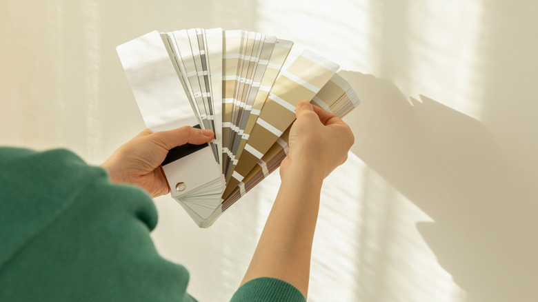
Paint color trends change with the times, from the funky bold tones of the 1960s to nature-inspired hues of the 1970s – and even to that regrettable standard of the 1980s: mauve. The past few decades have seen a rise in more neutral palettes of grays, whites, and taupe, and for good reason. Neutrals tend to be timeless paint colors that create a quiet luxury aesthetic, making them a go-to for bedrooms and other spaces in your home where you want a calm, cozy vibe. But a neutral palette doesn't have to be boring, and recent style trends are leaning into a color that goes way beyond banal beige. Meet khaki.
Khaki, that classic color of early British army troops and world adventurers, is a mid-tone tan with undertones ranging from yellow to olive. Khaki brings feelings of calm and earthiness to a space, making it work in almost any part of the home. An example of this popular shade is Sherwin-Williams 2026 color of the year, Universal Khaki SW 6150, which San Francisco Magazine calls "beige's cooler, more thoughtful older sister" in a recent Instagram post. Others in the design world are also taking note of this paint trend, including interior design YouTuber Ashley Childers, who describes khaki as a "grounded neutral that feels modern yet timeless." She adds, "It bridges classic and contemporary interiors beautifully." Wherever you use it, this mid-tone shade provides a warm, charming backdrop for a variety of complementary colors.
Styling khaki in your home
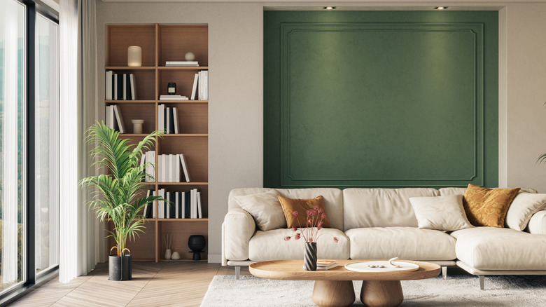
Just like your favorite pair of chinos, khaki can go with just about anything, but a few colors stand out as good complementary options for this classic neutral. A warm white, like HGTV host Erin Napier's favorite neutral, will stand out crisply against khaki when used on millwork like fireplaces or crown molding. However, you can get a lot more colorful with khaki as well, bringing in green elements (think upholstery or plants) or even a rich burgundy or terracotta hue to lean into that earthy feel. You can also pair it with classic navy or indigo accents for a clean, traditional look. Beyond color choices, wood furnishings and natural materials like stone and linen complement khaki shades well.
Room lighting plays a big role in choosing paint colors for your home, and how bright or dim your room is will affect how a khaki shade looks in the space. Khaki tends to look more yellow in warmer, brighter lighting or more brown or olive in darker rooms. Be sure to try it out in an inconspicuous area first before committing to an entire space, or consider using it in a smaller room, like a mudroom or entryway, to see how this trending color feels.