

IKEA's 2027 Color Of The Year Brings Moody, Earthy Vibes To Your Space For Max Comfort
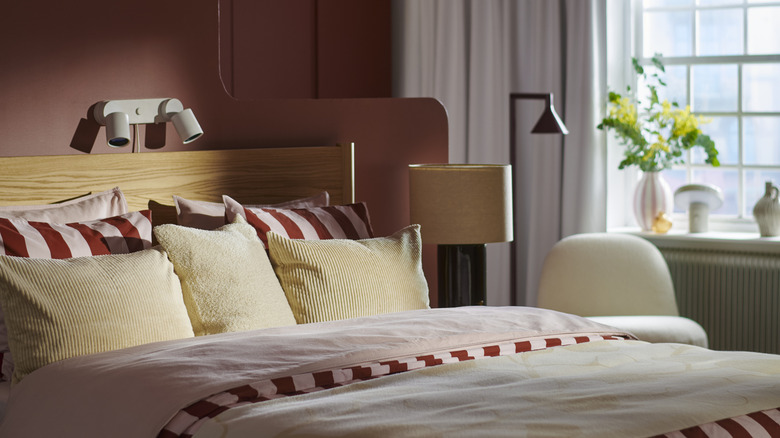
Swedish furniture retailer IKEA announced its 2027 Color of the Year today, alongside its corresponding annual Style Guide, which dives deeper into the trends its insights team sees coming for the year ahead. 2027's top honor goes to Wild Fig, a rich yet muted burgundy color with warm purple, red, and brown undertones. Unlike IKEA's prior Color of the Year picks, 2025's Electric Blue and 2026's Rebel Pink, which were distinctly vibrant, Wild Fig has a much moodier, earthy feel. "It really was derived from nature... looking at florals and things like berries," Abbey Stark, IKEA's Home Furnishing Direction Leader, told Hunker in an exclusive interview at DIY Con in Dallas last week. "People need to be in nature to feel much more grounded, and it's a very grounding color," Stark shared.
This cultural desire for serene, earth-focused, slow-living-inspired sanctuaries is exactly what earned Wild Fig the top spot for IKEA's 2027 lineup. While still bold and eye-catching, the winning hue also brings a warm, approachable calm that's rooted in nature. "We wanted people to be at peace and feel surrounded by comfort," explained Stark, adding, "I think this is what this color brings to them."
IKEA could be onto something, as variations on this deep, muted hue are appearing across many product lineups, from dark, red-heavy iterations like oxblood and maroon to more purple-based shades like plum and aubergine. So let's break down all the details on how IKEA's trend reports landed on this particular shade for its Color of the Year and how they envision it coming to life in a variety of 2027 interiors.
How IKEA chooses its Color of the Year
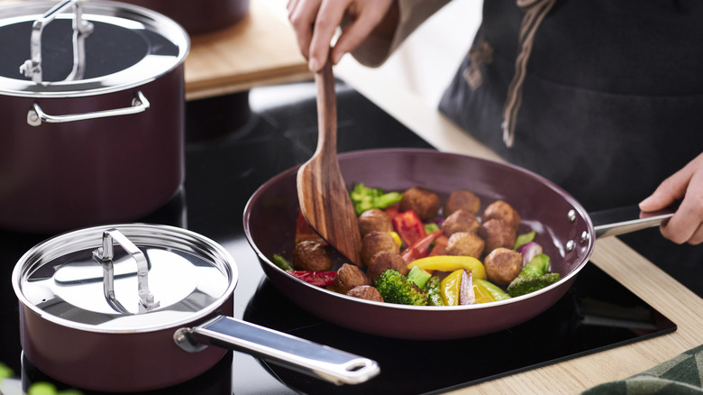
When choosing the Color of the Year and developing Style Guide trends, IKEA relies heavily on the conversations from its annual survey, Life at Home, which explores the ever-changing, dynamic relationship between people, their homes, and the world around them. This year's report had the overarching message that, in a lightning-fast, perpetually changing world, people need their homes to remain a constant, steady, reliable source of comfort and safety. This comes across loud and clear in IKEA's Style Guide, which features cozy, tranquility-focused terms like "stability," "communal," and "comfortmaxxing." Therefore, it's understandable how the insights team wanted a calming but eye-catching shade to lead the charge for the brand's 2027 vibe.
"As a Scandinavian company, we have always embraced bold colors," Stark shared. "We call it daringly bold, and I think it's refreshing for us to take that stance this year." But a hue with some oomph isn't just the retailer's preference. "People are daring to be bold. They're daring to be more themselves. They're experimenting a little bit more," Stark said about the survey's findings. "That's why we're going more towards color." Stark indicated bolder earth tones have been popular lately, such as beloved dark greens, but the deep purple-red felt fresh and exciting. And so, Wild Fig was chosen to play both roles: a rooted, time-tested earth tone and a striking on-brand color with a commitment to drama and depth.
IKEA's 2027 interior forecasts and how Wild Fig fits in
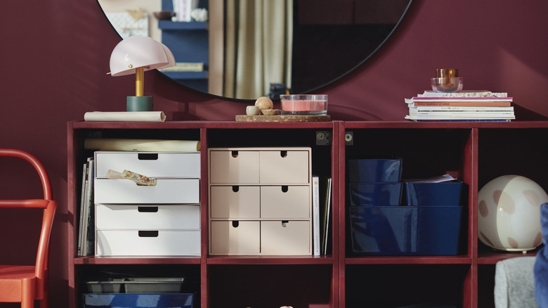
With the Color of the Year chosen, IKEA then worked Wild Fig into the four aesthetic trends for 2027. The first, The New Nostalgia, is a fresh perspective on an old classic: midcentury modern. According to IKEA, the upcoming renaissance will share some hallmark similarities with the original retro aesthetic, most notably the warm '70s color palettes (including Wild Fig in prints and patterns), mixed wood and metal finishes, and geometric patterns paired with vintage silhouettes. However, this revival will take on a more lived-in, eclectic feel, with an emphasis on curated personal touches.
The second IKEA trend story, Color Block Party, is a pop-art celebration combining energetic, happy hues. No timid color here — this trend embraces vibrancy, joy, and blocks of unforgettable shades. Stark has just the plan for pairing bright colors with Wild Fig, explaining, "This is a little bit more traditional of a color, but it can be swayed modern by pairing it with these fun combinations." IKEA's third visual story, Whimsical Wonder, centers around the art of mixing patterns, in which Wild Fig plays a role in the many textile prints. Epitomizing the world's cozy obsession with all things cottagecore and grandma-chic, the look combines florals, plaids, stripes, and textures for the ultimate layered style.
Lastly, the fourth IKEA aesthetic trend, Mindful Minimalism, takes a subtler, quieter approach to interiors. Clearly not the bland, uninspired white-on-beige spaces from the last decade, soft color palettes (warmed with a burst of Wild Fig) and curated eclecticism rule this trend. Across all four trends, the 2027 IKEA trends make one thing clear: Personal expression, warmth, and a willingness to experiment with new styles are at the heart of what's next in home design.