

Behr Refines Biophilic Trend With 'Living Neutral' 2027 Color Of The Year
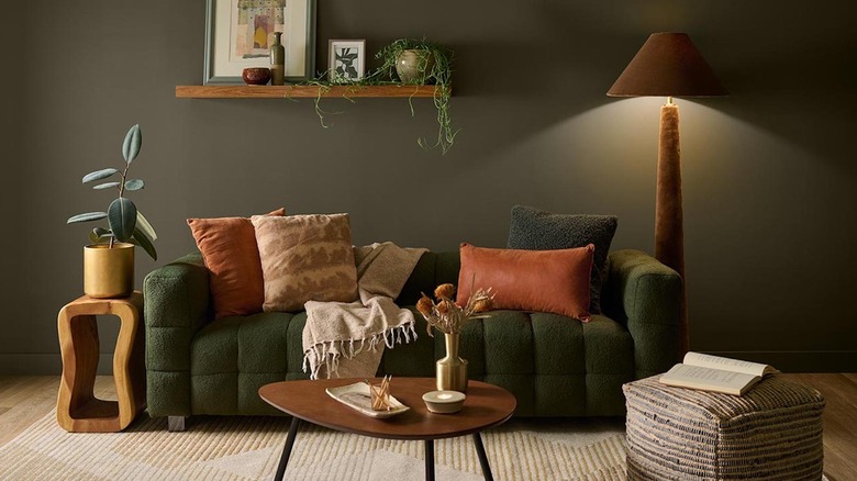
On August 26, 2026, Behr announced their 2027 Color of the Year as Grounded, a muted olive green with warm undertones. Revealed at a celebration for the 10th anniversary of the company's Color of the Year program, Hunker got an exclusive first look at the earthy hue. I've been saying it for years: Green is nature's neutral, and Behr's Grounded proved me right (love when that happens). Living very much up to its name, Grounded is a subtle, nuanced, earthy, mid-tone — and dances a pretty neat jig between olive, moss, and brown. "Grounded really, for me, echoes the green in the shadows," Kayla Kratz, Behr's Sr. Director of Color and Design Strategy, explained in an exclusive interview with Hunker. "We worked with our color lab with dozens of iterations, different expressions of the color, to find the perfect balance of vitality, warmth, and also the depth."
As an interior designer, I've never been shy to say when a paint company's Color of the Year pick goes awry, like when I called out Benjamin Moore 2026's Silhouette as basically Sherwin-Williams' 2021 Urbane Bronze in new packaging. Yikes. Or even worse, when Pantone selected the boring, whitewashed, and culturally tone-deaf Cloud Dancer as their winner in the same year. Double yikes.
However, I'm happy to report that Behr understood this year's assignment. It was a surprise to see green coming, given that their winner from last year was a moody blue-green called Hidden Gem, but it was a pleasant surprise. Thanks to its ability to toe the line between a neutral sensibility and nature-inspired color, the shade is very usable, approachable, and easy to digest. However, that's not to say it's ideal for every application. Below we'll unpack what sets Behr's Grounded apart and my suggested ways to utilize this neutral-but-not-neutral olive green inside (and outside) of your home.
Behr's Grounded as a living neutral and what that means for your space
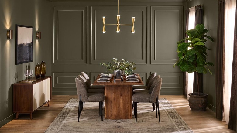
Designed from scratch for the Color of the Year honor, Behr's Grounded is intriguing as a paint shade because it simultaneously falls into both neutral and color categories. In the right setting, this could allow it to secretly fulfill dual needs in a space, in a way that only a well-constructed, muted, mid-tone shade can do. "When we think about Grounded as a living neutral, it's not bland or boring," Kratz explains about the dynamic hybrid shade. "It brings green and color and life to a space."
And frankly, this hits the nail on the head. The color's warm brown undertones safely pull the green into neutral territory, but the mossy olive hues also keep it gently in the camp of calming, nature-inspired color. This shade teeters on the edge, in a good way. And because the depth of the olive color is rich and the undertones are warm, it feels like a different, fresh experience than the previously ultra-popular sage greens that were muted with gray or greige.
This is all wonderful news for color newbies, recovering neutral addicts, and anyone trying to tiptoe carefully and elegantly into the process of adding color to their homes — it promises to be the best of both worlds. Behr's 2027 color of the year actually hits a surprisingly hard-to-accomplish middle ground between grabbing your attention and retreating into the background to create ambiance and calm the nervous system. If handled correctly, Grounded has the potential to be a slam dunk of a color in the right applications.
Putting Behr's Grounded into action at home
If you want to showcase Grounded by Behr, my advice would be to utilize it on the exterior of a home. Especially for properties nestled among trees, this complex shade has the potential to blend with natural surroundings in a chic but humble way. It has an elevated feel, and if you want to differentiate from neighboring green or brown homes (but not stand out too much), you'll get both tones in a fresh way.
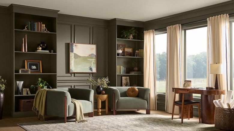
The other place Behr's Grounded will really shine is on millwork and cabinetry. Dynamic shades like this pick up texture beautifully, so walls rich with molding or paneling, trim (baseboard, casing, crown molding, wainscoting, etc.), doors, and cabinets are a natural fit. Adding a little gloss with a satin or semi-gloss sheen for these applications also gives organic, approachable tones like Grounded a little boost in sophistication.
The one location where Grounded's vibe might not come across very well is on a plain wall — especially with white trim — as the shade will probably fall a bit flat. The color's excitement very much lies in the subtle shifts in depth and undertone, and this won't be shown at its best without textural contrast to create that energy. If you do want to wash your walls in this moody hue, hopping on the color drench paint trend, where you at least include the trim in an alternate sheen, will help make this color sing. "If you get a little more of the sheen, you get more of that vitality of the moss transferring through," Kratz explains. "With the flat, you get more of the even, neutral expression of Grounded." She adds that combining sheen and flat finishes will create an attractive color story, and my design eye can see how successful this combo could be.