Our Interior Designer Has Major Reservations About Benjamin Moore's 'Predictable' 2026 Color Of The Year
On Oct. 16, 2025, Benjamin Moore announced its 2026 Color of the Year, Silhouette, a rich, moody mix of espresso and charcoal. Thanks to the natural earth tones of the brown, this neutral is tranquil and soothing, while still impactful. Silhouette has a warm purple-chocolate undertone, but with enough gray to balance it out, the perfect middle ground for those who aren't quite ready for the full commitment to trending warm, elegant, deep browns or luxurious, dramatic, but potentially harsh black tones. You may be wondering, "What's not to like?" As an interior designer, I am a bit skeptical.
I mean, is anyone else having serious déjà vu? While I think the color is really beautiful, it's giving major Urbane Bronze vibes to me, which was Sherwin-Williams' Color of the Year in 2021. That's right – I can confirm we've already been using a form of this stunner for half a decade. So is it the most revolutionary color pick that pushes the design envelope for 2026? Honestly, no. But let's call a spade a spade: It's a paint company trying to sell paint, and Silhouette is a safe bet for them. The boost in marketing for this hue will undoubtedly work, as it has a generally universal appeal (five years in the making).
Does this mean you shouldn't give Silhouette a try? Actually, no, I think it's a very chic color for certain areas of your home. And the best part is, we've seen several years of results to know where this color does and doesn't live up to the hype. Spoiler alert: it's usually not a good choice for walls. So let me break down the best ways to showcase 2026's Color of the Year, Urbane Bronze – ahem - I mean Silhouette – in your home without looking like you chose the paint in 2021.
Where we've learned colors like Silhouette fall flat
As we've learned in the past five years of watching people use Urbane Bronze well (and not so well), let's first talk about where a color like Silhouette will likely not deliver on your expectations. The issue is that, aside from interior millwork details and cabinetry, the color rarely comes to life on the walls the way it does in the marketing photos. Most people who put this color up on plain, drywalled walls (or a singular accent wall) end up with a space that looks disjointed, uninspired, and blah. But why?
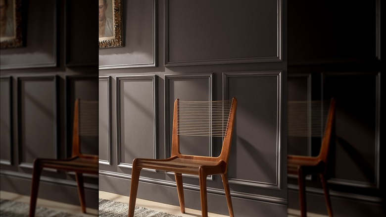
The staged rooms in the professional photos are dramatically color-washed (baseboards, ceilings, etc.), some with intricate wall molding or exciting textures to heighten the aesthetic. In these types of rooms, Silhouette will sing, as I will get into more later. But a typical application on the wall(s) of a standard drywalled room – probably with the existing white trim – is unlikely to result in the elevated aesthetic you're hoping for. Instead, your lackluster space will scream, "I never learned my lesson from 2021's Urbane Bronze!"
So, unless you're going for a fully-committed, moody color drench (amazingly enough, this is the best way to use it as the overall color for a room), Silhouette is generally not my top pick for plain walls. A half-measure usually just doesn't do the trick or have the wow-factor a color like Silhouette needs to really take flight. This is why this Color of the Year selection bugs me a little, as many people are likely buying the paint for just their walls to try and achieve that same moody vibe as the marketing photos, without much luck. Well, that and it feels a bit like jumping on a bandwagon that's already rolling. As promised, though, there are ways you can use Silhouette without the "been there, done that, won't make that mistake again" look.
Where we already know Silhouette will shine
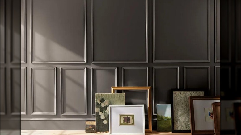
Now that we've covered where Silhouette is unlikely to impress, let's pivot to where we've learned similar colors really work well. Thanks to its neutral versatility mixed with the extra drama created by the hue's depth, I believe Silhouette is a beautiful, timeless choice for millwork. When featured on your interior doors/windows, trim, molding, wainscoting, or all of the above, the shade's richness really brings out the elegance and luxury of your home's details. I also love this color on a fireplace, whether it be drywall, a plaster-type finish, or – gasp! – the controversial decision to paint brick fireplaces (sacrilege, I know. But that is an argument for another day. Please don't spam my editor, please and thank you!). Similarly, I've used Silhouette's aforementioned Sherwin-Williams counterpart on all forms of cabinetry, from built-ins to kitchens and bathroom vanities, and it never disappoints. Silhouette is ideal for those who want more impact than typical light or mid-tone neutral cabinets or who like black but want less intensity. Millwork and cabinetry in this rich bronze-charcoal look high-end in a luxe lacquer or semi-gloss finish, as well as in a modern, more matte finish.
Finally, I think this deep hue is a lovely, soothing, nature-inspired pick for a home's exterior. Whether it's a small detail like the front door or the entirety of the siding, Silhouette is great for someone who loves black or charcoal exteriors but with a slightly softer, warmer approach.
There you have it, my two cents on Benjamin Moore's beautiful-but-all-too-familiar pick and the lessons learned from when it was basically already a Color of the Year (albeit, for a different paint company) five years ago. And before anyone comes at me for essentially giving Sherwin-Williams all the credit for this once-innovative hue, please don't forget that its 2026 Color of the Year pick was... beige. Sigh.