

The Bright Color Millennials Left Behind That Designers Are Bringing Back With A Twist
In recent years, there's been a general trend toward character, personality, and even full-on maximalism in home interiors. So, it's no surprise to see pink grow in popularity again as neutrals have started to feel a little dull (pink even took centre-stage in trends like Barbiecore decor, inspired by the very rosy world of the 2023 "Barbie" movie). The phrase "millennial pink" is credited to writer Véronique Hyland, who coined the term in a 2016 article for The Cut. Millennial pink was very popular in the 2010s, particularly amongst young women. The cheerful color is bright but also muted: not as vivid as neon or bubblegum pink, but a pale and soft salmon instead.
Millennial pink was the "it" color for a little while, to the point where a similar shade (Rose Quartz) was named Pantone's color of the year in 2016. As with any highly popular trend, though, it's natural to enter a period of trend fatigue, and that's also what happened with this ubiquitous pink shade. However, designers are now bringing it back.
While the color lost its spot in the limelight, its role in the design zeitgeist has changed. In an interview with Homes & Gardens, Hannah Yeo, the senior manager of color marketing at Benjamin Moore, said, "Millennial pink has evolved from a generational phenomenon into a prominent player in today's interior color palette. Its warmth and versatility make it easy to incorporate into everyday space." In the 2010s, alongside the "boss babe" or #girlboss era, millennial pink felt declarative and bold. Now, it has matured into a more subdued and versatile shade akin to blush pink (dubbed "Parisian Pink" by some), making it into elegant dining rooms, biophilic bathrooms, vintage-inspired kitchens, and more.
Millennial pink is back (in a new way)
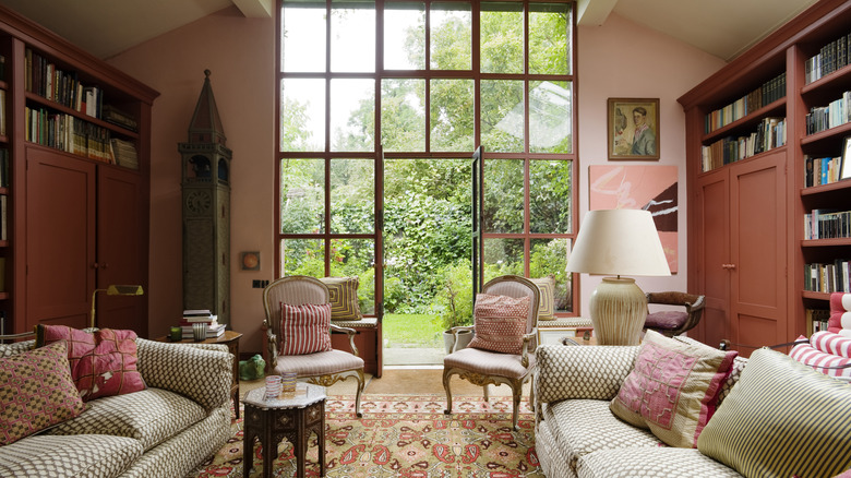
Today, designers are more likely to use the new soft incarnation of millennial pink as a neutral or complementary shade rather than the bold accent or a statement color in a room. "If Millennial Pink was about expression, this version of blush is about restraint. It's less about being noticed and more about how a space feels when you're in it," designer Janelle Patton told Good Housekeeping. The blushy color pairs well with several other color trends. It can offer a brighter and warmer tone than white or gray, adding some color without feeling overwhelming. The warmth helps it match with trending earthy paint color tones like brown, terracotta, and olive greens. It can provide a bright contrast to jewel tones, looking particularly beautiful next to deep forest greens, and it works in place of a neutral in warm minimalist spaces.
It can look refined and elegant in traditional spaces, particularly in feminine cottage-style or farmhouse homes, contrasting beautifully with dark wood tones in a dining room. The pastel-y color is also quite retro-looking, so it suits kitschy kitchens, pairing well with pale blue and butter yellow. Pink is a popular color in contemporary art deco-inspired spaces; the warmth of the new millennial pink fits with gold accents popular in this style. The blush shade also looks nice with bright but subdued nature-inspired color palettes and can create an attractive backdrop for greenery in biophilic homes. In short, it's not a one-note color anymore, but one that you'll see used with more decor styles and complementary colors in this new decade.