Ditch Sterile Whites: Nate Berkus' Go-To Neutral Paint Color Transforms Any Room

Nate Berkus has a great alternative to the stark, sterile white currently making your home look more like a corporate office than a cozy, lived-in space. When transforming a space from sterile to serene, one of Berkus' go-to neutral paint colors is always going to be Alabaster OC-129 from Benjamin Moore.
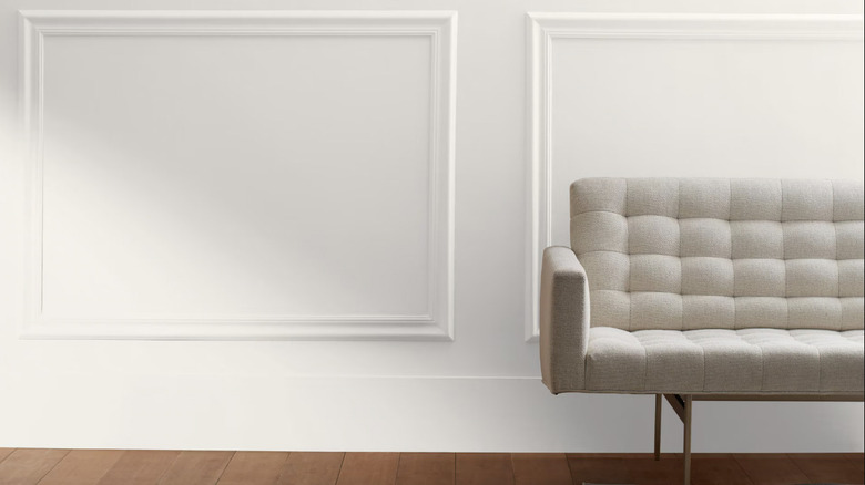
White wall paint is often considered a safe bet for most areas of the home because it's so neutral. It goes with pretty much everything and allows you to play with color and texture through other mediums, like furniture and decor. However, you might not be aware that there are hundreds of shades of the color, each with its own unique personality (and undertones!), which heavily influences the overall vibe of the room. If you go with a white that's too bright, the room starts to look too much like an old-fashioned hospital ward and not so chic.
Alabaster is one of the best white paint colors for your home because it has slightly pink undertones, which warm up the shade significantly. This gives the color a fresh, blooming look on the wall. It's firmly in the off-white camp, making it more inviting than most other cooler, true whites, but its undertones are subtle enough that the untrained eye won't be able to detect the color. It'll just pick up on the warmth that it brings.
How to transform your room with Alabaster by Benjamin Moore
There are a few great ways to transform your room with Alabaster. The first is to layer with a few of Nate Berkus' other favorite neutral tones, so you can create contrast in your space without introducing a bold secondary color if you like keeping things more low-key.
For example, try Alabaster on the walls and something subtle like Smokey Taupe 983 by Benjamin Moore on the trim, which Berkus also likes. If contrast isn't your thing, lean into the color drenching paint trend by using Alabaster in every part of the room: walls, window frames, and wainscoting, and even the ceiling to create a soft, cocoon-like impact. This would work especially well in parts of the house used for relaxing, such as the living rooms and bedrooms.
In the kitchen or bathroom, these options work well as a cabinet color choice. Because of its warmer undertones, it won't seem so harsh under direct lighting. This is what sets softer hues like Alabaster apart from stark, sterile whites. While lighting definitely impacts how paint colors appear, the warm hints of pink mixed in with Alabaster remain prominent enough, even in bright light. This means that nothing ends up feeling too utilitarian, which is a design win.