The Color Mistake HGTV's Nate Berkus Warns Against For Open Floor Plans

Open floor plans became popular in the mid-1990s, with walls no longer dividing common areas like the living room, kitchen, and dining room. In modern homes, it caters to large families and those who love entertaining. While it's functional for certain lifestyles, open floor plans can be tricky to decorate. There's the challenge of maintaining cohesion yet defining the separate areas in the large space, especially when using paint. According to interior designer Nate Berkus, open floor plans do not play well with striking hues. When choosing paint colors for your home, he recommends calm shades.
"I think it's very difficult to actually do a bold color in an open floor plan," Berkus shared in an Instagram post. As the walls span from one end of the house to the other, a bold shade can drown the space and be too overwhelming. He doesn't even recommend trying to insert a statement color on just one panel, either. "I think that accent walls show a lack of commitment," he added. In that case, it's all or nothing, which is crucial in an open layout. In such a flexible space, where does the living room wall paint begin or the dining room end? Using different shades breaks up the space too much, creating a design that is choppy and lacks harmony. Considering the chosen hue will be slapped on every wall, you want it to be one you can live with and avoid any outdated paint color trends.
Stick to one neutral wall color for an open concept space
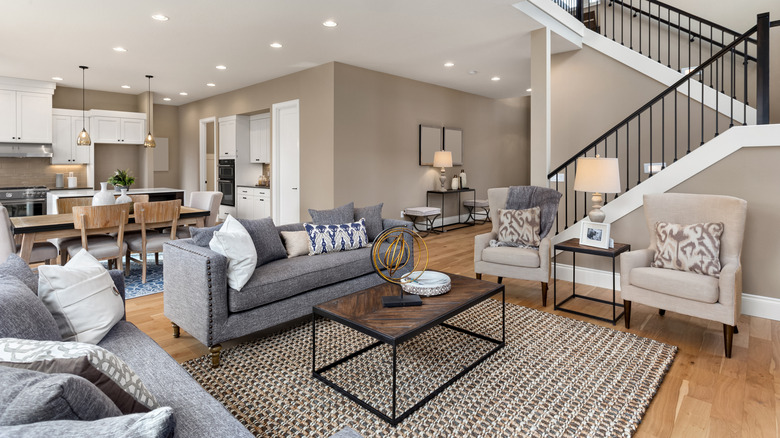
Nate Berkus' go-to colors for an open concept space are pastels and neutrals. "I think you keep your ceilings white, and I think you have to pick one shade, one tone — it can be pale blue, it could be light yellow, preferably it will be more like an alabaster — for the rest of the walls around you," he said. Benjamin Moore Alabaster is Berkus' favorite neutral paint color. It's a warm white with pink undertones. Coating every wall, these light shades make the room feel airy and give leeway to experiment with furniture and decor patterns. In the end, you have a seamless design that livens the space instead of dragging it down. So perhaps save the mind-blowing paint ideas for the bedroom.
However, if you're a fan of contrasting colors and bold hues, you can incorporate another shade in your open concept space — just not on the walls. In a separate Q&A Instagram post about paint color, Berkus suggested "using a contrasting shade for the baseboards and door trim" or opting for "a deeper tone of the wall color for the doors or window frames." With this look, there'll still be a seamless design throughout the open-concept space, yet the complementary paint tones will prevent it from being one-dimensional. A little bit of personality that doesn't compromise aesthetics or function.