The Best Paint Color For Small Bedrooms, According To Our Interior Design Expert
The goal of designing a bedroom is to create a restful sanctuary where you can recharge and relax. The atmosphere should promote a good night's sleep in a calm environment, no matter the room's size. So, it should come as no surprise that picking the right paint color is essential, as is expressing your personal style in a space that makes you feel happy and at home. In a tiny bedroom, this decision is extra important because the paint color can easily help or hinder the overall impression of the room's size.
Here's the part where you probably want me, as an interior designer, to simply rattle off the paint color and be on my way. But this is actually where the conversation becomes a bit more nuanced. There's some evidence for choosing bedroom hues based on color psychology, and some anecdotal surveys support certain paint colors over others. Many of these will send you to the soft blue section of the paint store.
I'll concede that a muted blue is a lovely option for a small, serene bedroom and is a solid first-place contender (I'll happily explain why below). But in the same breath, I'd also argue that choosing the best paint shade for small bedrooms is more about selecting the right color type and actually applying the color than it is about a specific hue. Let's break this down to determine the best paint color for bedrooms in general, alternative colors for a similar effect if it doesn't suit your aesthetic, and how to tailor your wall paint to work best for a small space.
Painting a small bedroom blue (or another muted earth tone) promotes rest
Let's defer to science to determine the best bedroom paint color for promoting sleep. According to color psychology, blue is associated with trust and calm. It also brings to mind clear skies and tranquil waters. These strong ties to serenity create a positive, relaxing effect on our minds and bodies. According to Sleep Foundation, studies have shown that soothing blue tones lower your heart rate and blood pressure, which can help you fall asleep faster. Rooms painted soft blue might also help you sleep longer. Per Travelodge, a 2013 study revealed that people with blue bedrooms reported getting the longest night's sleep, averaging 7 hours and 52 minutes per night.
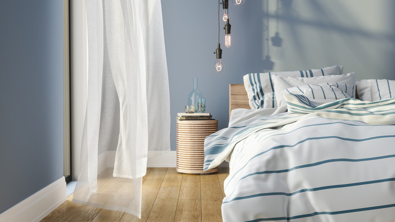
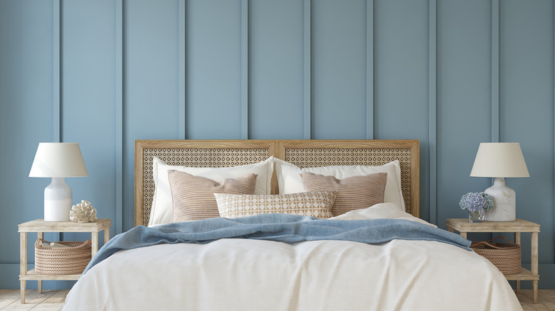
Soft, muted blues in the light to medium range will give your tiny bedroom the refreshing vibe of water or an airy daytime sky, making it feel serene yet endlessly spacious, just like its natural inspiration. Shades in the medium to dark range will create a cozy sleep retreat reminiscent of the night sky, blurring the lines of your small space and tricking the eye into thinking the room is larger. Sounds perfect, right?
Well, what if you're not a blue person or these hues don't mesh with the rest of your home's aesthetic? The great news is that this general effect still works with most soft, muted earth tones, such as sage green, dusty pink, straw yellow, mocha brown, and warm neutrals. Because these colors are subtle and connected to the earth, they promote a similar peace, tranquility, and calm as soft blue, while their gentle, muted quality makes an undersized space feel lifted, balanced, and expansive.
Small bedrooms feel peaceful and spacious with low-contrast, low-saturation palettes
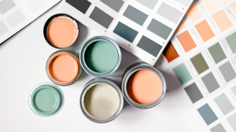
Now that you know which colors encourage tranquility, let's talk about choosing the right shade for your tiny sleep space. The key to selecting the best color for your small bedroom lies in low saturation. Mimicking the soft, grayed-out quality of natural hues is crucial, as an intense color will be more energetic than relaxing. Keep in mind that a paint color covering an entire wall is always going to look more saturated than the sample, especially up close in a confined space, so I always paint a large sample on the wall to watch throughout the day before committing.
Once you have a perfect low-saturation shade, whether it's blue or another muted earth tone, the next step is to develop a low-contrast color palette to complement it. By keeping each shade's color value (a part of color theory measuring relative lightness and darkness) within a reasonable range, you avoid the distracting energy of a high-contrast space to achieve calm, restful vibes. Low contrast also improves the flow of small spaces, meaning your eye keeps moving and reads the space as larger due to fewer visual distractions.
Similarly, to further blur the lines of a small room and make it feel bigger, I love the color-drenching trend. This entails painting a room's walls, ceiling, and trim the same restful hue, enveloping you in a soothing cocoon. Small spaces with a low-contrast or totally seamless color wash will seem more expansive than choppy, high-contrast spaces full of visual clutter.