Avoid Painting Your Home Office These Colors At All Costs
Your home office is an important room. It's a place where you do work, take conference calls, and maybe even come to relax and read. The paint color you choose should reflect that. There are plenty of paint colors that work for home offices. Rosy-hued pink offices blend bohemian charm with modern temperaments. Gray, meanwhile, is a universally professional color that brings soothing vibes to the atmosphere. And yet, there are paint colors that simply don't work for an office space — the ones you want to avoid painting your home office at all costs.
With more people beaming into work than ever before, the color you choose for your office needs to be pleasant and professional for those on the other end of your screen. As such, you want to avoid vivid, bright, bold, or garish colors, as they can flare under lights and cause eye fatigue. Specific colors to avoid in this case would be stark white with a glossy finish, true orange, or neon green.
Instead, go for colors that are both professional and will work well through a computer camera. Matte colors with mid-tones will work best in this instance. Go for warmer neutral colors like the gray mentioned earlier or even earthy but slightly muted greens. Off-whites, like a tan or beige tone, will also work, though those can tend towards being dull.
Don't paint your office distracting colors
The color you choose for your home office can have a much bigger impact than just looking crummy on a Zoom call. Colors also greatly affect your productivity and creativity. Exceptionally bold or bright colors can have strong emotional and bodily responses that can greatly hinder your ability to stay focused. There is a reason most office buildings are painted in neutral colors. Employees need to focus and get work done, even if they are working from home.
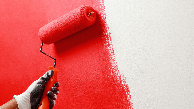
So, what colors should you avoid painting your home office if you want to stay focused? Bright reds are certainly one. Their fiery intensity can be overwhelming for a small office space, and their vividness can often be rather distracting. So too can brighter greens and yellows. Though these colors are said to aid in creativity, they can also create feelings of restlessness and distraction, neither of which are vibes you want invading a home office.
If you're hoping to create a space that is geared towards focus, go for grounding colors like blue, which is a really underrated hue for offices. Gray and darker green tones, like sage or olive, can also help create calming environments that are conducive for long hours of targeted focus. Who knows, you might just see your productivity increase if you choose the right colors over the wrong ones.

