Design Fans Have Major Problems With Pantone's Color Of The Year (& They're Right)
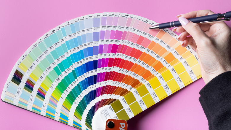
Ever since Pantone, a long-time industry authority on color, first released its "Color of the Year" in 1999, the winning hue has been celebrated as the forward-thinking forecast for the upcoming year's exciting color trends for interiors, products, fashion, and more. From rich jewel tones like 'Emerald' and 'Ultra Violet,' to vibrant shades like 'Radiant Orchid,' and the color expert-approved 'Viva Magenta,' Pantone's big annual announcement has historically favored the side of the bold boundary-pushers (for the most part), which I've always appreciated as an interior designer. And with 2025 setting the stage, 2026 was poised for color to steal the show in a big way.
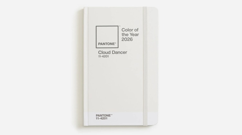
However, this year's selection proved to be anything but vivid or distinct, with Pantone naming a simple shade of off-white, called 'Cloud Dancer', as 2026's winner. "Similar to a blank canvas, Cloud Dancer signifies our desire for a fresh start," said Laurie Pressman, Vice President of the Pantone Color Institute, on their website.
But fans anticipating the big reveal were hardly unanimous in this "new beginnings" view of Cloud Dancer, taking to social media to weigh in on the surprisingly colorless choice. On a particularly vocal Reddit thread, some commenters agreed with Pantone, one vibing, "I'm into it, tell me why I'm wrong," and another elaborating, "White does bring out that feeling of a restart or clean slate and this color doesn't feel boring for now. It certainly has the calming, soothing tones that are timeless in design." I agree that off-white is generally a clean, tranquil color for wall paint, but is "vaguely palatable" the criteria for the Color of the Year? Though some saw the value of 'Cloud Dancer' as a common, usable neutral element in design, most feedback for Pantone's big winner was dismal at best, and downright scathing at worst.
Critics felt Pantone's Color of the Year was boring and culturally troubling
While a select few agreed with the Reddit sentiment, "I have no strong feelings about this one way or the other," there was very little middle ground regarding Pantone's pick – the social media reaction was definitely more polarizing. And most hated it, slamming its bland choice as unworthy of the once-distinguished honor and an easy money grab from the very sellable shade. For a company that's attempted to position itself as the expert on the pulse of the industry's biggest color risk-takers, the only thing risky about Pantone's Cloud Dancer, or "The Landlord Special" as one Redditor called it, is that you truly might bore yourself to death.
Besides those claiming 'Cloud Dancer' is every synonym of dreary and lame, there was another common — and far more troubling — criticism. One commenter joked, "Ahh, bleak is the new black," to which another replied sarcastically, "This color embodies our future — it's perfect." And to me, that's just it — what an underwhelming, rather joyless "hue" to select for something that's essentially supposed to serve as the year's mascot for innovative color inspiration reflective of the current world climate. Pantone touts its Color of the Year selection not just as something pretty to look at, but as a further representation of and conversation about our global culture. In a time when things feel hopeless, somber, frighteningly conformist, and... ahem... whitewashed, I feel like 2026 was an opportunity for Pantone to celebrate the diversity in vibrancy, personality, style, and culture with a more thoughtful, exciting pick. Instead, it's giving dystopian "Orwellian" and "The world is losing its color" vibes, like Reddit users remarked. With the personality and pizazz of a slice of white bread, I just don't understand this drab, culturally tone-deaf selection.