Joanna Gaines Reveals The One Timeless Paint Color That Will Never Go Out Of Style
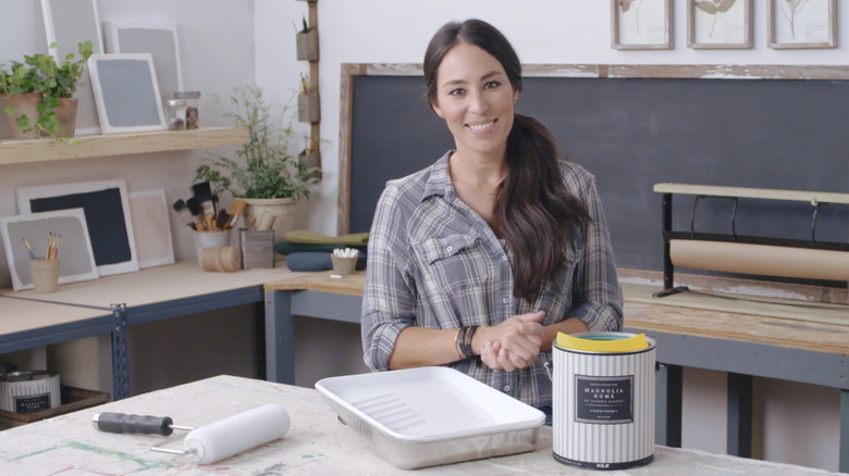
Interior designer, television personality, and Magnolia empire entrepreneur Joanna Gaines truly needs no introduction, as her multi-faceted brand has permeated the home industry far beyond renovating homes on HGTV's "Fixer Upper" alongside her husband, Chip. The Gaines family business has expanded in many ways over the years, including launching Joanna's own brand of paint, Magnolia Paint, in partnership with KILZ in 2016. The interior and exterior collection was originally introduced with 25 of Gaines' custom-crafted colors, including one dusty shade of pale pink called Ella Rose.
Despite being part of the Magnolia Paint collection for nine years and counting, Gaines says Ella Rose is here to stay. "This shade of pink is my favorite color," Gaines says on Magnolia's website. "It's a true classic that never goes out of style. That's why I chose my grandmother's middle name, and now my daughter's middle name, to describe it. Because both of them are timeless beauties, equally gracious and graceful."
This multi-generational namesake sounds appropriate for a color that Gaines claims will always be in fashion. But will it? Or were pink hues like Ella Rose just a blip in the history of home design? In my opinion, as a fellow interior designer, dusty pale pinks are indeed a time-tested choice, and their historical roots are strong enough to weather any fads — unlike the outdated millennial pink, for example. When chosen correctly, this shade's soft, flattering color can bridge eras and design styles with ease. But that's where things get tricky: Pink often walks a fine line between timeless sophistication and overly feminine cuteness. So, let's dive into the best ways to incorporate dusty pinks into your home, and how to choose the perfect shade (Spoiler alert: it might not be Ella Rose.)
The staying power of dusty pink — and how to use it at home
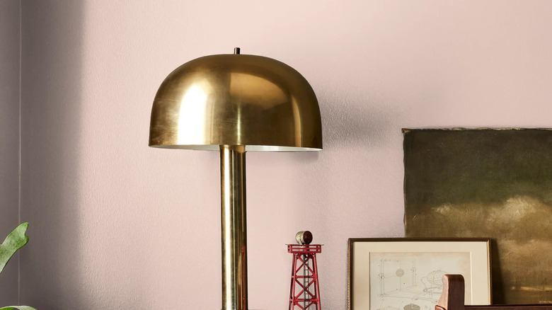
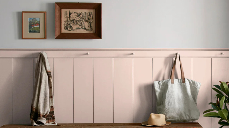
The reason dusty pinks like Joanna Gaines' Ella Rose have stood the test of time is because the soft, muted shades read less like a color and more like a nuanced, warm earth neutral tone. With plenty of brown and/or gray to mute them, these subtle shades feel more like the pink-beige nude of desert sandstone or the soft peachy glow of a sunset rather than, say, the vibrant pink of Barbie's Malibu Dreamhouse. Additionally, pastel pinks have design roots dating back to at least the 1700s; India's famous pink Hawa Mahal palace was built in 1799, and the shade became a European fashion favorite in the Georgian era. So, while recent generations may have helped the color surge toward its latest moment of mainstream popularity, this subtle, soft earth tone was around long before we were — and it isn't going anywhere any time soon.
This soothing rosy hue looks stunning on the walls in a living room, dining room, or bedroom for a flattering glow. The fact that it can envelop without overpowering makes it perfect for color-drenching a space for an impactful yet tranquil result. I also love the look of muted pink on millwork, such as cabinetry, trim or crown details, and molding walls. To really elevate and compliment the hue, pair your nude-toned neutral with a color palette of other earth tones, as well as natural wood tones, warm brass finishes, and organic materials like clay plaster, marble, and rattan, for a truly grounded feel. However, incorporating pink into your home isn't as simple as throwing a coat of paint on the walls, as choosing the right shade of time-tested pink is essential for its longevity.
How to choose the right muted pink paint color
The key to finding a timeless shade of pink lies entirely in its saturation — that is, the color's intensity — as well as its undertones. What gives Joanna Gaines' Ella Rose a "dusty" appearance is the fact that the shade of pink is muted or grayed out. Subtle, desaturated versions of pink feel sophisticated and mature, more like a nuanced warm earth tone neutral than a color. Here's where Gaines and I disagree a hair: I'd argue her shade, Ella Rose, is right on the edge of being too saturated for me — I typically prefer a step or two more muted to make sure it doesn't feel too sweet.
The second piece of the pink puzzle is the undertone. A true pink, like light bubblegum pink, is often going to come across as childish or overly feminine when used as the main hue. Elegant, elevated dusty pinks tend to have peachy undertones, with a decent dose of yellow or orange to better round out the hue and make it feel more like a historical color or organic earth tone.
If Gaines' Ella Rose isn't right for you, her Antique Rose may do the trick. Alternatively, I'd call Farrow & Ball the undisputed champ of muted pinks, most notably Setting Plaster, Scallop, and Templeton Pink, to name a few. Sherwin-Williams has standouts like Intimate White and Pueblo, Benjamin Moore boasts Tissue Pink and Bashful, and Clare Paint dazzles with Wing It and Meet Cute. Regardless of brand, it's essential to test large samples in your space throughout the day to make sure they feel just right.
And there you have it: Why I agree that dusty pinks like Gaines' Ella Rose are indeed a classic design staple — when chosen wisely.