Valspar Just Released Its 2023 Colors Of The Year — And They're Stunning
With 2022 more than halfway over, there's no telling what's left in store for the rest of this year (or even next year). But one thing we do know for certain is Valspar's 2023 Colors of the Year. Yes, the rumors are true. The paint brand just revealed the latest trend-worthy colors for next year — and you will not be disappointed.
Color experts at Valspar carefully matched each hue to a different emotion. This set of paints is all about comfort and flexibility, leaning into the latest DIY shift.
"Valspar's 2023 Colors of the Year are usable shades that encourage self-expression and [that] anyone can envision in their space," said Sue Kim, Valspar Color Marketing Manager, in a press release. "With our 12 colors to choose from, you are guaranteed to find a color that is picture-perfect for you!"
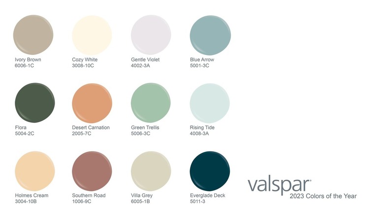 Valspar
The entire collection is available at Lowe's stores and select independent retailers across the country. You can read about the colors below and learn more about each one on the Valspar website.
- Cozy White – Comfort – A comfortable white with a yellow undertone that makes a space feel cozy like a soft blanket.
- Villa Gray – Mindful – A cool gray that is balanced by the warmth of the yellow undertone. A natural hue like a cotton muslin cloth.
- Rising Tide – Health – A light blue that has a dose of softness, used as a fresh neutral with the uplifting qualities of a modern pastel.
- Gentle Violet – Connection – A white softened by a violet undertone. A harmonious shade promoted by digital connectivity.
- Holmes Cream – Joy – A classic tan that is dependable, with a yellow undertone that gives it new life with uplifting qualities.
- Ivory Brown – Natural – A washed brown tone inspired by the shades found in nature. A new warm neutral being incorporated inside and outside the home.
- Blue Arrow – Balance – A cooled-down blue with a slight yellow undertone. A beautiful shade to find balance between cool and warm shades in the home.
- Green Trellis – Calm – Tapping into the calming tones of nature, this hazy green has duality – bringing in the calm and liveliness we seek from outdoors.
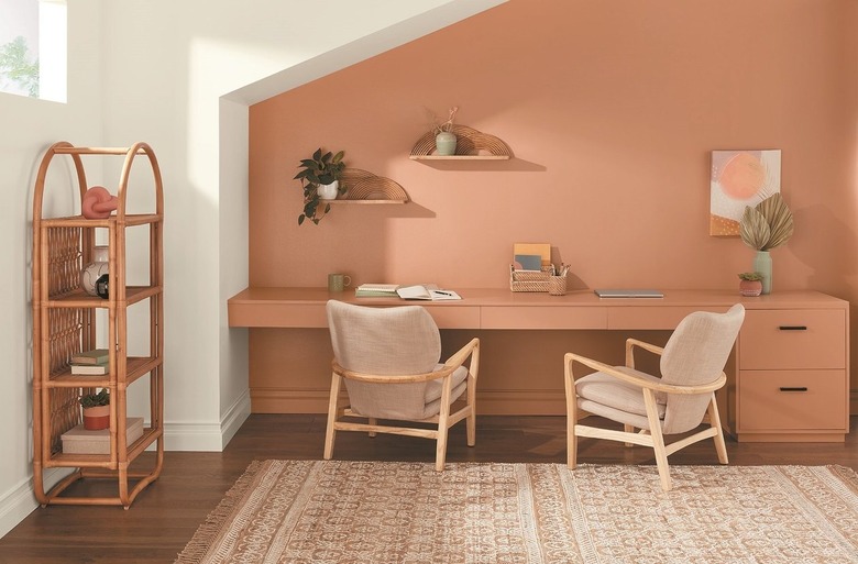
- Desert Carnation – Inspired – Faded natural terra cotta that leaves us inspired to craft a home with individuality and warmth.
- Southern Road – Contentment – A muted clay with a brown undertone, embracing the life of contentment we seek in living with what we have.
- Flora – Thoughtful – A deep blackened olive. A new neutral being introduced into the home that embodies charm and sophistication.
- Everglade Deck – Restored – A deep midnight blue, used as an elegant calming shade to restore our mind, body, and home.