

The '50s Design Trend Boomers Left Behind That Millennials Are Bringing Back
No matter the generation, parents and grandparents tend to have way more style than we'd like to give them credit for. That said, there is one trend that Baby Boomers left behind that Millennials now can't get enough of: Pastel colors! "The postwar era was all about embracing fun and lightheartedness in decor. Colors like mint green, bubblegum pink, and cotton-candy blues were in every home, specifically the bathrooms," designer Bethany Adams told House Beautiful. And in 2026, these happy colors are so back! "Although considered part of a vintage era, they've circled around into today's time, which makes them timeless," added designer Caren Rideau.
In the 1950s, the widespread use of pastels was likely the result of postwar optimism (quite literally a country pointed towards a brighter future!) and new manufacturing technology, which allowed for a wider array of colors to be created on a large scale. "The postwar home-building boom may also explain the ubiquity of certain colors, as builders were likely to buy materials in bulk for spec homes," Adams continued, explaining why pastels were everywhere. These days, pastels are a bit of a course-correction from the stark minimalist design of the 2010s. "After years of gray, beige, and high-contrast minimalism, these gentle pastels feel optimistic, comforting, and familiar in a way that still feels fresh," designer Rachel Brown explained to Good Housekeeping.
How to style 1950s-inspired pastels in your home
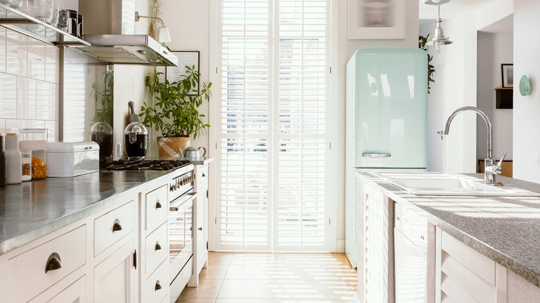
The bathroom is currently a popular place for the revival in pastel colors, yet the trend is growing to include laundry rooms and kitchens, too. No matter what room you choose to style, the key to success in 2026 is incorporating pastels as bold highlights instead of the main color palette. "Today's pastel appliances and plumbing fixtures offer a fresh way to reference 1950s color without recreating the past," designer Heather Kirk told Good Housekeeping. Keep background features neutral and use bits of retro-inspired decor for just a touch of nostalgia. "A soft mint refrigerator or pale blue sink creates a focal point when paired with clean-lined cabinetry and contemporary hardware," she advised.
To avoid appearing too kitschy, designers also recommend adding natural materials into a space. Things like a wooden kitchen table, a teak bathroom stool, or even a strategically placed potted plant work well. The richness of wood and the deep colors of botanicals can offset any paleness created by pastels. "The key is contrast — letting the color feel intentional, not themed," Kirk continued. In addition, if you land on a pastel hue when picking your house paint, be sure it's in a space that's already bright and airy so the color can reach its full potential. "Soft pastel wall colors shine best in rooms with ample natural light, where they reflect brightness rather than read flat or overly sweet," Kirk explained.