The Old-School Paint Color Trend That's Making A Surprisingly Chic Comeback
We may receive a commission on purchases made from links.
The old-school paint color trend quietly stealing the spotlight isn't another barely-there neutral or safe beige remix. It's burgundy. Moody reds with undertones of plumy purples, deep brown, and warm rust are showing up in entryways, offices, and statement spots all over Instagram. It makes sense, since design fans had major problems with Pantone's latest color of the year, a soft white that signals restraint instead of richness. Although white is a perennially stylish neutral, it doesn't reflect where color-curious homeowners are actually heading in 2026. Whether you call it burgundy, bordeaux, maroon, or mahogany, wine-inspired reds are a powerful but approachable way to embrace bold color, experiment with color-drenching, and create rooms that feel intentional rather than designed for resale.
Burgundy showed up across major brand forecasts for 2026. Sherwin-Williams' Colormix Anthology II highlighted a Restorative Darks collection including Plum Brown, Dark Auburn, and Rojo Marrón, each offering a slightly different expression of the burgundy trend. On the Colormixology podcast, Sue Wadden, Sherwin-Williams' Director of Color Marketing, summed it up perfectly. "It adds such a touch of elegance and deepness and sophistication," she said. Glidden's 2026 Color of the Year, Warm Mahogany, also lands squarely in that same camp, while Graham & Brown's COTY pick, Divine Damson, is an unapologetic dark cherry red that's also getting a lot of love online. As multiple brands arrive at the same color conclusion, it's a strong sign that burgundy's chic comeback is the real deal.
How to use burgundy (whether you're feeling brave or not)
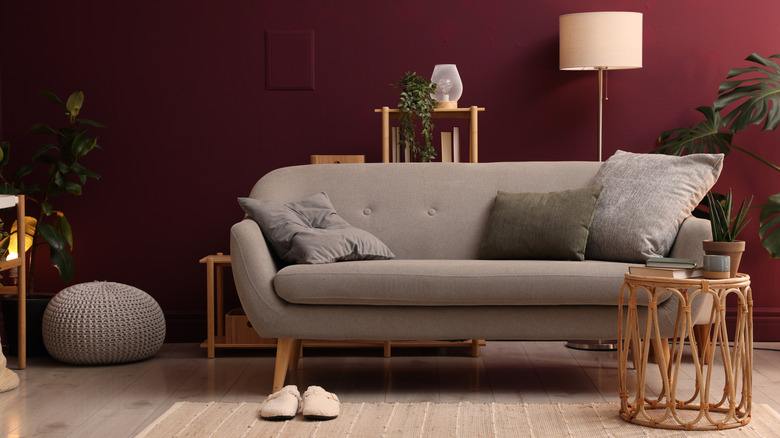
Although burgundy may seem too bold at first glance, interior designers find the color surprisingly livable. "It's timeless and perfect for adding depth to any space," the team at Studio McGee explained in an Instagram post showing off how well the moody hue works in both a tiny powder room or spacious kitchen. The interior designers at Albionnord went even further, enveloping a home theater in monochromatic burgundy by mixing cleverly paneled walls, a velvet sofa, and marble bar in the old-school color. Although pulling off the color-drenching trend like a pro can be a challenge, it's a trick you can borrow to inject plenty of drama without going too dark, especially if you contrast burgundy surfaces against brushed brass accents or warm neutrals with plenty of texture that soften its depth.
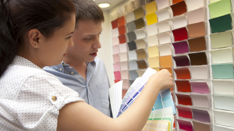
Choosing paint colors for your home often requires a leap of faith. It's one thing to love how a shade looks while you're scrolling through your feed, but it's quite another to feel confident once it's actually covering your walls. Not ready for a color-drenched commitment? Try a subtler approach. If you've fallen in love with a certain burgundy paint color, experiment with an accent wall behind a sofa or bed, on a set of lower kitchen cabinets, planters flanking a front door, or even your mailbox. For a dramatic look that doesn't require picking up a paintbrush, you can also capture the chic trend by hanging new window treatments like the Roslynwood Velvet Ruby Wine Drapes or statement pieces like the Howard Elliott Antiqued Talida Red Ornate Mirror from Amazon.