The Nate Berkus-Favored Living Room Paint Color That'll Make Your Space Feel Calm
With the busyness of everyday life, many of us can find ourselves longing for a home space that offers a bit of rest and relaxation. However, making your house feel calming can sometimes be difficult, particularly when it comes to figuring out how to choose paint colors. Should you opt for a light pink, which is considered in color psychology as a non-threatening, nourishing color? Or should you go for a shade of green with its links to nature and peace? Well, according to interior design expert Nate Berkus, you should actually be looking for a soft taupe or grey-beige color. And he knows exactly which one to use, too!
Berkus told House Beautiful in an exclusive interview that his go-to paint color for making a room feel peaceful is Tranquil Gray from Behr. He describes it as "a delicate taupe/greige shade that makes the room feel calm and is a perfect backdrop" for creating your own relaxing interiors. This shade is true neutral perfection for any space in need of some quiet balance. In fact, in the product description for this paint, Behr describes it as the perfect way to welcome "stillness and harmony like a hot stone massage." So, this shade could be a fabulous way to transform your living room into a calming space, or even turn your bedroom into a healthy, happy sleep oasis. But how should you style your room around this paint color?
How to style your room around Tranquil Gray paint
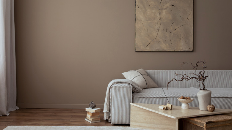
Shades like Tranquil Gray from Behr (or you can look at Sherwin-Williams Repose Gray or Farrow & Ball's Ammonite for a similar look) can create a beautiful neutral base for any room in the house, but what living room ideas and inspiration can you use to get the most out of this serene hue? Well, you should consider pairing it with a chocolatey brown color, such as Glidden's Chocolate Moment or Behr's Light Truffle shade. However, it is a good idea to keep dark browns as an accent in order to avoid dominating the softer taupe shades completely. Behr recommends pairing shades like Tranquil Gray with an airy, pastel color such as a light mauve, watery blue, or earthy green. These will help give the room a timeless, yet sumptuous feel that perfectly complements the soothing look of the taupe.
Those colors work well with this particular shade of 'greige', but what furnishings and hardware should you use with it? Brass and gold make for great accessories to this color as they can help create a luxurious, refined look. On the other hand, if you're looking for a more organic feel, taupe can also be paired with pale wood like oak or beech. These textures will help make your living room feel nature-inspired and infuse it with the level of calm that is a huge highlight for designer Nate Berkus.