If Blue Is Your Favorite Color, Then This Updated Victorian Is For You

From the street, a family's Victorian-era home in Brighton, Australia, looked like a perfectly charming residence. But in the rear of the house was a mess of additions that had created a disjointed and dark layout that just didn't work for the couple and their two young children. That's when Jane Merrylees of Merrylees Architecture came to the rescue. She and her firm opened up the back of the house and created an extension that feels modern, but still aesthetically connected to the original house.
In addition to more light and a better layout, the family also wanted their home to feel tranquil — a challenge given its location on a busy street. "We wanted to create something that was calming and felt like a sanctuary in contrast to the hustle and bustle of the main road," says Merrylees. "We chose cool tones of white, blue, and blue-gray throughout the house to tie in the old and the new." The end result is peaceful, but not boring, and comfy, but still sophisticated.
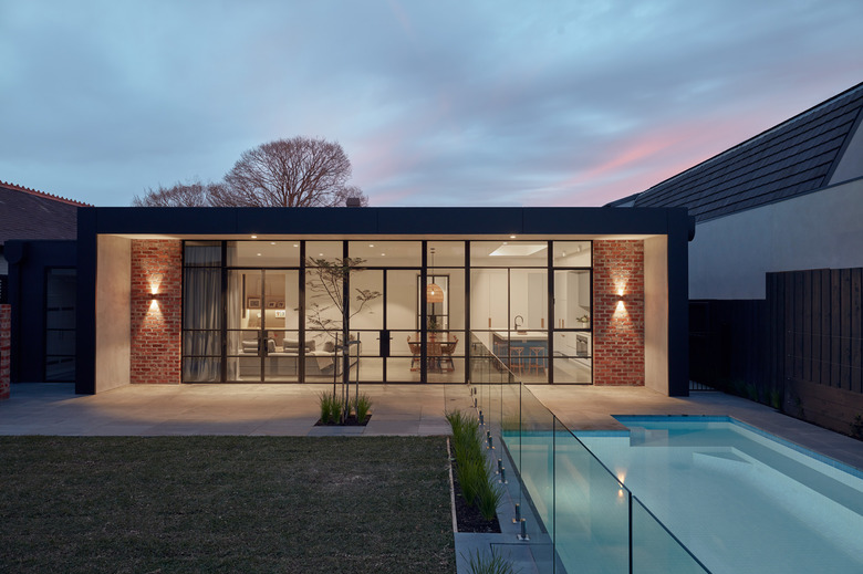
1. Extension
A wall of black steel-framed windows separates the kitchen, dining, and living areas from the bluestone-lined terrace and pool area. Merrylees used red brick to connect the extension to the front facade, which was given a refresh by removing the cream-colored paint and cement covering to reveal the original brick.
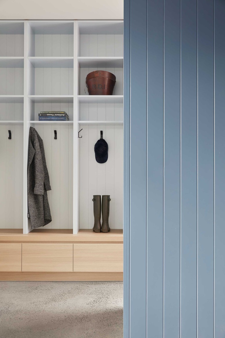
2. Mudroom
 Tom Ross
The team decided that a garage wouldn't fit with the original Victorian home, so they added a new entry off the driveway with a mudroom. Each family member has their own storage locker and there's also space for laundry and wine storage.
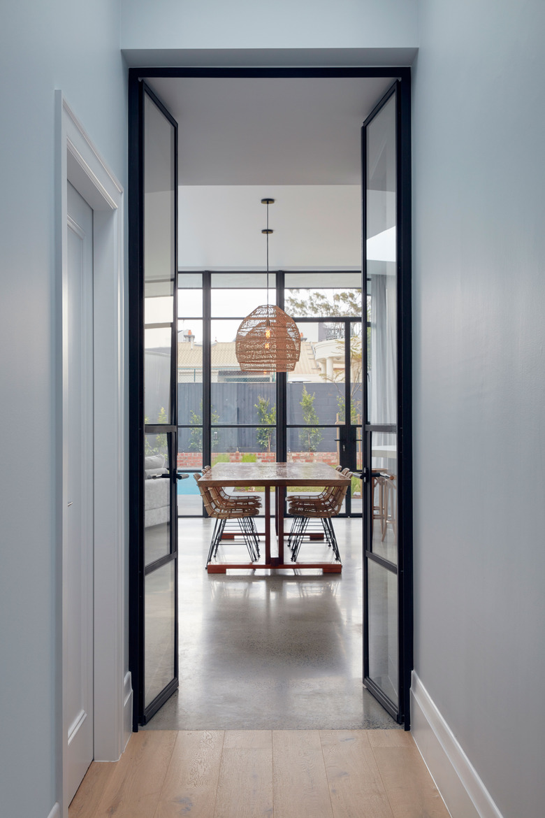
3. Hall
 Tom Ross
Glass doors lead from the original house to the new extension. The palette of soft blues and blue-grays was used in both areas of the home, creating a cohesive feel.
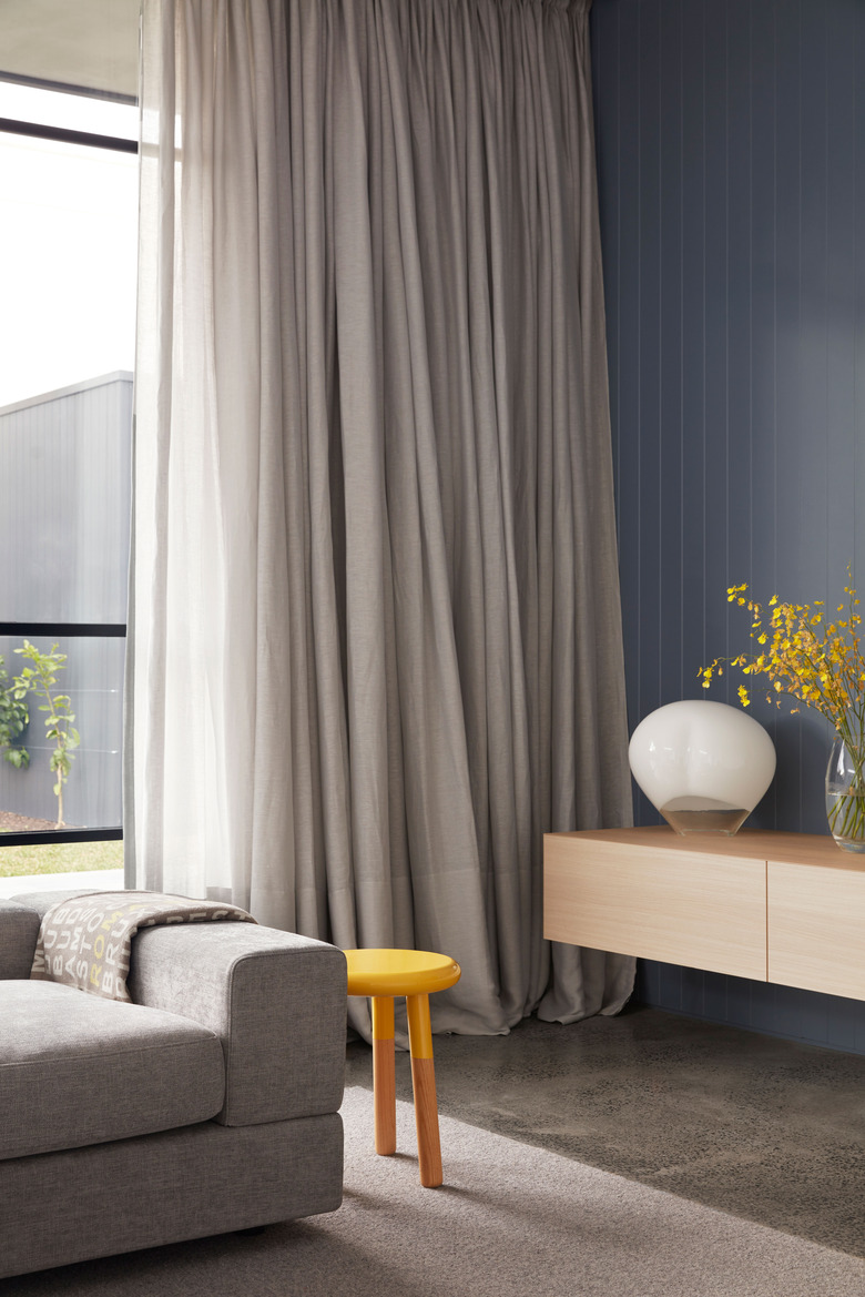
4. Living Room
 Tom Ross
The living room was designed to be a space for play — complete with plenty of toy storage — that could eventually become a spot for homework. The floating storage piece helps keep the space from feeling cluttered.
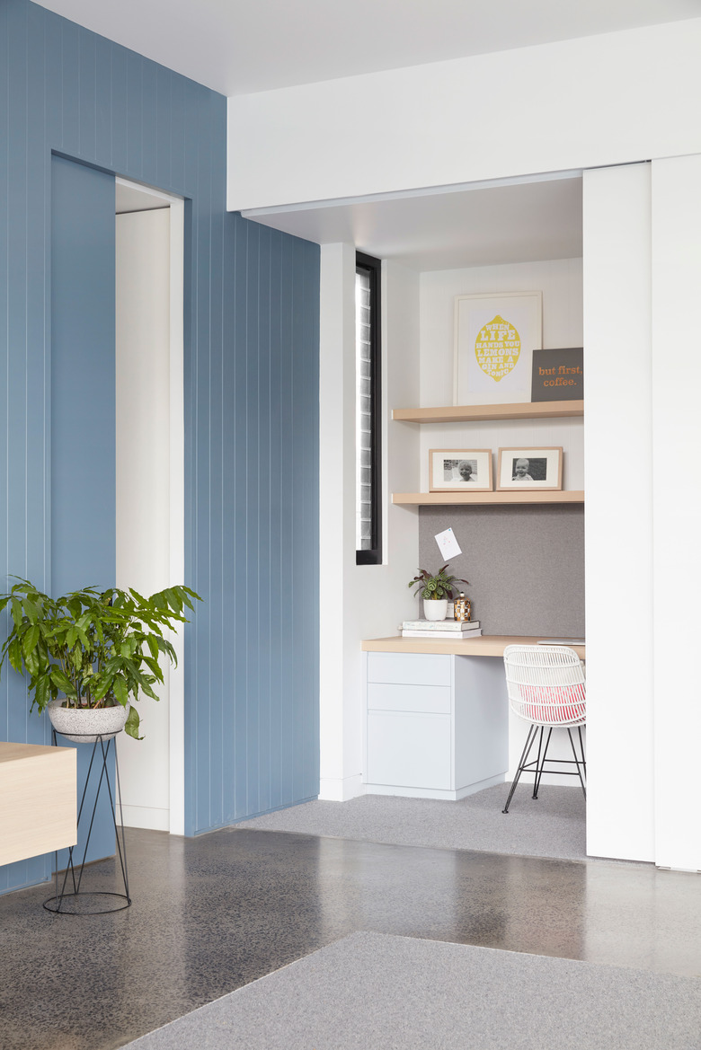
5. Workstation
 Tom Ross
Merrylees tucked a small workstation in a nook just off the sitting area. The space can be hidden when not in use by closing a pocket door.
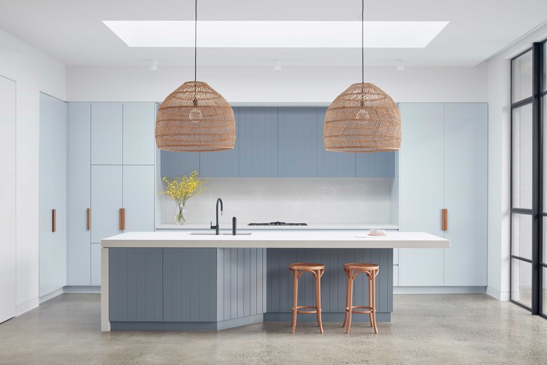
6. Kitchen
 Tom Ross
The kitchen cabinets and island were done in two different colors and textures, keeping it from feeling flat or too monotone. The firm placed a large skylight over the kitchen island, and woven pendants add extra light to the dining area.
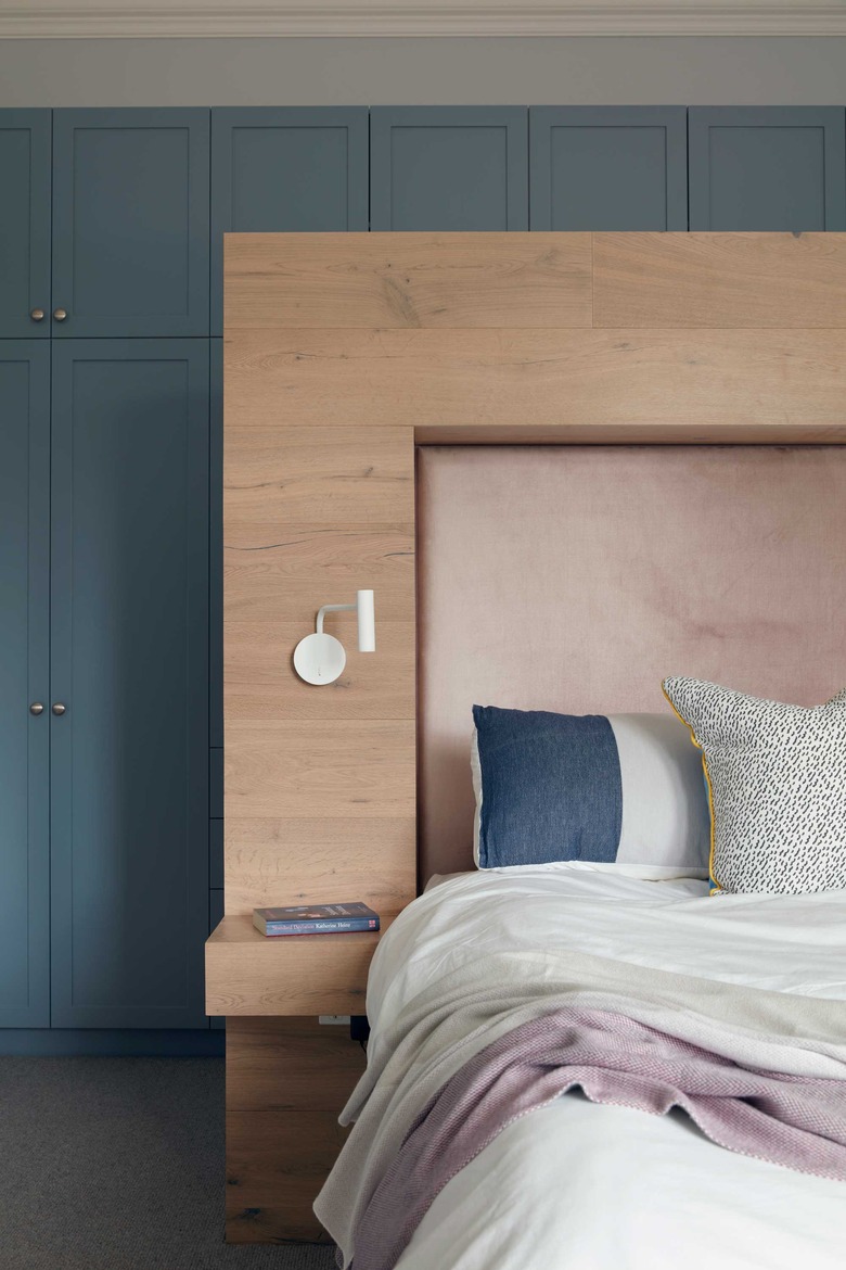
7. Bedroom
 Tom Ross
The bedroom was one of the most challenging aspects of the renovation because it faces the street. To cut down on the noise, Merrylees installed an extra pane of glass to "glaze in" the original Victorian windows. A wall of shaker cabinetry was installed behind the custom headboard, which was made of engineered floorboards and blush velvet.
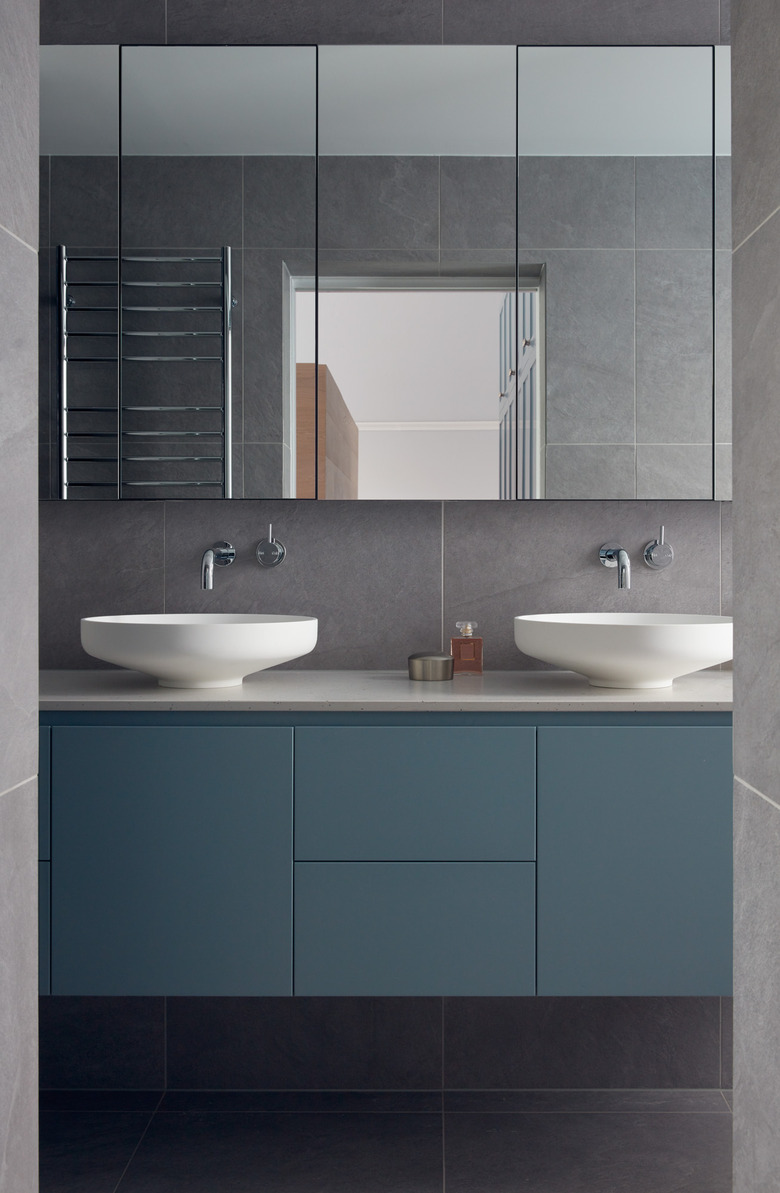
8. Bathroom
 Tom Ross
Mirrored cabinets and a floating vanity provide lots of storage in the petite master bathroom.