Here's How To Turn A Mom-And-Pop Grocery Store Into An Unthinkably Cool Townhouse
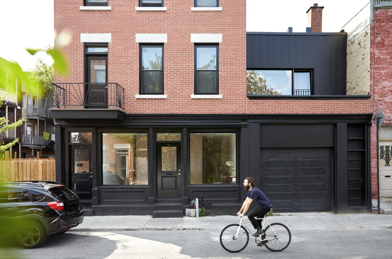
Atelier Barda is a Canadian architectural firm that likes to push the creative boundaries of home design. In April 2017, the firm took on the unusual challenge of transforming a commercial building in the busy Le Plateau-Mont-Royal neighborhood in Montreal into a cozy home for a family. The building, which was formerly two apartments above a grocery store, is now a 2,500-square-foot home and rental space apartment.
When collaborating with the owners on a redesign, the firm realized that, in order to build what was needed, loss of privacy was going to be an issue. Rather than hiding the new residential space, the firm embraced it, creating it as part of the public experience but making it less obvious to avoid too much attention. With the downstairs on view, the designers decided to create a somewhat mysterious quality for passersby, who see a transitional space framed by storefront windows.
Many of the challenges of building in an existing space also presented moments of advantage. The building is situated between a side yard, which was used for hauling merchandise into the store, and a long garage with a shed. A partial floor behind the garage became a new living room space with a deck overlooking the cityscape.
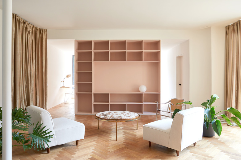
1. Living Room
Retaining natural light was one of the reasons the firm decided to work around the storefront windows. Behind the wall that is visible from the street, a bookcase in muted light pink is the key accent to living room furnishings: a Carrera marble table with metallic gold legs and large green plants.
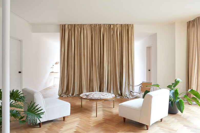
2. Living Room
 Maxime Desbiens
Lengthy weighted fabric curtains are a great way to bring a dramatic touch to any room. The light-colored herringbone wood floors give a textured backdrop.
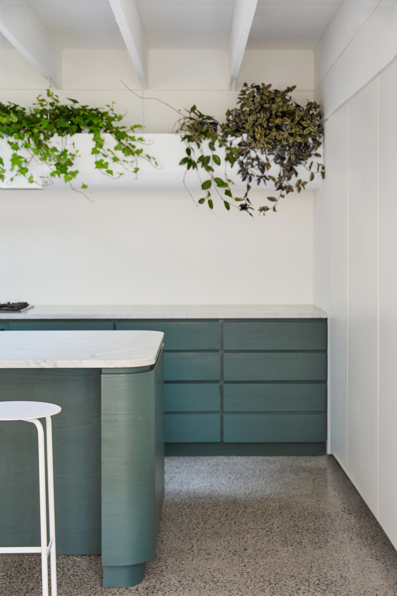
3. Kitchen
 Maxime Desbiens
The terrazzo-style concrete floor in the kitchen and the custom-designed range hood and banister painted in a muted green evokes a touch of vintage inspiration in the aged building. The round corners of the kitchen island and drawers are repeated on the staircase design.
4. Kitchen
 Maxime Desbiens
By placing focus on materials, rather than embellishments, the firm created a space that is uncluttered. It's also delightfully interrupted with seemingly unruly green ivy and other plants, giving it a more lived-in ambience.
5. Kitchen
 Maxime Desbiens
Coordinating light woods and linear lines allows the space to feel succinct. Besides the wood textures and white paint, the only colors are pink and green, two complimentary colors that can be found in other details throughout the spaces.
6. Dining Room
 Maxime Desbiens
The entire downstairs living room area is private and cannot be seen from the street outside. The stairway ascends to more private areas of the home, including the family's bedrooms.
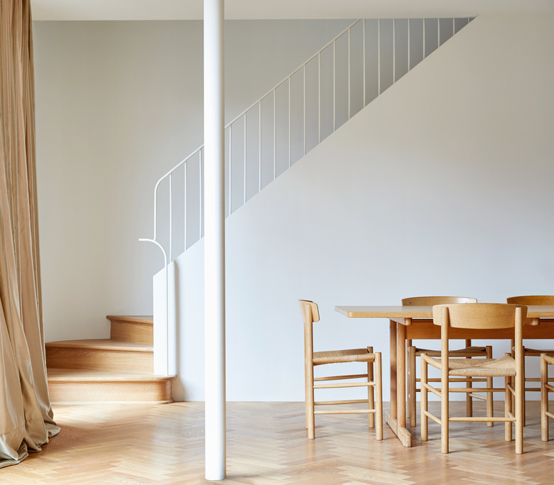
7. Staircase
 Maxime Desbiens
The rounded corner of the stairs and the curves of the staircase handrail lend the downstairs a whimsical quality, extended from the façade. The light wood, tan-colored curtains, and white walls make up a monochromatic composition.
8. Home Office
 Maxime Desbiens
Since hiding from the outside world wasn't a viable option, the firm got creative and created a transitional space downstairs. The viewable space is minimal and includes a desk area, lamp, and chair.
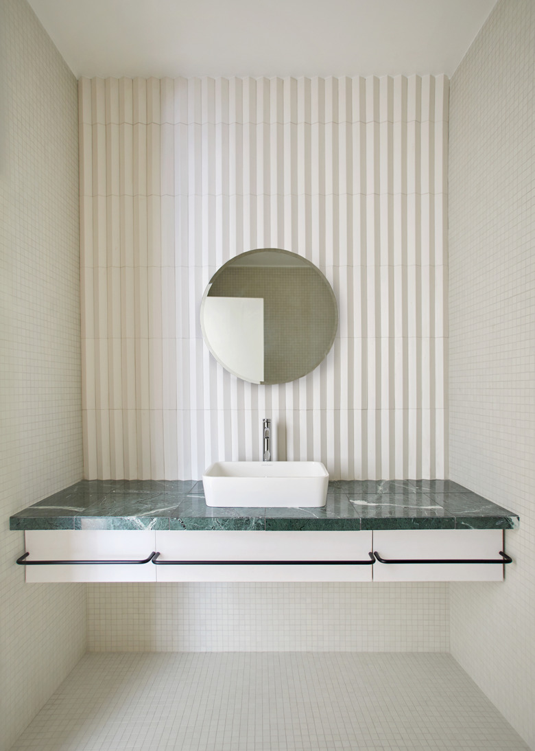
9. Bathroom
 Maxime Desbiens
The firm worked to create a bathroom that is both minimal and warm. The only decorative elements are vertical lines and simple, geometric shapes.
10. Exterior
 Maxime Desbiens
Originally, the side yard that was used for hauling merchandise into the grocery store was going to be redesigned as a side garden, a rare feature for the highly populated area. However, privacy concerns arose and the idea had to be scratched. Still, the firm managed to create an interior that balances the building's past public identity and its future as a private home.