It's Hard To Believe That This Light-Filled Berlin Home Is Actually In An Attic
When Polish design firm Loft Kolasinski was faced with creating a family home from a tight attic inside a Berlin building, the team opted to focus on one necessary feature: natural light. Given that the site had minimal windows and a closely-structured form, they were determined to create a haven that didn't quite feel as cramped as it was. "The owners wanted a bright space filled with objects they love," said designer Ewa Adamiak. And if that wasn't already a challenge, the firm also aimed to respect the address's history — after all, the members have a reputation for harmoniously pairing furniture from different eras to complement the modern properties they design. So, they started with repairing and retaining the original floors, doors, and ceiling beams, and giving them white-washed finishes that brighten every room in the home. Then, they matched the straight lines of the ceiling beams and wood floors with minimalist furniture in bright shades and patterns. The result is a play on light and dark in a small and angular floor plan: the shapes, shadows, and shades work together to promote a sense of airiness in an unlikely place.
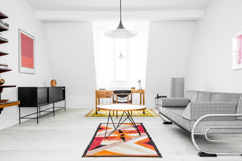
1. Living Room
In the living room, a vintage patterned Bauhaus-style sofa is paired with a GUBI floor lamp. A midcentury Polish rug designed by painter Teodor Grott sits under the coffee table.
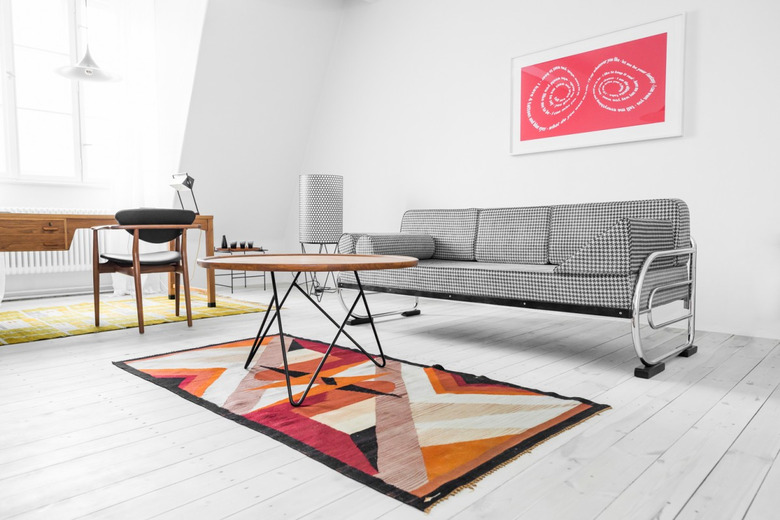
2. Living Room
 Karolina Bąk
After coming across a Finn Juhl desk chair in perfect condition with no visible restorations, Adamiak paired it with a 1946 modernist desk from Denmark. "It remained in perfect condition for over 35 years," Adamiak said.
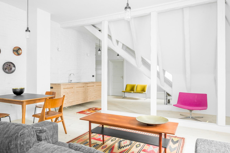
3. Living Room
 Karolina Bąk
The original wooden floor was cleaned up and restored to match the paint used throughout the home, which is an off-white mixed with grey. Pendant lights designed by Bonderup & Thorup hang overhead.
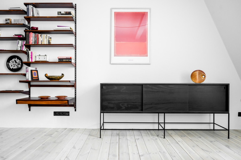
4. Living Room
 Karolina Bąk
A vintage console cabinet redesigned by the studio provides a dark contrast to the rest of the furnishings. Vintage shelves designed by Kai Kristiansen display an extensive collection of midcentury Polish pottery, and a vintage midcentury Polish poster hangs nearby.
5. Living Room
 Karolina Bąk
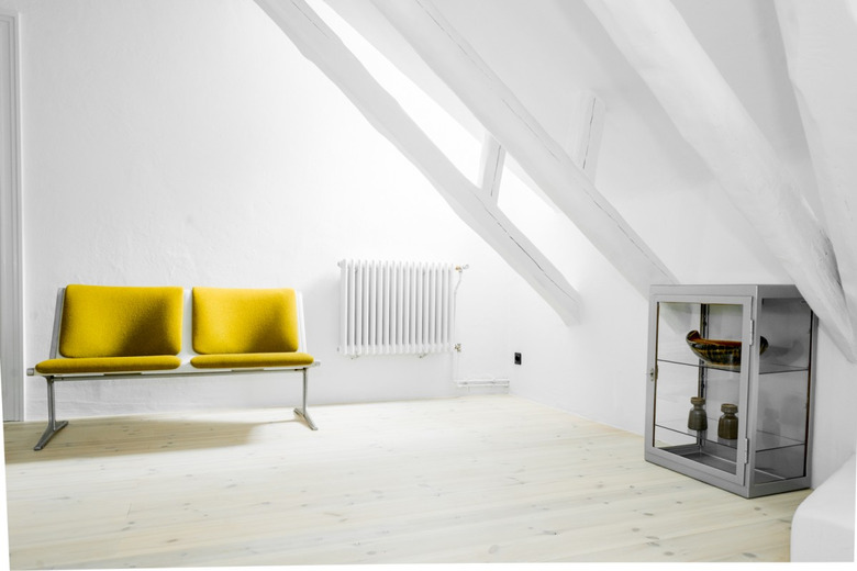
Original ceiling beams were painted off-white, which makes a vintage yellow bench pop.
6. Common Area
 Karolina Bąk
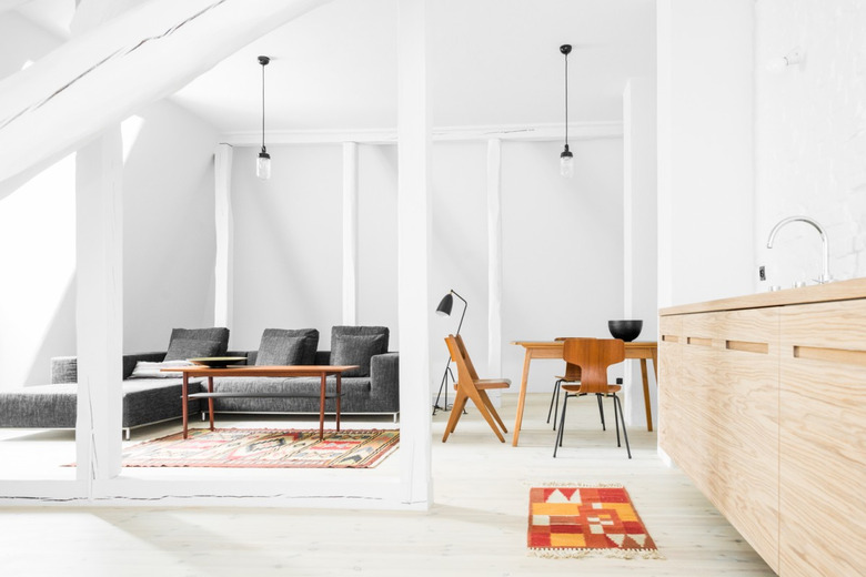
The light wood kitchen cabinets were designed by the studio, and vintage industrial lamps hang over the dining and living areas.
7. Bedroom
 Karolina Bąk
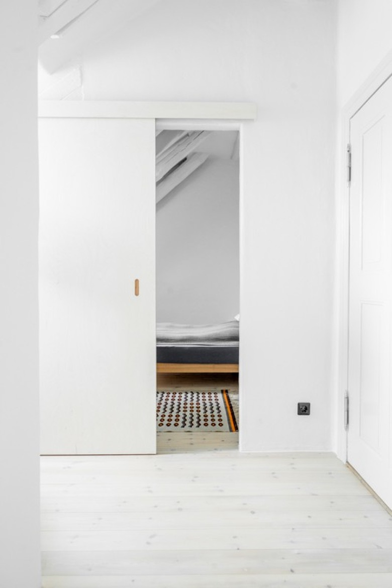
A classic minimalist look — white walls and simple patterns — continue into the private areas. Sliding doors save space and partition the rooms, but still make them feel accessible.
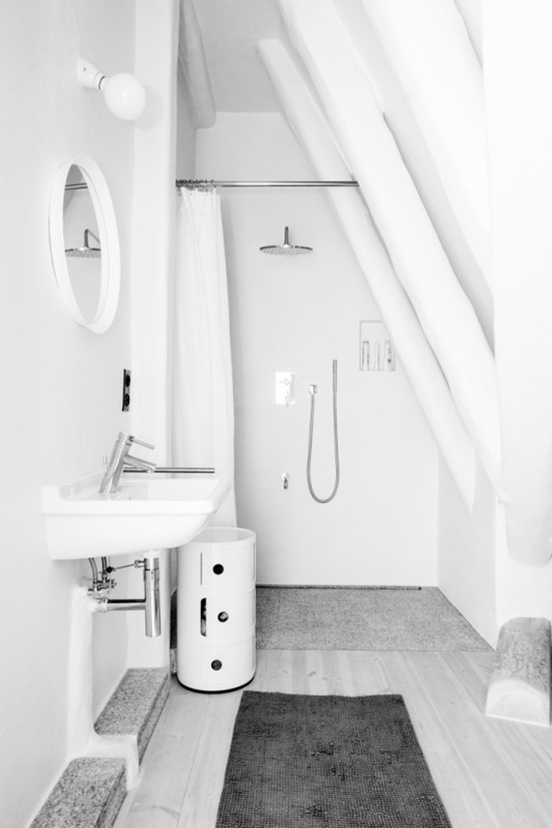
8. Bathroom
 Karolina Bąk
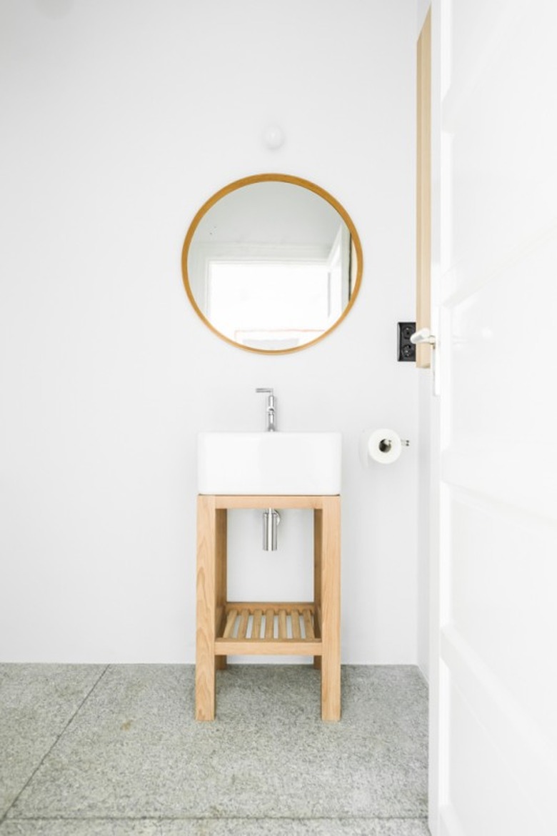
The studio designed the cabinets, which complement granite stone floors and a vintage mirror.
9. Bathroom
 Karolina Bąk
It's not easy to make a small bathroom feel larger than it is. But the designers primarily used bright white and gray to give the illusion of space.