The 6 Principles Of Landscape Design
A landscape design ultimately depends on personal preference, but following some basic design principles can make the difference between a cohesive look and a disjointed one. Although plants play a significant role in landscape design, their selection comprises only one of many elements.
By following some basic principles of landscape design, you needn't relinquish your personal style in favor of a cookie-cutter look.
Six Basic Landscape Design Principles
Landscape design shares common ground with other art forms. Here are the six basic principles of landscape design.
1. Simplicity
Achieving simplicity in the landscape doesn't mean you have to work toward a sparse look with only a few plants dotted about, nor do you have to omit other features, such as hardscapes and lighting effects. Many landscape designs are quite complex, but their simplicity lies in their avoidance of clutter and their repetition of certain plants, shapes, textures, and colors. Even a casual cottage garden that may hold a lot of plants in a small space can still achieve simplicity by sticking to a complementary color scheme.
2. Focalization
When you look at a landscape, the first thing that draws your eye is the focal point. This fulfills the landscape design principle of focalization. A garden design may have more than one focal point, but it typically has one primary focal point.
Secondary focal points, which do not compete with the primary focal point for attention, can enhance an overall landscape design. Two primary focal points in the same landscape are not competitors, however, when one is in the front yard and another one is in the backyard.
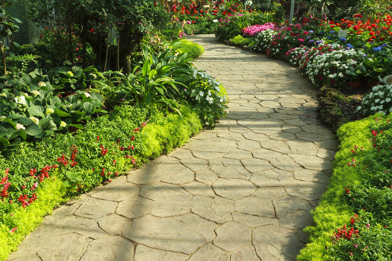
Focal points include different features and structures such as plants, garden structures, hardscapes, and aquascapes. Even elements like texture, movement, and color can serve as focal points. Geometric shapes, such as lines and circles that are formed by certain design components, also contribute to focalization. For example, the straight or curved line of a sidewalk or garden path can be used to direct attention to a featured plant or a structure.
3. Balance
Balance in a landscape design offers a pleasing sight and a comfortable experience for the viewer. On the flip side, an unbalanced landscape can cause a viewer to feel uncomfortable.
Achieving balance means having equal visual weight on both sides of a landscape, but it doesn't mean that having exactly the same number and types of plants, garden structures, or colors on each side of your yard. This arrangement, however, does describe one of the three types of balance in a landscape design: symmetrical balance.
-
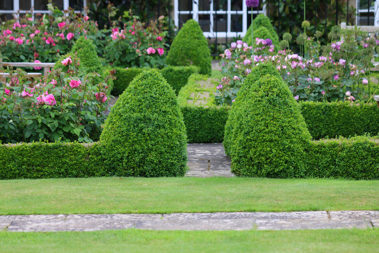
Symmetrical balance. Most often used in formal
landscape designs, symmetrical balance creates a reflection of one side of the
design onto the other side. In other words, if you drew an imaginary line down
the center of a landscape design, each side divided by the line is a mirror
image of the other side. Picture a formal courtyard garden with perfectly trimmed hedges that form borders around quadrants containing identical perennial plants.
Typically, symmetrically balanced landscapes require
high maintenance. -
Asymmetrical balance. Most often used in
informal landscape designs, asymmetrical balance has the same visual weight on
both sides of a central axis, but the design elements are not mirror images of
each other. Asymmetrical landscape designs appear more relaxed and not as
"buttoned up" as symmetrical designs. Groupings and/or combinations or clusters of
plants and structures can create asymmetry in the landscape while still
achieving balance. -
Proximal/distal balance. Also called perspective
balance, this type of design emphasizes the relationships between near and far landscape
components. It addresses the view of the foreground, midground, and background
of a design. For example, objects in the foreground that are closer to the
viewer have greater visual weight even though they're generally smaller than tall trees in the background.
4. Proportion/Scale
Landscape design includes two facets of proportion: relative proportion and absolute proportion. Relative proportion considers the size of an object in comparison to other objects in the landscape. Absolute proportion considers only the size of one specific object.
The human scale, which represents the size of the human body, is one example of absolute proportion. When comparing the human scale to plant scale, house scale, and garden structures scale, it's this proportionate size relationship that helps landscape designers produce comfortable, workable, and functional designs.
For example, an oversized patio that overwhelms the scale of a home looks disproportionate and throws the total design out of balance. A small plant in a large urn will look awkward because the relative proportion is off kilter.
Proportion doesn't only consider tangible items; it also considers open space. Not every nook and cranny in a landscape needs to contain plants, structures or other garden features. Open spaces provide not only proportion in design, but also a reprieve from an otherwise busy landscape.
5. Rhythm and Line
Just as the rhythmic cadence of a drum beat adds repetition to a musical score's theme, rhythm in the landscape repeats design elements with something – often space – between them. In other words, the rhythm may consist of plant groupings with space between them. Even separate sitting areas with space between each area provide landscape rhythm.
Landscape lines are formed by forms and shapes of garden beds, sidewalks, patios, plants, and even the home itself. Worthy of note is that the lines of a landscape aren't always straight. Curved lines help soften the harshness created by straight lines. They can also create a gradual change of flow in design as the overall theme transitions from one area to the next.
Also, landscape lines don't always follow a route along the ground. Vertical lines add another dimension to the horizontal lines that exist on the landscape floor. Trees, walls, and fences are some of the landscape components that create vertical lines. These vertical lines form outdoor walls, enclose garden spaces and create backdrops for a landscape design.
6. Unity
When a landscape design achieves unity, the design principles and the contributing components supporting them work together harmoniously. The overall design is not awkward or cumbersome, and it doesn't leave the viewer with tired eyes.
A unified landscape design looks good when viewed from every angle. The design forms a seamless integration of components that complement each other instead of competing for attention. Another sign that you've achieved design success is when your landscape provides picture-worthy views from your home windows.
Contributing Components to Design Principles
While principles are standards that influence landscape designs, individual components can support more than one principle. For example, color in landscape design is a component that may influence focalization, balance, and unity. Plant choices can influence the principles of simplicity, proportion, and rhythm. An effective landscape design considers not only the six basic principles, but also the component subsets that populate these principles.
Color in Landscape Design
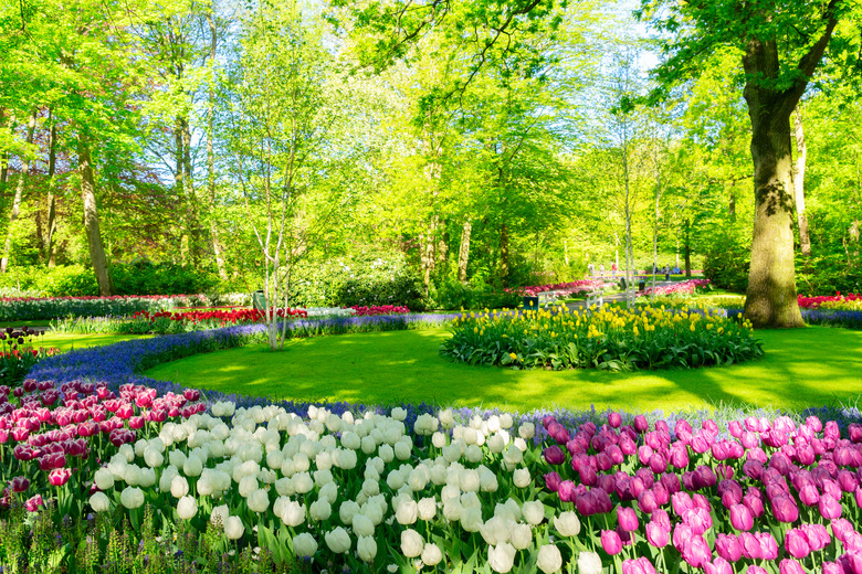
Landscape design color schemes are largely based on personal preference. Some gardeners lean toward a palette of cool colors, while other gardeners prefer warm colors. There's also the choice of bright colors or subdued colors, making the color scheme even more subjective.
As important as color choice is, it is, as a rule of thumb, one of the last components that landscape designers put into place. It's similar to an artist who makes a sketch of her subject before adding color. She may draw an outline, embellish the picture with a focal point, fine-tune the sketch by adding background balance, and make sure that everything is in proportion all before she picks up a paintbrush to add color.
Landscape designers and other artists commonly use the color wheel. The color wheel is separated by its arrangement of colors into three primary colors (red, yellow, and blue), three secondary colors (orange, green, and purple) and six tertiary colors. Color theory defines the relationship of these colors on the color wheel and helps designers choose a color scheme that's complementary, with choices that exist on opposite sides of the color wheel, such as red and green.
When choosing colors for a landscape design, the color of a home or the color of another structure, garden ornaments and hardscapes add to the overall color scheme. It's not just flowers that add color from plants to a landscape — foliage, fruit, berries, and even bark can also add brushstrokes of color.
Plants in Landscape Design
Plant selection covers a lot of territory in landscape design. Not only are individual plants a consideration, but also the climate, soil, elevation, light conditions, and other factors that will support growth for different types of plant material. Your local cooperative extension service is a valuable resource for recommending suitable plants for the region where you live.
Large trees, small trees, shrubs, perennials, vines, and ground covers are just some of the plant types to consider. Plant forms also cover a lot of territory, including rounded, columnar, upright, cascading, and vase-shaped. These and other architectural design elements found in different types of plants contribute interest to a well-appointed landscape.
Garden Structures in Landscape Design
Arbors, pergolas and trellises are some examples of garden structures that boost design appeal while supporting vines. Although these terms are sometimes used interchangeably, there is a distinction between their forms and functions.
An arbor may be either a partially enclosed or a recessed area that's shaded by trees, but a garden arbor also refers to a structure that supports vines over its latticework with a bench underneath. A trellis is essentially an arbor without the bench, although other types of trellises are flat structures attached to walls or used as freestanding structures against walls. A pergola is a long trellis structure over a walkway and is typically covered with vines.
Hardscapes and Aquascapes
Effective use of hardscapes can complement the plant material in a landscape. Driveways, sidewalks, patios, decks, benches, and stone walls add texture to a landscape design and define borders, boundaries, and recreation areas. As with any landscape design element, the overuse of hardscapes interrupts the flow of a design. If, for example, you have a swimming pool with a concrete surround, additional concrete structures can overwhelm a small landscape.
Another way to enjoy a visually and aurally appealing feature in your landscape design is to add a water feature. Water walls, pondless waterfalls, and fountains are some examples of aquascapes that function as strong focal points. Whether you have a small water feature, such as a tabletop recirculating fountain, or a large aquascape, such as a koi pond, the look and sound of water can enhance any landscape.
Putting It All Together
Between the actual principles of landscape design and all the components that make these principles work, designing your own plan can be a daunting task. Instead of tackling a grand master plan for your entire landscape by yourself, calling on professional landscape designers and landscape architects may be a step in the right direction.
Some designers will make recommendations without an actual diagrammed plan or drawings, allowing a gardener to do the actual work. Others may offer a design plan with recommended plant selections and proper placement of plant materials as well as garden structures. Many landscape designers will do all the work for you — drawing up plans, choosing plants and other materials, and installing their design.
