Selecting a palette for your kitchen no longer means having to choose between the wall and cabinet color. These days, it's all about mixing and matching inspired hues with patterned backsplash tiles and visually dynamic countertops. The downside of having such a rich array of possibilities? Narrowing down all the choices to a color scheme that best complements your aesthetic. Luckily, we're here to shed some light on the shades worth considering.
The most popular kitchen color choices are soothing shades of blue, green, and pink that feel timeless yet fresh. For those who prefer neutrals, white, beige, gray, and greige never go out of style. If you're thirsty for more, read on for nine classic paint color ideas that might just inspire a kitchen makeover.
Video of the Day
Video of the Day
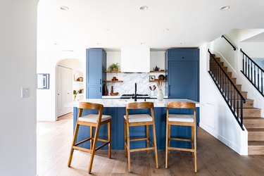
1. Experiment with shades of blue.
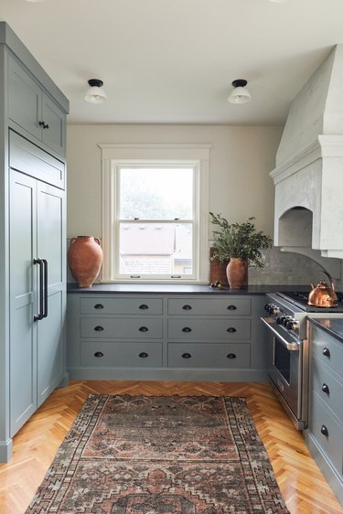
When renovating the kitchen of this historical, turn-of-the-century home, interior designer Victoria Sass from Prospect Refuge Studio married the modern-day function of an open floor plan with the timelessness of a refined shade of blue paint. Farrow & Ball's De Nimes is featured throughout the space and it complements the subtle blue undertones in the backsplash and natural soapstone countertops.
2. Look to nature for color inspiration.
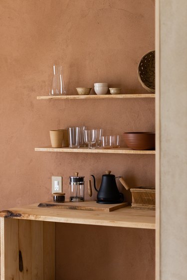
Kelly Brown and Bryce Ehrecke, owners of this airstream-turned-dream home, let Joshua Tree and the modern desert inspire their kitchen colors. To keep a natural, minimal feel throughout their tiny 250 square foot dwelling, the pair chose a terra cotta paint color that's reminiscent of adobe or clay.
3. Try a little white on white.
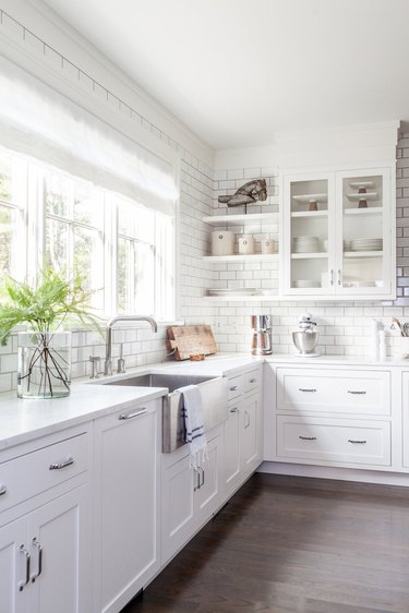
For the color averse, there's good news: White-on-white kitchens will always be in style. In this crisp design, Chango & Co. paired white cabinets with a white countertop and subway tiles stacked to the ceiling. Add color in small doses through plants and decor accessories.
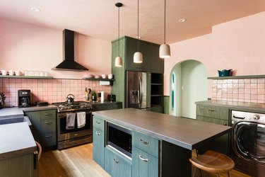
4. Brighten up with blush pink.
For their 1920s Spanish-style apartment in Los Angeles, Michael Kaminsky and Mel Keedle, co-owners of Still Life Ceramics, used this sweet blush color in a big way. Dusty pink tiles — which aren't just for granny bathrooms anymore — are accented with a matching paint that extends to the ceiling. Green cabinets and neutral accessories, including ceramic pendant lights that Keedle made herself, complement the rosy shade.
5. Don’t be afraid of dark paint.
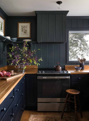
Little black dresses never go out of style, and here's betting matte black or navy blue kitchens don't either. Seattle-based designer Heidi Caillier shows us how to go dark the right way in this stunning space that's brightened up with fresh blooms and big windows welcoming ample natural light. Wood elements, like the countertops, floors, and stool, make sure the space feels warm and down-to-earth.
6. Consider a mellow shade of yellow.
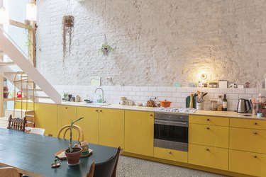
The color yellow can occasionally feel abrasive, but a subtle version of the sunny hue is cheery and energizing. Balance its bright tone with white brick walls, hanging plants, and wood countertops. You'll smile every time you walk into your kitchen.
7. Let the forest inspire you.
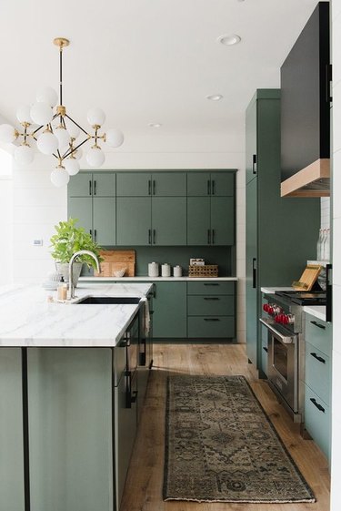
This modern cabin, designed by Studio McGee, looked to the surrounding trees for kitchen color inspiration. Floor-to-ceiling green cabinets, including an integrated refrigerator, match the forest views outside. And the rest of the kitchen design — from the subway tile to the chandelier bulbs to the countertop accessories — sticks to a crisp white palette, further emphasizing the verdant hue.
8. Keep it simple with black and white.

What's black, white, and timeless all over? This kitchen, designed by & Shufl. The black cabinetry and floating shelves add dimension, while the herringbone wood floors add dreamy warmth. Add additional color with the help of an area rug or countertop accessories.
9. Go for soothing tonal grays.
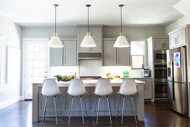
Even when life feels chaotic, there's nothing like a gray kitchen to bring a little calm. Here, Studio Ten 25 went with a silver hue for the cabinets, kitchen island, and walls. White accents, like the backsplash and light fixtures, brighten the space — as do bowls of fresh fruit and children's artwork.
How Not to Choose Kitchen Colors
Finalizing a kitchen color scheme can be a daunting task. But if you take your time and steer clear of these common mistakes, you'll be headed in the right direction.
Don't ignore existing elements in the room.
The kitchen cabinets, lighting fixtures, appliances, and flooring can all have an impact on the end result so be sure to take them into consideration when picking out a color palette. If you're working with predominantly stainless steel appliances, it's worth sticking with cooler tones such as gray, white, or blue. Brass hardware and fixtures will shine when paired with warm, earthy tones or bolder shades like black or forest green. And you can't go wrong with wood cabinets and a neutral wall paint.
Don't fall for whatever is "in" that season.
Color trends may come and go, but if you're siding with a hue simply because it's deemed trendy, you'll find yourself in need of a premature kitchen remodel. Go for color ideas that fit your style and opt for ones that you know you won't tire of in a year.
Don't overlook the layout.
If you have an open format kitchen that exists within the same confines of a dining or living room, you'll want to take the colors of those zones into consideration, too. While the rooms don't necessarily need to feel like seamless extensions of one another, you want to make sure the palette of the kitchen isn't clashing with that of the surrounding areas.
Don't dismiss the power of color.
Sure, sticking with neutral colors is always a safe choice but don't be intimidated to experiment with something a little bolder. If you're leaning towards a saturated or vibrant hue but can't quite commit to it, designate it for an accent wall or incorporate it within the backsplash tile.