This Crash Pad For Creatives Is All About Minimalism
Located in the Mile End district, the center of Montreal's bustling art scene, architectural firm Atelier Barda redesigned a space that serves as accommodation for collaborators of a fashion company. Aiming to create a cross between a loft apartment and a hotel room, the firm utilized their own furniture studio, Foraine, to create pieces that put materials and textures at the forefront of the design.
The final product strips the space down to its bare essentials, concentrating on color contrasts and horizontal lines as well as a mixture of heavy and light textures.
1. Living Room
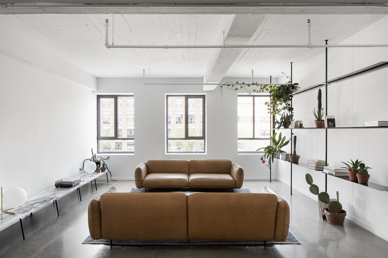
In the dining room, a collection of tables and benches were made from solid oak with black-painted metal bases. Shared spaces throughout the apartment were composed to bring in ample natural light.
2. Living Room
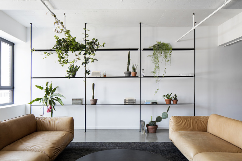
The black metal bookshelf mirrors the black framed windows on the neighboring wall. Natural light allows shadows to be cast, creating more depth in space.
3. Living Room
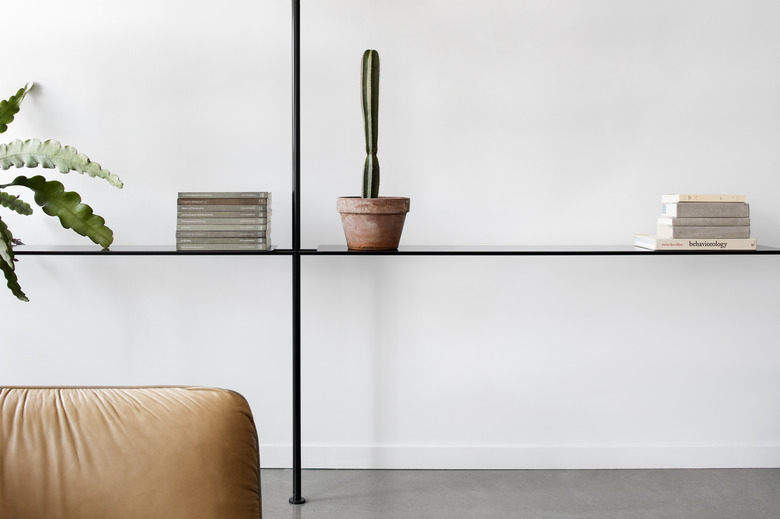
Just because the space is shared doesn't mean it has to lack individuality. The minimalist shelf houses a few unique and personal items.
4. Kitchen
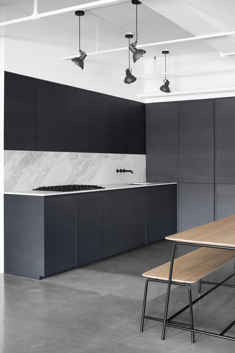
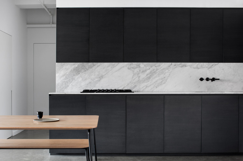
In the dining room, a mostly gray palette sets a soothing background to the solid oak furnishings. Metal ceiling lights and a sleek gray floor contrast the natural wood materials.
5. Dining Room
Dark cabinets frame the marble backsplash. The lines mimic the shape of the tabletop and bench seat of the dining table.
6. Bedroom
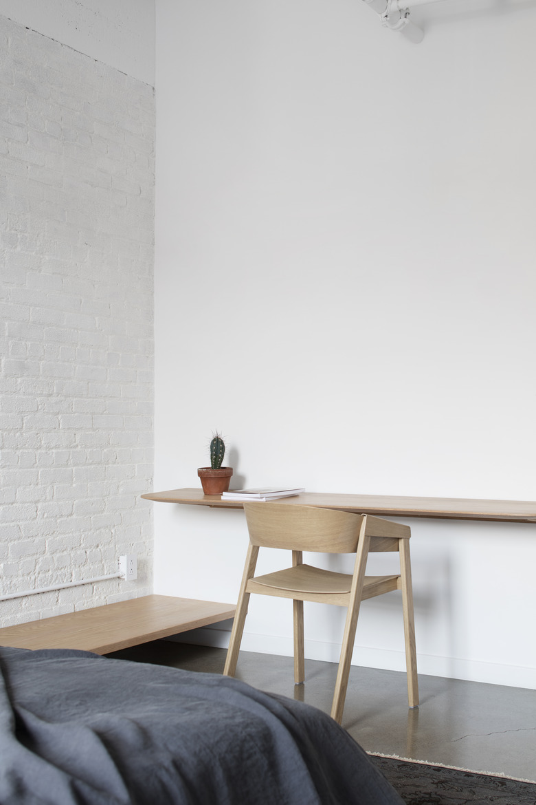
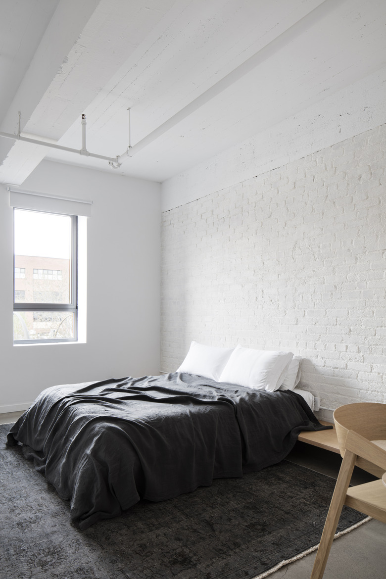
In the bedroom, a bed frame and desk are also made of solid oak. The parallel lines in each furniture design form a minimalist composition.
7. Bedroom
The exposed brick wall, original to the apartment, was painted white in order to keep the texture without betraying the minimalist atmosphere. Comfort is a fundamental component in a home that also serves as a crash pad for creatives.
8. Bathroom
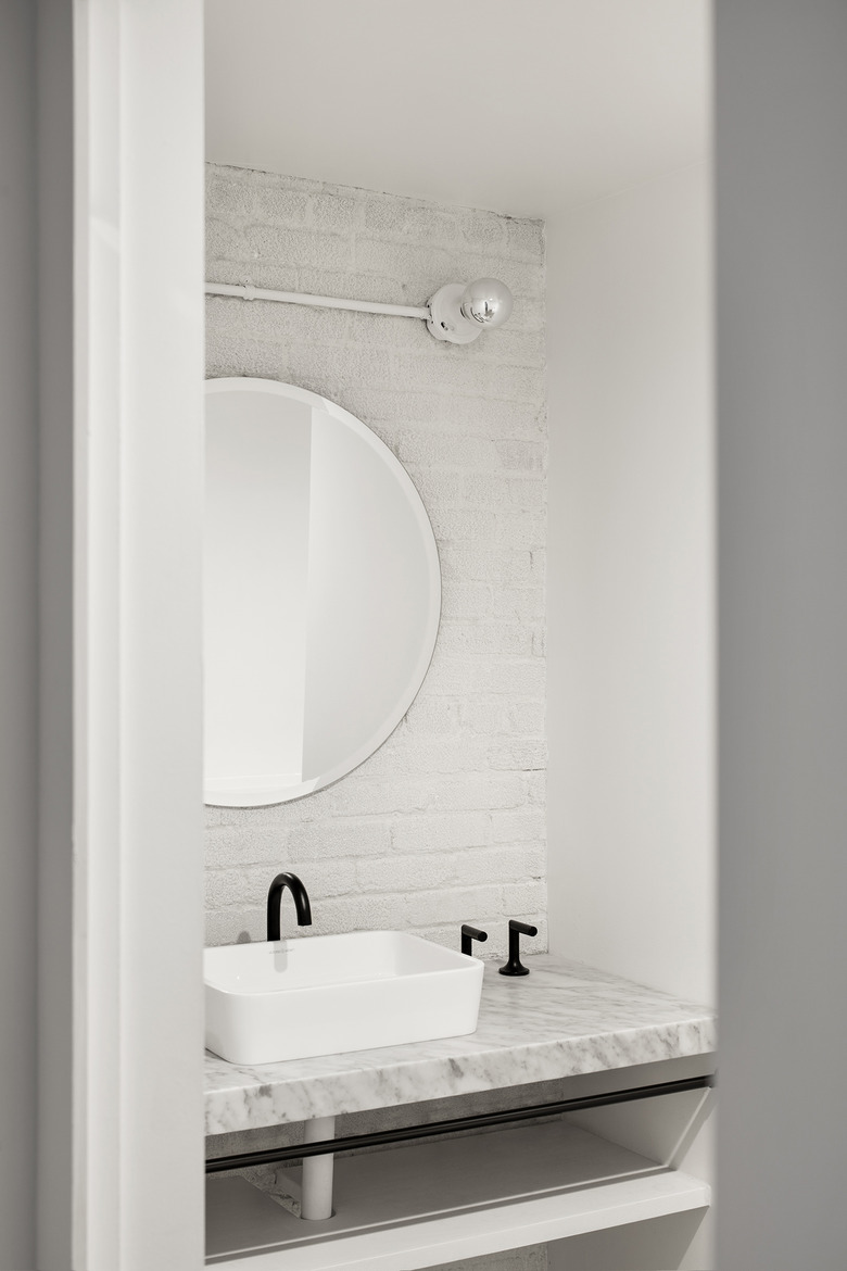
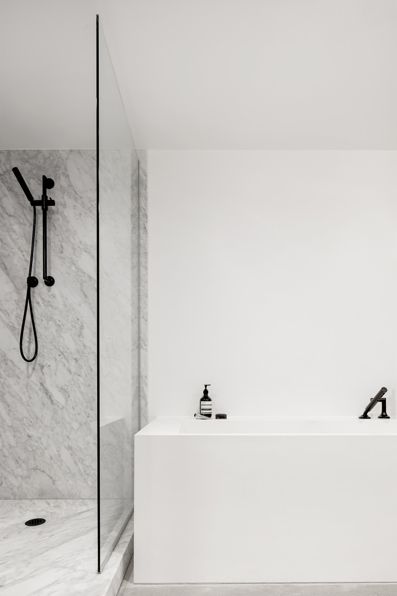
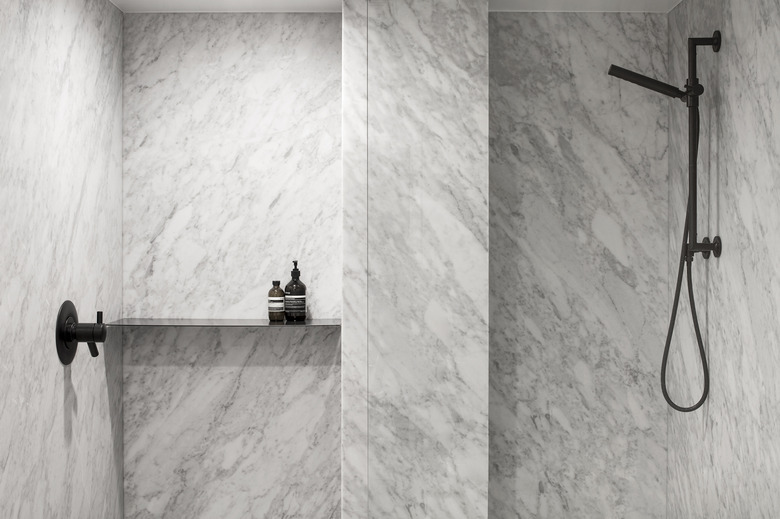
In the bathroom, the firm opted for a sleek and clean design, utilizing white colors. The monochromatic palette is interrupted with various textures, including a marble white counter and black metal faucets.
9. Bathroom
For shared bathrooms, instead of using decorations, the designers opted to use use beautiful pieces, like the faucets, shower heads, and round mirror, in place of the usually mundane elements. Creating a bathroom design that is light on embellishments comes with an added bonus: It's easier to clean.
10. Bathroom
"The close collaboration with local craftsmen for the implementation of this high-end project has also allowed to meet the different challenges at all the stages of construction and design," designer François Olivier-Gouriou said. The final design translates into a space that is representative of the quality craftsmanship and chic design found in the city.
